![]() Chamberlain Logo PNG
Chamberlain Logo PNG
Clients’ property is behind secure locks; the Chamberlain logo guarantees it. The emblem focuses on several levels of protection. The signs read the balance and precision that distinguishes the garage door elements.
Chamberlain traces its roots to 1900, when Andrew M. Chamberlain and his son Floyd founded Peerless Cream Separator in Waterloo, Iowa. The company began with dairy equipment, later moving into washer-wringers and home ironing devices before shifting to military production during World War II.
After the war, Chamberlain redirected its factories toward consumer products. Suburban growth and wider car ownership created demand for garage doors that could be opened from a vehicle. In 1955, Perma Power introduced the first radio-controlled garage door operator, and Chamberlain acquired the company, gaining patents and production capacity. Its Nogales, Mexico, facility became a major manufacturing base for Chamberlain garage door openers.
The market was shaped by competition with Alliance Manufacturing Company and its Genie brand, which launched a mass-market radio-controlled residential opener in 1954. In 1994, Genie was acquired by Overhead Door, giving the rivalry a stronger corporate frame.
In 1983, the Duchossois family became the sole owner of Chamberlain. In 1984, the business was organized as Chamberlain Group, Inc. within The Duchossois Group. The company patented automatic radio-code technology, introduced a wireless keyless entry system in 1989, and promoted infrared safety sensors that later became mandatory under U.S. federal law. Chamberlain expanded through acquisitions, including German Gasselschaft, French Wecla, Clicker Corporation, Moore-O-Matic, Atlas assets from Clopay Building Products Company, Australia’s Merlin, and Grifco. In 2011, it launched myQ, a smartphone garage control app, and in 2021, Blackstone acquired Chamberlain Group.
Meaning and History
![]()
The company’s emblem emphasizes the strength of its products and its focus on the male audience. Character traits more common among men include constancy, accuracy, and reliability. The history of the logo conveys these motifs after all, it has not changed for more than 65 years. During this time, several generations of people who used the company saw it; it became a part of their lives.
The year 2020 has affected the activities of many organizations worldwide. Chamberlain employees also decided to update the company’s symbol to make it more modern. Did they succeed? Well, let’s figure it out.
1954 – 2020
![]()
The first version of the logo remained in use for over six decades, appearing on various signs and the manufacturer’s marketing materials. During this time, many events took place worldwide, but the identity did not change, as if to emphasize the company’s persistence.
The font is designed in an italic style and includes a small graphic element under the first letter “A” (a yellow triangle). Separately, it should be noted that the first letter “A” differs from the second one in that it does not contain a horizontal line that imitates the graphic element under it. Some associate the triangle’s yellow color with happiness and comfort; well, it’s hard to disagree. The company gives its customers these emotions, never ceasing to please them with high-quality, reliable, durable products.
The logo is in blue, the letters are clearly distinguishable, and the bold and italic styles are perfectly combined. The main idea is to convey the brand’s professionalism and reputation worldwide. This is not just a company logo but a reflection of the efforts, the soul, and the qualities that the organization’s employees have invested in its activities.
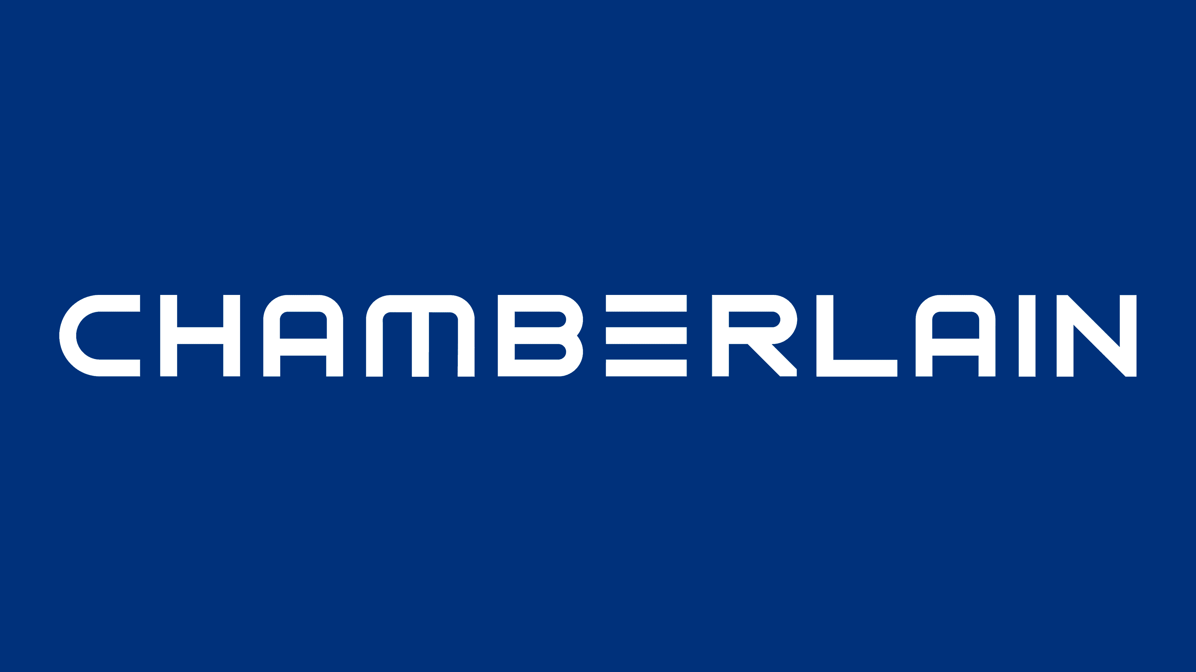
2020 – today
![]()
In 2020, the company rebranded the logo to reflect the enterprise’s modern activities in the identity as clearly as possible. Here, it is important to note Chamberlain’s innovative direction, which keeps up with the times. Most Chamberlain garage doors can be opened and closed using a smartphone. “myQ” technology has been incorporated into garage door openers and lighting. With it, you can control the garage doors via Wi-Fi.
A year earlier, at CES 2019, Chamberlain Group announced its partnership with Amazon. The main goal is to use the “myQ” product to enable fast delivery by couriers when they can safely leave it in the customer’s garage.
The current Chamberlain logo successfully captures the contemporary motif. The “robotic” text style is combined with a light blue color scheme, rather than the previous one. The distance between the letters is almost the same mathematical precision as in the manufacture of garage doors, where there is no room for error. The garage theme is perfectly conveyed in the letter “E,” written as three dashes to symbolize the garage door.
Font and Colors
Both logos perfectly combine unobtrusive, pleasing to the eye, blue gamut; ease of writing; the transfer of those qualities with which the brand’s activity is connected – reliability, strength, constancy. In both versions of the logo, there is an element of the product theme (three dashes instead of the letter “E” symbolize the garage door; the letter “A” with a yellow triangle under it symbolizes the comfort that customers receive from using the company’s products).