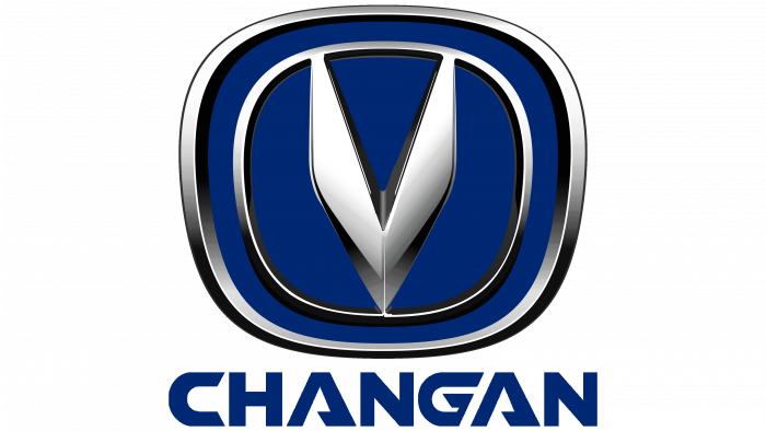
Large machines with optimal parameters and ease of operation are encrypted in the symbols of the Changan logo. The emblem demonstrates the accuracy of the assembly, with every part perfectly fitted and forming a reliable mechanism.
Changan: Brand overview
| Founded: | 1862 |
| Headquarters: | Chongqing, China |
| Website: | globalchangan.com |
Meaning and History
Changan’s roots date to the mid-19th century when Li Hongzhang opened a military-grade factory, the Shanghai Foreign Armaments Bureau. It was originally located in Shanghai but was relocated to Chongqing during the Sino-Japanese War. This happened in 1937.
Car production started in 1959, when Chongqing Chang’an Arsenal, under an agreement with the government, developed and assembled the Changjiang Type 46. It became the first production car in the PRC and was produced under license from Suzuki. In 2009, the company bought two small specialized firms, Hafei and Changhe. The second was later taken over by the Jiangxi provincial administration and was restructured, eventually becoming a subsidiary.
In 2010, the brand experienced two major events. First, it has risen to the fourth position in terms of car production in the country. Second, the company received an updated logo for its consumer products, while commercial production remained with the same logo in the form of a red arched structure.
In 2012, the company was split into two new structures cooperating with foreign car manufacturers – Changan Ford and Changan Mazda. During this period, 72 percent of its production was passenger cars. In 2017, the company announced that it would completely reorient its sites to produce electric vehicles by 2025. Although the countdown of the activity of the automobile brand dates back to 1862, the history of its logos dates back to 1957. To date, she has four of her emblems.
To finally determine the style, the authors of the logo experimented at first. The trial ended when they turned the double arch over and shaped it into a wide “V.” As you know, this letter symbolizes victory, but here it also looks like a bird’s wings raised for flight.
What is Changan?
Changan is a brand of Chang’an Automobile Co., Ltd., the oldest automaker in China. Its history dates back to 1862, although, at that time, it only produced weapons. The company now specializes in commercial transportation, passenger vehicles, electric vehicles, and SUVs. It sells them under different brands, such as Kaicene, Oshan, and Changan. The China Ordnance Equipment Group Corporation owns the company.
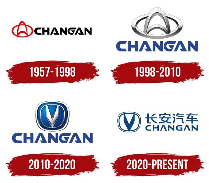
1957 – 1998
The debut logo was a double arch curved upwards. It was in a red oval and was connected by the ends to the bottom line of the base figure. At the same time, the arch overlapped the upper side of it, which made it seem that the strip was open. Thus, four white hollow parts appeared, separated by red strokes of different configurations. An inscription was placed to the right of the graphic emblem. It was the brand name in Chinese or English, in black capital letters. Although all the symbols were sloping, elongated, with rounded corners, some had an individual design. For example, “A” was depicted as an isosceles triangle with a lower bar.
1998 – 2010
After tweaking, the emblem received a volume created by the correct combination of shadows and highlights on the gray. The developers retained the shape of the arch but added width to the lines. They worked the same way with the oval. The letters have been changed the most. Thanks to the oblique cuts, they have become stylish and curly. Tips appeared at the ends of the “C.” The triangular “A” had its lower half shortened (improvised crossbar). The right side of “G” is now diagonal. The designers replaced the black color of the lettering with blue.
2010 – 2020
The graphics have been completely redesigned. The authors turned the emblem over, placing the arch upside down. They made a wide “V” out of it, resembling two wings when flapping. The oval also became elongated: it received the shape of a ring, slightly narrowed at the bottom. Behind it was a trapezoidal frame. All elements were three-dimensional and set against a blue background with gradient transitions. The inscription has remained the same.
2020 – today
The current emblem is in line with the current fashion for 2D style logos, so it is flat and simple. The designers removed various special effects, visually unloading them. But at the same time, they retained the basic components: the letter “V,” a trapezoidal frame, and double edging.
Changan: Interesting Facts
Chick-fil-A, famous for its chicken sandwiches, was founded by S. Truett Cathy in 1946 in Hapeville, Georgia. It’s one of the top fast-food chains in the U.S., known for its food, unique culture, and business practices.
- The Original Chicken Sandwich: Invented by Cathy in 1964, this sandwich has a hand-breaded, seasoned chicken breast on a buttered bun with pickles.
- Closed on Sundays: Reflecting Cathy’s Christian beliefs, all locations are closed on Sundays to give employees a day off for rest and worship.
- Cow Advertising Campaign: Since 1995, the “Eat Mor Chikin” cow campaign has become a signature part of Chick-fil-A’s brand. The campaign humorously suggests that people eat more chicken instead of beef.
- High Sales: Chick-fil-A achieves high sales per restaurant in the U.S., thanks to its quality food, efficient service, and customer satisfaction, despite being closed weekly on Sundays.
- Service Innovations: It was among the first to have a drive-thru and has embraced technology with its mobile app for ordering.
- Scholarships and Philanthropy: Chick-fil-A supports leadership and education through scholarships and charitable efforts, donating over $75 million to its employees since 1973.
- Unique Franchise Model: Operators are often limited to one location, ensuring they’re directly involved in their restaurant’s daily operations, which helps maintain quality and service standards.
- Fresh Ingredients: Chick-fil-A is committed to quality, using whole, fresh chicken and making items like lemonade and milkshakes from scratch.
- Menu Diversification: Over time, Chick-fil-A has added healthier options and adapted its menu to meet various dietary needs, including gluten-free buns and removing high-fructose corn syrup from its recipes.
Chick-fil-A’s blend of traditional values and modern business strategies has secured its place in the hearts of many Americans. It’s not just a fast-food chain; it’s a brand that stands for quality, innovation, and a commitment to people, whether employees or customers.
Font and Colors
The inscription is made in an individual typeface, in which “A” has the form of a triangle since its crossbar is lowered down and forms an edge. The letter “G” has the right side cut diagonally.
The logo’s color scheme is simple and currently consists of a combination of deep blue and white. Previously, black, red, and several shades of gray were used.
Changan color codes
| Safety Blue | Hex color: | #004382 |
|---|---|---|
| RGB: | 0 67 130 | |
| CMYK: | 100 48 0 49 | |
| Pantone: | PMS 7686 C |

