Freshness and comfort are the main accents that the Charmin logo demonstrates. The hygiene products manufacturer deliberately chose this style because it has to show purity. Softness is conveyed by smooth lines and roundings, reliability – by the color palette, and positivity – by the font style. The result is a pleasant atmosphere aimed at the target customer segment.
Charmin: Brand overview
| Founded: | 1928 |
| Founder: | Procter & Gamble |
| Headquarters: | United States |
| Website: | charmin.com |
Meaning and History
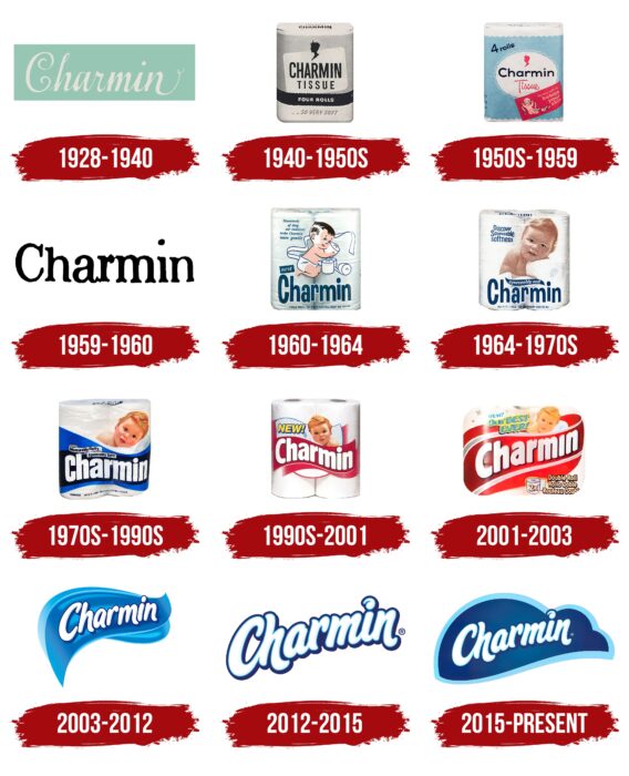
Charmin, globally speaking, is the most recognizable toilet paper brand. For almost a century-long history of the brand’s existence, 11 variants of the logo have been presented to the target audience. Each redesign added new elements to the Charmin logo, making it stand out from the competition.
What is Charmin?
It is one of the most famous manufacturers of personal care products globally. Millions of customers around the world regularly use the products of the American brand.
1928 – 1940
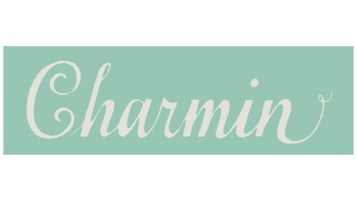
The first version of the logo was introduced almost immediately after the company’s founding in 1928. It was a white word inscription depicted on a light green background. It was a gothic font with significant serifs in the letters. Particularly striking were the curved “C” and the elongated line in the last “h.” Thus, the Charmin brand name seemed larger than it is, which is a direct reference to the potential and capabilities of the company.
1940 – the 1950s
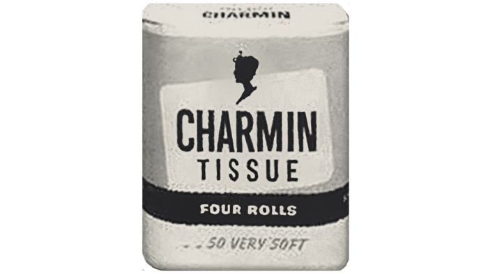
The first redesign significantly changed the style of writing the brand name. It was not a cryptic inscription but a more down-to-earth and modern sans-serif style. All letters in Charmin were capitalized. As a rule, black characters on a white background were used.
the 1950s – 1959
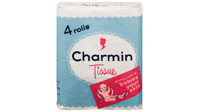
The traditional color palette for the company appeared thanks to this redesign. The logo consisted of a blue square inside, a white oval with a black wordmark. The font has changed and now looks more like Courier New with more character spacing.
1959 – 1960
In 1959, another redesign was made. It should be noted that the new version of the logo lasted only one year. It was a concise and minimalist logo. The name Charmin, made in black letters, was depicted on a white background without additional elements. The font was close to handwritten, with barely noticeable serifs at the ends of the letters.
1960 – 1964
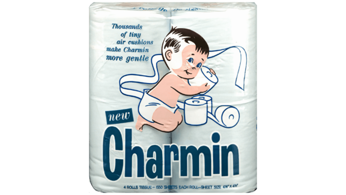
The update toward modern trends is noticeable in the 1960 redesign. The brand name has become bolder and more interesting. The classic sans-serif looked more elegant and ambitious. Moreover, only the initial “C” was capitalized, and in the rest, you can see the jumping effect. The color has also been changed. It became light blue on a white background. Also, it was then that an additional element was added, namely a little boy in diapers who decided to play with Charmin toilet paper.
1964 – the 1970s
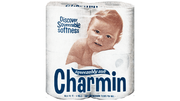
The new version of the logo followed the font and style of the Charmin wordmark shown above. However, there have also been several significant changes. A blue line with white letters appeared in the upper right part of the inscription, which displayed the organization’s slogan. Also, now not a drawing of a boy was used, but a photograph of a baby who leaned on a roll of toilet paper.
the 1970s – 1990s
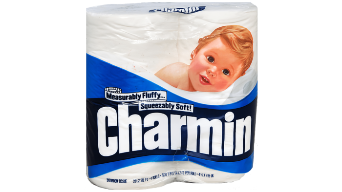
The new version of the logo used a darker color scheme. Thus, the Charmin logo has become more strict. The brand name letters were on the same line and written in a classic bold sans-serif using white letters on a dark blue background. Once again, the child’s photograph was replaced with a drawing of a smiling baby.
the 1990s – to 2003
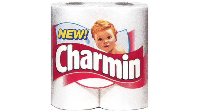
The white and blue color palette was changed to white and red. The name’s font remained unchanged, but the letters were displayed diagonally. This is due to the use of a wavy red ribbon. The child’s image became smaller, and now he towered over the letters. At the same time, the pattern of toilet paper was removed.
2003 – 2012
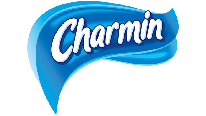
For the first time in a long time, the font of the word inscription has been changed. Cursive letters and bold sans-serifs were now used. Each symbol had a dark blue shadow that made the Charmin brand name look voluminous and friendly. The effect of dancing letters also added to the effectiveness of the logo. The inscription itself was on two wavy ribbons – blue and light blue. These elements were displayed using a gradient.
2012 – 2015
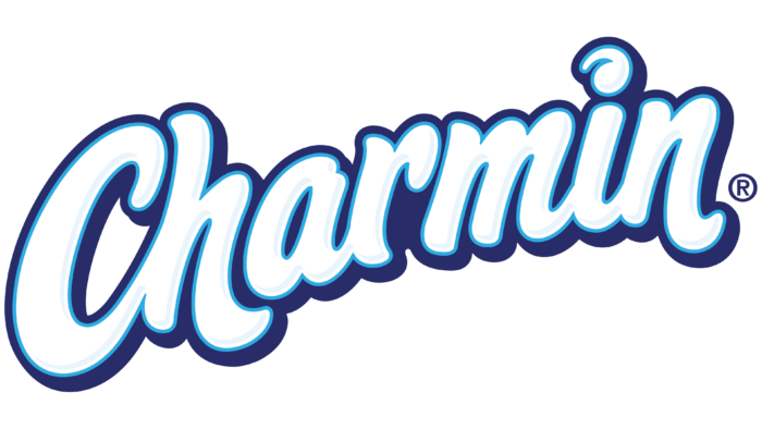
A 2012 redesign resulted in the previous version’s blue background being removed. At the same time, the verbal inscription became brighter and clearer. It was also cursive with rounded letters. The style of writing individual characters is significantly different. For example, the dot above the letter “i” is made in the form of a spiral. Also, it is worth noting the elongated line in the letter “h.” The effect of three-dimensionality, thanks to dark blue shadows, remained.
2015 – today
The most recent redesign took place in 2015. The verbal inscription remained identical, down to the smallest features of the spelling of each character. At the same time, a new background appeared namely a dark blue cloud with brighter contours.
Font and Colors
Given the many updates to the Charmin logo, it is worth noting that the font has changed many times. As a rule, it was a classic bold sans-serif, made in italic style with a shadow that creates a three-dimensional effect of the image. Such decisions have led to the fact that the logo looks fresh and pleasant.
The Charmin logo is based on a white and blue color palette. Bright colors evoke positive emotions among buyers of an American company. The use of an additional image of the baby in some variations of toilet paper only increases the friendly mood. It should be noted that a white-red color scheme was used at some stages, which seemed more gloomy than the current version.
Charmin color codes
| Sky Blue | Hex color: | #87dfff |
|---|---|---|
| RGB: | 135 223 255 | |
| CMYK: | 47 13 0 0 | |
| Pantone: | PMS 305 C |
| 7de2ff | Hex color: | #7de2ff |
|---|---|---|
| RGB: | 125 226 255 | |
| CMYK: | 51 11 0 0 | |
| Pantone: | PMS 311 C |
| Medium Persian Blue | Hex color: | #015e92 |
|---|---|---|
| RGB: | 1 94 146 | |
| CMYK: | 99 36 0 43 | |
| Pantone: | PMS 7691 C |
| Rainbow Indigo | Hex color: | #1c336e |
|---|---|---|
| RGB: | 28 51 110 | |
| CMYK: | 75 54 0 57 | |
| Pantone: | PMS 294 C |
| Delft Blue | Hex color: | #2e3773 |
|---|---|---|
| RGB: | 46 55 115 | |
| CMYK: | 60 52 0 55 | |
| Pantone: | PMS 7687 C |
