


![]() Charter Communication Logo PNG
Charter Communication Logo PNG
The Charter Communications logo emphasizes a close connection with viewers, which is very important for a cable operator. It demonstrates the reliability, seriousness, and high practicality of the second-most-important network in the United States. The color palette demonstrates the desire for new horizons and attracting new subscribers.
Charter Communications was founded in 1993 in St. Louis, Missouri, by Barry Babcock, Jerald Kent, and Howard Wood. The company began as a cable operator focused on small and mid-sized US cities, where larger national players had not yet gained full control. In its early years, Charter grew by buying smaller cable systems and expanding its subscriber base.
The company’s trajectory changed in 1998-1999, when Paul Allen, co-founder of Microsoft, invested heavily and became its controlling shareholder. With his financial backing, Charter went public on NASDAQ in 1999 and began an aggressive acquisition campaign across the US. By the early 2000s, it was competing with Comcast and Time Warner Cable. Still, rapid expansion left the company with a heavy debt load.
In March 2009, Charter filed for Chapter 11 bankruptcy protection with more than $20 billion in debt. The restructuring converted part of the debt into equity and gave creditors control of the reorganized company. Charter exited bankruptcy in November 2009, keeping its cable business and subscriber base. In 2012, former Cablevision executive Tom Rutledge became CEO and focused on network upgrades, service quality, and stronger operations.
In 2015, Charter announced the $78.7 billion acquisition of Time Warner Cable and the $10.4 billion purchase of Bright House Networks. Both deals closed in 2016, making Charter the second-largest US cable operator after Comcast. Afterward, its consumer TV, internet, and phone services were united under the Spectrum brand across 41 states. Paul Allen died in 2018, closing a major chapter in Charter’s history.
Meaning and History
![]()
The Charter Communications brand is highly recognized among the company’s potential clients. Three versions of the logo have been presented to the target audience throughout the operator’s time on the market. All of them were made in the same style and complemented each other. Each redesign made minimal changes to the logo, making it more modern and forward-looking.
What is Charter Communication?
It is one of the largest cable operators in the United States. This is not only about the number of customers, but also about more than 100,000 employees.
1993 – 1999
![]()
The first version of the logo was presented immediately after the company’s creation. It was a verbal inscription and an emblem located on the left. The brand name was given in two lines. Moreover, each of the two words was set in a different font. Charter is a classic bold sans-serif typeface. The capital letters look confident, and the blue color evokes a friendly vibe among potential customers. In turn, the word “Communications” is written in a much smaller font. In contrast to the first word, black was used. Consequently, potential clients understand that the main focus is on the Charter.
On the left, the emblem is depicted as a blue square turned slightly to the right. A wavy white line runs through its center, which is divided into many small blue horizontal lines.
1999 – 2010
![]()
The first redesign made the logo look even more modern and confident. The word “Charter” was now navy blue. Only the first “C” was capitalized, while the rest of the characters were in lowercase. The font has become more unique, especially the style of writing the letter “r.” The font for the word “Communication” remained identical, but it was slightly shifted to the left.
The emblem has undergone the greatest changes. Now it was a three-dimensional white square with thick blue outlines. It was also turned slightly to the right, and its lines were undulating. Two green lines pass through its center. However, at points directly on the square’s edges, the lines turn blue.
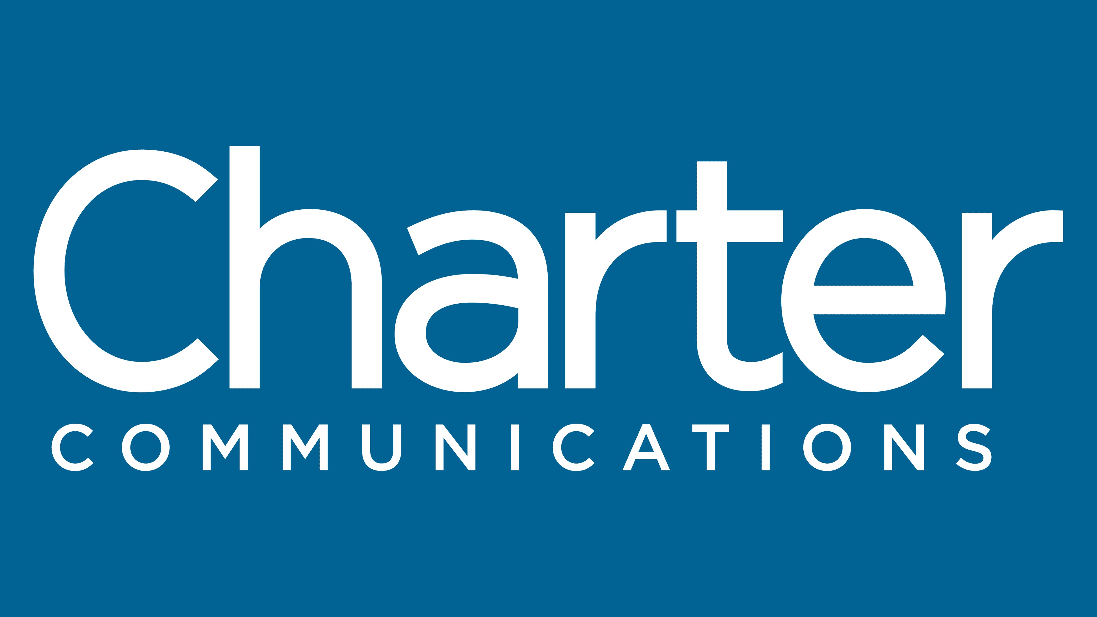
2010 – today
![]()
The latest redesign has significantly simplified the Charter Communications logo. It now looks concise and minimalistic. The first word has become even larger. It uses the same typeface as the previous redesign, but with thinner character strokes. The color of the word “Communication” has been changed to gray, and its size has been slightly increased.
Font and Colors
The company uses a classic bold sans-serif font. It is easy to read, allowing a person to immediately remember the company’s name, purpose, main missions, and goals.
The Charter Communications logo uses a blue-and-white color palette. Lively, bright colors immediately attract potential customers’ attention. Throughout the brand’s history, this range of colors has remained unchanged, allowing us to speak to tradition and history.