 Checker Motors Corporation Logo PNG
The Checker Motors Corporation logo focuses on the main purpose of the company’s products. The emblem showcases the design’s functionality and the taxis’ spaciousness. The logo reflects a market leader holding a dominant position in producing specialized vehicles.
Checker Motors Corporation: Brand overview
Checker Motors Corporation, founded in 1921 in Chicago by Morris Markin, resulted from the merger of Commonwealth Motors and Markin Automobile Body and focused on building specialized taxicabs. In 1923, the corporation moved its base to Kalamazoo, Michigan, where its main headquarters and manufacturing facility were located.
The first Checker model, the Model T, was produced in the early years. It modified the Ford Model T, designed specifically for the taxicab industry. Subsequent models, such as the A-Series, appeared in the 1930s and 40s, leading to the famous Checker A2 model in 1956. This model entered the American urban landscape with its spacious interior and stability.
Throughout the 1970s and 1980s, Checker continued to be one of the leading taxicab manufacturers in the United States. Its cars were a familiar sight in major cities, symbolizing urban transportation. However, as demand for specialized cabs declined, things began to change, leading to the discontinuation of production of the famous Checker model in 1982.
To adapt to the new environment, Checker tried diversifying its portfolio by producing cars like the Superba sedan. However, these efforts did not help the company avoid decline. After over eight and a half decades in automobile manufacturing, Checker went bankrupt and ceased production in 2009.
The departure of the last Checker cab from the streets of New York City in 1999 marked the end of an era, ending Checker’s extensive legacy as the quintessential American cab brand. The final chapter was written in 2010 when the company’s assets were liquidated, bringing closure to the book on a car company that was once a symbol of American urban mobility.
Meaning and History
What is Checker Motors Corporation?
It is an American automobile manufacturer best known for producing the iconic Checker Taxi. Based in Kalamazoo, Michigan, the company became known for its rugged, roomy, and easily recognizable cabs, an essential attribute of major U.S. cities. It produced civilian vehicles and automobile parts. Despite its success and iconic status, the company stopped producing cars due to financial difficulties but continued to produce car parts for some time.
1958 – 1961
The emblem includes the name and a charming sign once used on taxis. The image’s center shows America’s outline, indicating where the cars operate. Above the logo, the brand name appears in a style resembling an open/closed lock. This design choice emphasizes that taxis are always Checker.
Two crossed flags represent racing. The cars are convenient and move quickly, promptly getting passengers to their destination.
The black and white checkered pattern is highly symbolic. Checkers introduced this design to the taxi market. The company’s cars first featured this checkered mosaic, which later became common on the tops of taxis worldwide.
The manufacturer’s name is written in a long cursive line to convey the sense of movement on a highway. Below this, another font style lists the city and state of the brand’s origin. This inscription, without any tilt, signifies the foundational and unchanging nature of the brand’s birthplace.
1961 – 1982
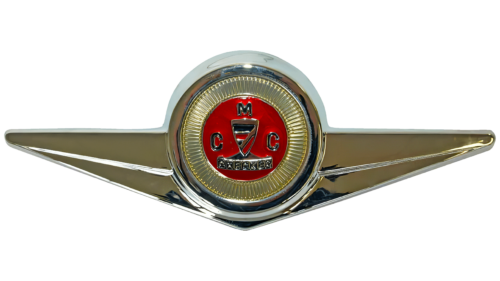
A rebranding was carried out to introduce the new A11 and A12 models. The logo now features wings, symbolizing speed, with a full metal frame representing the strength and reliability of the cars.
The emblem’s center is designed as a round commemorative sign. The main element is a shield, complemented by a base that turns the image into a winner’s trophy. The brand name is written on the base. Two “C” letters are placed on either side of the trophy, representing the two companies, Checker Taxi and Checker Motors, both owned by Morris Markin (indicated by the top “M”).
The symbol has another meaning. The double “CM” stands for Checker Motors (the manufacturer) and Checker Marathon (the company’s main car).
Horizontal and vertical stripes on the shield indicate two types of cars with the same design – one always styled for taxis, like the A11, and the other sold to consumers (A12).
The abundance of gold and bright red in the logo highlights the brand’s success and leadership.
1963 – 2010
The Checker Motors Corporation logo symbolizes American cab manufacturing excellence. This iconic design features a distinctive monochrome checker pattern synonymous with Checker Motors cabs. The arrangement of black and white squares makes the cabs easily recognizable in traffic.
The simplicity and boldness of the checker pattern give the logo a timeless appeal, ensuring that Checker Motors cabs stand out in a sea of vehicles. This design element is like a classic, well-tailored suit, making the cabs instantly recognizable even from a distance.
The checkers are akin to a simple, distinctive tattoo that everyone knows. They give the car a stylish and classic appearance that never goes out of fashion. When you see this pattern, it’s clear that the vehicle is a Checker Motors cab, no matter how many other cars are around it. This straightforward arrangement of squares creates a strong and memorable brand identity.
The monochrome checker pattern conveys a sense of reliability and tradition. The design balances simplicity with visual impact, making the cabs easy to spot and remember. This pattern has been integral to the brand’s identity, helping establish and maintain its presence in the competitive cab industry.


