


![]() Chery Logo PNG
Chery Logo PNG
Chery logo rushes to the top. It is a symbol of technological progress and modernity. The emblem conveys the strength and solidity of cars, their streamlined bodies, and smooth rides that allow you to glide silently on the road.
Chery Automobile Co. Ltd., commonly referred to simply as Chery, is a state-owned automobile enterprise. It was founded in 1997 and currently has several subsidiaries, both independently and in cooperation with foreign automakers. The company is engaged in the production of SUVs, minivans, commercial vehicles, and passenger cars. In 2020, she sold half of her shares to the Brazilian group CAOA. Its head office is located in Wuhu City, Anhui Province.
The Chery car plant was established through the efforts of local administrative officials. The first car left the assembly line in 1999. It was a prototype called Fengyun, based on the Volkswagen SEAT Toledo chassis. The debut line consisted of 30,000 units of equipment, each of which was sold. After a while (in 2001), the company switched to exporting car assembly, becoming the largest Chinese supplier of passenger cars abroad. She kept this bar from 2003 to 2011.
Today, in equal shares with Kenon Holdings, the brand owns Qoros, established in 2007 and producing premium-class cars for developing countries. In 2012, he became a co-owner of Chery Jaguar Land Rover, a joint venture between Jaguar and Chery. The company also has a research and development center, factories for the assembly of transport equipment, and the manufacture of components.
Its most popular model is the urban QQ series. It is in such high demand that it has become an independent trademark. At the same time, Chery has been repeatedly attacked over alleged remarks and violations of foreign firms’ property rights. Some of her samples are directly copied from other manufacturers’ car designs. Even the brand’s name is criticized, as many see it as an attempt to lure customers away from the world-famous Chevrolet, since the word “Chery” is very similar to “Chevy.”
Meaning and History
![]()
Chery’s corporate logo is associated not with the name but with the company’s business type. It stands for the letter “A,” with which the word “Auto” begins. Therefore, the designers tried to preserve it and beat it as accurately as possible visually. In the first version, the graphic elements are well traced, whereas in the second, they are hardly recognizable.
What is Chery?
Chery is the trade name of Chery Automobile Co. Ltd., one of the largest automotive companies in China. It has been operating since 1997 and produces a wide range of vehicles from commercial to passenger cars. Its most famous models are Arrizo, Tiggo, and QQ. The brand exports its products to more than 80 countries worldwide.
1997 – 2001
![]()
The logo features a stylized, bright red letter “A” (short for Chery Automobile). It consists of two diagonals and a broken oval ring, one end of which forms the central crossbar in the “A.” This symbol can have two meanings:
- Some believe that it symbolizes the company’s innovative spirit and its commitment to developing new technologies.
- Others argue that the ring, divided into two parts, signifies openness and collaboration.
At the bottom is the black word “CHERY,” consisting of capital letters. Its font is roughly similar to Craft Gothic DemiBold by FontSite Inc., but on the logo, the diagonal line of the “R” is curved.
2001 – 2013
![]()
The volumetric emblem is rendered in a silver palette to closely resemble a metal part integral to the car. This approach added not only individuality to the sign but also dynamics. The logo itself consists of several geometric elements. The first is an oval open at the top center and bottom right. The second character is “V,” depicted upside down. It is claimed to be “A” without a horizontal bar. The top of the letter is cut off. The edge effect is created by coloring one side of the graphite lines in light gray. The word part is done in a modern sans-serif typeface. The “C” and “E” have rounded corners, and the “R” has an elongated top half.
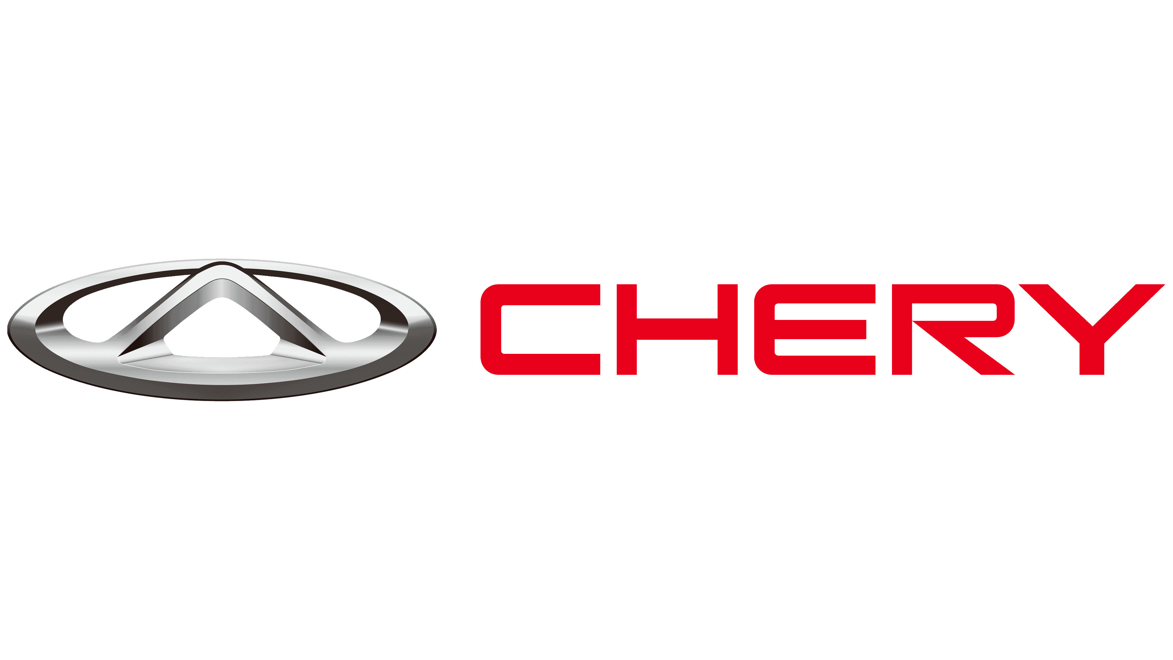
2013 – today
![]()
The logo was redesigned in 2013, resulting in a smoother, more flowing look. The developers have enhanced the three-dimensional effect, removed gaps in the oval, rounded off all corners, and added a chrome finish to the sign. They changed the letter “R” in the inscription, pushing the leg closer to the vertical strip. In addition, the authors changed the color red to crimson.
Font and Colors
The typeface used in the logo is reminiscent of the Korataki Regular font provided by Typodermic Fonts Inc. The color scheme is standard, consisting of several shades of red and gray.
![]()
