The brand name promises the user long journeys on different roads. The Chevrolet logo symbolizes the car’s versatility: street roads, tracks, races – it can do it all. The sign also hints at the availability of parts for auto repair.
Chevrolet: Brand overview
| Founded: | November 3, 1911 |
| Founder: | Arthur and Louis Chevrolet, William C. Durant |
| Headquarters: | Detroit, Michigan, U.S. |
| Website: | chevrolet.com |
Meaning and History
The history of the creation of the famous logo is shrouded in many legends and stories. The Chevrolet Story says that Durant while traveling in Paris, saw a drawing of infinity on hotel wallpaper. Inspired by this idea, he created a world-famous logo. Durant’s daughter said in her book that her father drew the logo during their dinner together, “somewhere between a soup and fried chicken.” The founder’s wife states that Durant was inspired by a newspaper ad for the Coalettes during their vacation. Another version says that the emblem is a tribute to Louis Chevrolet, who was born in Switzerland. The symbol of the rider’s homeland, the cross on the flag, visually intertwines with the company logo. The most interesting thing is that it is still unknown what the logo means and which of the origin stories is real.
What is Chevrolet?
Chevrolet is a car manufacturer known for its innovative technologies and high-quality standards. The company was founded in 1911 and was named after its founders – brothers Louis and Arthur Chevrolet. Today, it is a division of General Motors and produces various car models, including sports cars, pickups, SUVs, crossovers, and sedans. Recently, the company has started developing electric vehicles.
1911 – 1913
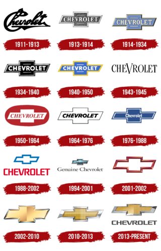
The Chevrolet brand logo has gone through many changes. The company’s first emblem has nothing to do with the famous cross or, as it is also called, a bow tie. The first logo was created by the founder of the brand, William Durant. He wrote the name of the company himself, underlining it with a line. The emblem is made in black in bold type. It was used for the first car in the C series, the Classic Six, built with Louis Chevrolet.
1913 – 1914
In the mid-1910s, Chevrolet used a logo with a cross consisting of a rectangle and a parallelogram. It had a white frame, which seemed voluminous due to the many lines drawn in a special way. Inside, the brand name was written in white letters, for which the designers chose a bold font with long serifs.
1914 – 1934
1914 – the beginning of the history of the bow tie. The logo is associated with a cross, plus, or even an infinity sign. The main color of the emblem is light blue. The company name is in white and bold. The text is positioned horizontally in the middle of the cross. Above and below, the brand name is underlined with white lines. The bow tie, text, and lines are framed with a gold outline that adds a bulging and three-dimensional effect. Also, inside the cross, you can see the inner border of the solid white line. The logo was created to honor the Chevrolet brand’s release: the H and L series models. The emblem has not changed for 20 years and added sophistication and uniqueness to the brand.
1934 – 1940
The year 1934 came, and the Chevrolet company decided to change the style radically. The light blue hue disappears, and black comes in its place. The text becomes wider, but the color remains the same – white. The company also kept the white lines and inner trim, but now without the gold trim. The bulge effect was created using additional outer lines. The font became more modern, and this design was perfect for printing in black and white newspapers. The logo is associated with courage and determination.
1940 – 1950
After six years of using the monochrome logo, the creators returned to the color version. The logo color, blue, has become more saturated. The font remains the same as on the previous emblem. The inner white border disappears, but the gold border returns, though only from the outside. The logo loses its volume and is displayed in 2D format. The logo was brighter to attract a younger audience.
1943 – 1945
Along with the striking logo, Chevrolet used another emblem that was radically different from the previous one. The brand removed the famous cross and left only the name of the company. The font changed completely, just as the color went black, and there were serifs on the edges of each letter that betrayed sophistication. Big V stood out from the rest.
1950 – 1964
Chevrolet decided to change the main colors of the logo and replaced the blue with a rich red. But the beloved cross returned, which acquired a white color. The text is bold again with serifs and an additional detail – red italics. The emblem background is an oval with a gray “highlight” that looks like a shadow, which added volume to the figure. The redesign of the logo most likely symbolized the company’s rapid growth and high level of productivity.
1964 – 1976
In the 1960s, a new style emerged in the United States – minimalism. Modern trends at that time also influenced the company’s logo. Chevrolet removed the bright colors, leaving only a white cross and black italic text. The font has become bolder and more modern, and the spacing between letters has decreased. A thin black line frames the logo. The emblem has lost its bulk.
1976 – 1988
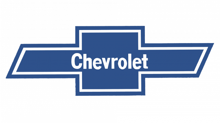
Chevrolet produced 2.8 million Chevette cars between 1976 and 1988, which became the best-selling cars in 1979-1980. Along with unprecedented success, the company changed its logo again, returning to a blue gradient color. The text has changed completely: from the font to the size of the letters. A white line and a gray shadow appeared, which added volume to the figure.
1988 – 2002
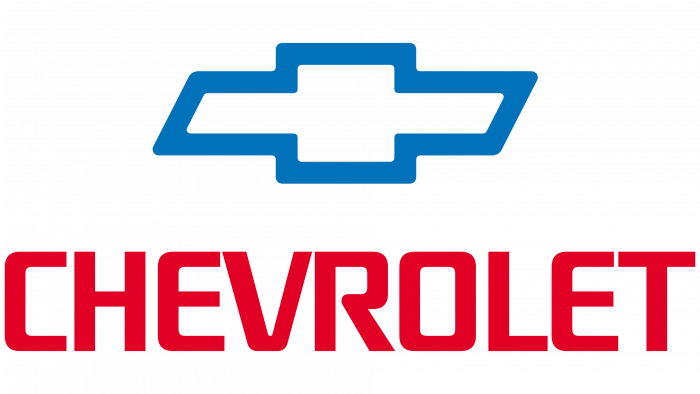
A minimum of details and more color – this is how the logo of a company of that period can be described. Since 1988, the company’s name has been moved beyond the bow tie, and the brand has never returned to the previous versions. The color of the cross is white with a deep blue border, and the text is reddish. The company’s name is larger than the famous bow tie.
1994 – 2001
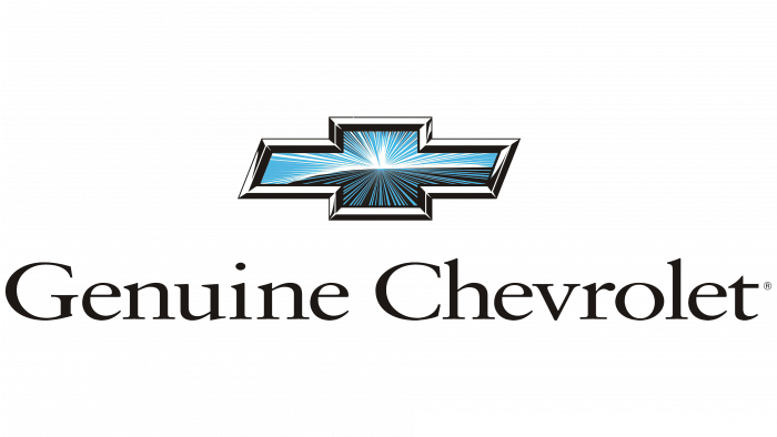
During this period, the company produced a new generation of Chevrolet Lumina. This also influenced the brand’s logo. The emblem has become brighter and more chrome. The name of the company was added – “Genuine Chevrolet.” The color of the cross consisted of blue, black, and white strokes. The framing added volume and shine.
2001 – 2002
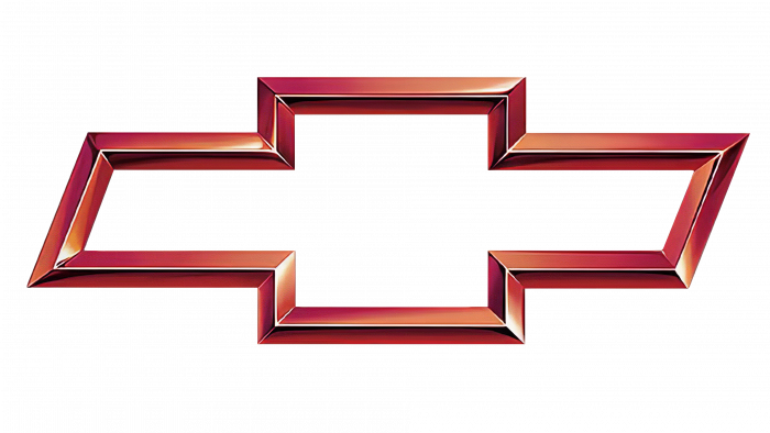
The logo that was used for only one year was different from all the previous ones. There was no company name on the emblem, only the famous cross. The framing of the logo was filled with red color with overflow, which added volume. The emblem looks modern and fresh.
2002 – 2010
Since 2002, the history of the most recognizable golden butterfly began. The emblem symbolized the strength and power of the company and also emphasized honorary status. The logo is bright, golden in color with a matte finish, without a company name. The frame of the emblem is gray chrome, which emphasized the volume of the badge.
2010 – 2013
In 2011, the company celebrated its 100th anniversary, and the logo perfectly reflects all the brand’s greatness. The concept remains the same as in previous years, but some details have changed. The company name is back, and the bezels are a bit wider. Black color and bold font were used for the text; all letters are spelled out separately. A small checkered pattern can be seen inside the cross against a gold background.
2013 – today
The modern logo is still gold with a silver border, with no additional patterns inside the cross. If you look closely, you will notice that the emblem appears to be tilted. The cross is divided into two parts: a brighter glossy and a less saturated matte one. A new gray font is used for the company name. Some letters are a continuation of each other. It is this logo that the company still uses today.
Chevrolet: Interesting Facts
Chevrolet, also known as Chevy, is a famous car brand with a long history dating back to 1911. It’s known for offering a variety of cars that meet almost any need, valued for their performance, reliability, and affordability.
- Founders: Louis Chevrolet, a Swiss race car driver, and William C. Durant, the founder of General Motors, started Chevrolet. Louis brought his racing insights, while Durant aimed to create affordable cars for everyone.
- The Chevy Bowtie: The story behind Chevrolet’s “bowtie” logo is still debated. It might have come from wallpaper Durant saw in a French hotel in 1908, but other stories also make the logo’s origin intriguing.
- First Car: The Series C Classic Six, released in 1912, was Chevrolet’s first car. It was luxurious for its time and had a 6-cylinder engine that could reach 65 miles per hour.
- Small-Block V8 Engine: Launched in 1955, the small-block V8 became famous for its size, lightweight, and versatility, appearing in everything from trucks to sports cars.
- Iconic Sports Cars: The Corvette and Camaro are two of Chevrolet’s most famous sports cars. The Corvette was America’s first sports car in 1953, while the Camaro has been loved by muscle car fans since 1966.
- Worldwide Reach: Chevrolet isn’t just American; it sells cars in over 100 countries, making it a global brand.
- Electric Cars: Leading in electric vehicles, Chevy introduced the Volt in 2010 and the Bolt EV in 2016, one of the first EVs to go over 200 miles on one charge.
- Trucks: Chevy trucks, like the Suburban introduced in 1935, are central to American industry and culture, helping to define the SUV category.
- Innovation: Chevy is all about innovative technology to improve performance, safety, and driving experience, with advances like Magnetic Ride Control and carbon fiber.
- Cultural Impact: Chevy has left its mark on pop culture, symbolizing American creativity, freedom, and adventure in songs, movies, and TV.
Chevrolet stands out for blending innovation, quality, and value, earning a special place in the hearts of car enthusiasts and everyday drivers.
Font and Colors
The bow tie logo is undoubtedly part of the great history of automotive production. The modern emblem is a kind of tribute to William Durant. Playing with textures and colors demonstrates the company’s openness to experimentation and new ideas. The logo of the company emphasizes its greatness, ideology, and confidence.
The colors used for the logo are a combination of gold and silver. It is complemented by matte and glossy textures that add style and features. The text has taken on a dark gray, graphite color.
The font used to write the company’s name is quite unusual and sets Chevrolet apart from other brands. The text is in bold; all letters are capitalized. Some of them, in particular E, smoothly transitions into V and T. The distance between the letters is small, as in the previous company logo.
Chevrolet color codes
| White Linen | Hex color: | #efe7db |
|---|---|---|
| RGB: | 239 231 219 | |
| CMYK: | 0 3 8 6 | |
| Pantone: | PMS 7527 C |
| Golden Sand | Hex color: | #e5ca70 |
|---|---|---|
| RGB: | 229 202 112 | |
| CMYK: | 0 12 51 10 | |
| Pantone: | PMS 7403 C |
| Metallic Gold | Hex color: | #cdac3b |
|---|---|---|
| RGB: | 205 172 59 | |
| CMYK: | 0 16 71 20 | |
| Pantone: | PMS 7753 C |
| Mandalay | Hex color: | #b6812a |
|---|---|---|
| RGB: | 182 129 42 | |
| CMYK: | 0 29 77 29 | |
| Pantone: | PMS 1255 C |
| Hacienda | Hex color: | #997624 |
|---|---|---|
| RGB: | 153 118 36 | |
| CMYK: | 0 23 76 40 | |
| Pantone: | PMS 7558 C |
| Dark Brown | Hex color: | #5b3e1c |
|---|---|---|
| RGB: | 91 62 28 | |
| CMYK: | 0 32 69 64 | |
| Pantone: | PMS 7553 C |
| Jungle Mist | Hex color: | #bfc6c6 |
|---|---|---|
| RGB: | 191 198 198 | |
| CMYK: | 4 0 0 22 | |
| Pantone: | PMS 428 C |
| Silver Chalice | Hex color: | #aaaea8 |
|---|---|---|
| RGB: | 170 174 168 | |
| CMYK: | 2 0 3 32 | |
| Pantone: | PMS 7537 C |
| River Bed | Hex color: | #5c5f60 |
|---|---|---|
| RGB: | 92 95 96 | |
| CMYK: | 4 1 0 62 | |
| Pantone: | PMS 425 C |
| Aubergine | Hex color: | #2e2b2c |
|---|---|---|
| RGB: | 46 43 44 | |
| CMYK: | 0 7 4 82 | |
| Pantone: | PMS Black C |
