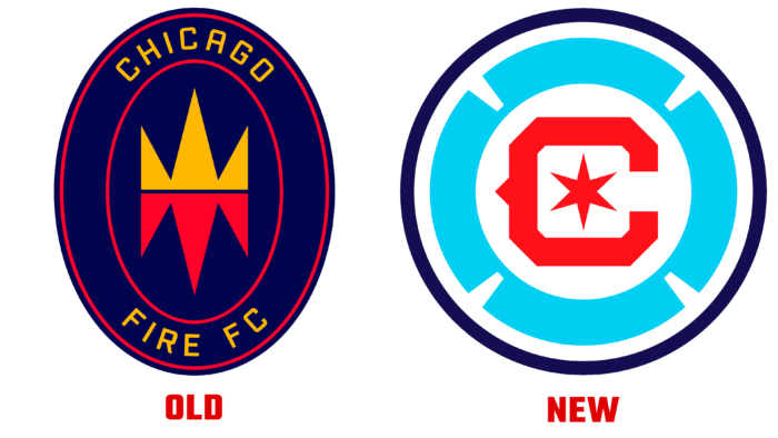
The previous logo update, presented by the team two years ago, did not generate positive emotions among the fans.
The team will use the new logo from the 2022 season. On social media pages, Chicago Fire FC added that it is “inspired by the collective opinion of fans and supporters.” Indeed, the emblem was developed under the clear direction of Matthew Wolff. Twenty thousand fans shared their opinions on the club’s official page and social networks. 2022 will be a jubilee year for the team – 25 years at MLS.
The new logo brings together the past legacy of the Chicago Fire FC and is designed “for future generations of Chicagoans.” The image is presented in a color palette with reds and blues. The colors are reminiscent of the official flag of the city of Chicago. The logo Chicago Fire FC consists of a six-pointed star inside the letter “C.” A modernized Florian cross is placed around the central figures.
Two years ago, the team carried out an unsuccessful rebranding, and the new logo became a necessity. The club was losing its relevance, as it played in Bridgeview, far from its native Chicago. That logo was not very good, as it did not reflect the history of the club. Shortly, Chicago Fire FC is yet to present other materials, for example, a team uniform with a new logo, merchandise, souvenirs. The team seeks to strengthen its position in the country and worldwide by updating its corporate identity.


