 Children’s Miracle Network Logo PNG
The Children’s Miracle Network logo is kind and inviting. It’s appealing to yourself and to the organization it represents. And it, in turn, is of great importance for children of all ages, as it is related to children’s health care facilities. Together with the positive atmosphere, the logo brings joy and hope for financial support for a successful recovery.
Children’s Miracle Network: Brand overview
| Founded: | August 11, 1983 |
| Founder: | Marie Osmond and John Schneider, Mick Shannon, Joe Lake |
| Headquarters: | Salt Lake City, Utah, U.S. |
Children’s Miracle Network is the name of America’s largest foundation dedicated to helping children’s hospitals. Assistance is being transferred to medical facilities throughout Canada and the United States. During its existence, the fund was able to raise more than 6 billion US dollars for the needs of hospitals, and every year the amount increases. Currently, the main office is located in the state of Utah (Salt Lake City).
The organization’s visual identity was initially based on a striking logo that included an original balloon-like symbol and name. The modern emblem is a more stylish and refined version. It consists of straight, smooth lines without frills. The main message of this badge is to hope for the best and for mutual assistance. The foundation is proof that miracles are possible.
Meaning and History
Children’s Miracle Network has provided financial assistance to children’s healthcare facilities for over 30 years. The management collects considerable sums that are spent on innovative research, life-saving procedures, medicines, medical services, medical equipment for pediatrics, and support for the normal emotional state of children in hospitals. Donations help improve the health of millions of children.
Currently, the foundation is represented by a bright logo that demonstrates the main goal – charity. It consists of 2 elements – an inscription and a bright icon that looks like a balloon. The inscription includes three words denoting the name of the non-profit organization.
This part demonstrates confidence and reliability. The graphic element has a different role. The balloon evokes associations of miracle, hope, and joy. This fully captures the essence of the background. It helps in those situations when parents despair due to lack of finances, restoring faith in the best.
What is Children’s Miracle Network?
The Children’s Miracle Network is an American non-profit organization that collects donations to give to children’s hospitals in Canada and the United States. Initially, it was a telethon, and over time it became a full-fledged charitable foundation. Each year, it distributes the funds it raises among a network of over 150 hospitals.
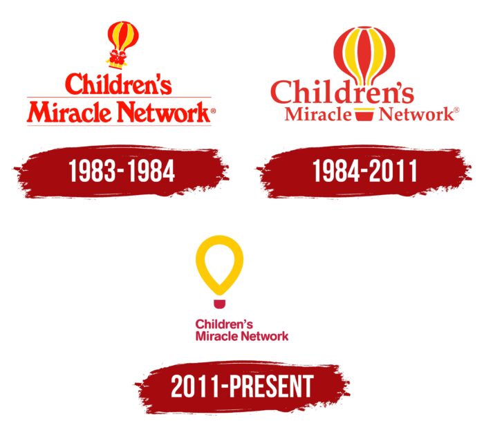
1983 – 1984
The organization was founded in America in 1983. The founders are Joe Lake, Mick Shannon, John Schneider, and Marie Osmond. These people wanted to create a fund that could collect donations to treat little patients. The idea was not only implemented but also began to develop successfully. The Children’s Miracle Network has collected millions in financial aid for children every year.
At the time of its foundation, the foundation received its first logo. The corporate badge consisted of the name, made in the original style, and the image of a hot air balloon. The last element was constantly present on the emblem, but over time its design changed. The 1983 version featured a bright picture, including a clear balloon icon with two small children. It was located slightly at an angle.
Under the icon was the name of the organization. The chosen performance emphasized the direction of activity and symbolized the support of small patients. The inscription was executed in powerful serif letters, demonstrating confidence and calmness. We chose two primary colors (yellow and red) as the colors and a neutral white color for the background. The picture reflected energy and positivity, while white symbolized the purity of intentions.
1984 – 2011
The foundation used the first emblem for a year. In 1984, management decided to change the corporate identity. The new icon was more professional and balanced. It also had a more modern concept. The changes affected the font format and graphic icon. The balloon was already located straight, and its size increased significantly. This performance was due to the successful development of the fund.
The organization managed to collect more and more donations that helped little patients and parents. The font has also changed. The letters have become more elegant, smooth, and thin. This decision improved the overall picture and also made the logo more modern. The color scheme has not changed. The logo was still full of bright, vibrant shades of red and yellow. This is a direct reflection of the main value of the foundation – active assistance and charity.
2011 – today
In 2011, the Children’s Miracle Network logo changed its look again. Regular changes in the corporate identity were due to modern trends in brand design. As a result, the foundation received a stylish new logo that reflected the changes taking place within the organization itself. It still consisted of the name and the balloon element, but they had a more refined look.
The letter format has been changed to be more rounded and straight. The serifs in the new version were completely absent. This approach has significantly changed the overall concept of visual identity. Soft, smooth lines symbolized confidence, comfort, and a friendly attitude. Added a beautiful picture of a simplified version of the balloon. The new icon lacked detail and was more abstract.
The figure consisted of a teardrop top created by a single yellow line. The lower part was a cut square that resembled a cabin. A small gap also appeared between the inscription and the balloon. The colors remained the same, which symbolized the unchanging goal of the foundation and the desire for development. Such changes benefited the logo and made it more concise. It is fully consistent with the brand design.
Font and Colors
Characteristic features of the modern Children’s Miracle Network logo are brightness, expressiveness, and style. Despite the simplification of elements that were more complex shapes with notches and detail in previous versions, the overall concept has only improved. Simplicity, in this case, made the emblem more modern. The letters of the inscription became more rounded but, at the same time, remained quite elongated.
This stylization demonstrates confidence, friendliness, and trust. The spaces between the characters are small, but each letter is readable. An invariable picture of a balloon complements the expressive verbal sign. Both elements are painted in 2 primary colors: yellow and red. Shades symbolize joy, fun, positivity, and energy.
This is how the fund positions itself. The management is very enthusiastic about charity and directs all efforts to increase funding for children’s hospitals. The intentions are also confirmed by choice of white for the background. It symbolizes the purity and transparency of the fund’s activities. On a white background, two bright primary colors also look harmonious. Balance and harmony can be traced due to the successful color combination in the logo. Each element complements the other, and shades emphasize individuality.
Children’s Miracle Network color codes
| Tangerine Yellow | Hex color: | #feca06 |
|---|---|---|
| RGB: | 254 202 6 | |
| CMYK: | 0 20 98 0 | |
| Pantone: | PMS 7549 C |
| Cardinal | Hex color: | #c71e3f |
|---|---|---|
| RGB: | 199 30 63 | |
| CMYK: | 0 85 68 22 | |
| Pantone: | PMS 199 C |
