China Mobile: Brand overview
Emerging from a reorganization of China’s telecommunications sector in 1997, China Mobile was spun off from the larger China Telecom. Two years later, it became an independent company known as China Mobile (Hong Kong) Limited and established its position on the New York and Hong Kong stock exchanges.
In the early years of the 21st century, the company undertook aggressive strategies to expand its network and attract subscribers across the mainland. This led to the company becoming the world’s largest mobile operator. In terms of technological advancement, the company has made significant progress: it deployed a 3G network in 2009, 4G in 2013, and launched 5G services in 2019.
By mid-2021, China Mobile’s operations will cover all of mainland China and Hong Kong, and its customer base will exceed 950 million mobile users. Committed to innovation, the company continues to invest heavily in promising technologies such as 5G and artificial intelligence. This strengthens its leading position in the domestic market and enables it to introduce state-of-the-art services. Despite its extensive operations, the company remains predominantly owned by the Chinese government. It closely aligns its corporate strategies with government initiatives such as accelerated 5G deployment and digital transformation.
Meaning and History
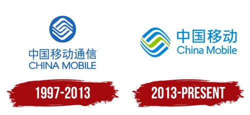
1997 – 2013
2013 – today
The logo of the Chinese cell phone and media services company is a diamond shape with rounded corners. It consists of four blue stripes separated by a single green line. All five elements are curved in the form of waves (center) or boomerangs (top and bottom). On the right side is a two-tiered inscription in two languages, Chinese and English. The style of the Chinese characters differs from the style of the letters, making the font in the first line abrupt and angular and in the second line smooth and fluid.
The combination of green and blue colors in the logo is reminiscent of the ocean meeting the sky. The curves and colors seem to say, “We are as flexible and endless as the sky and the sea.” The Chinese and English words seem to belong to different worlds, yet they are side by side, like a handshake between tradition and modernity.
China Mobile color codes
| Green Blue | Hex color: | #0088d7 |
|---|---|---|
| RGB: | 0 136 215 | |
| CMYK: | 100 37 0 16 | |
| Pantone: | PMS 3005 C |
| Apple Green | Hex color: | #8fc300 |
|---|---|---|
| RGB: | 143 195 0 | |
| CMYK: | 27 0 100 24 | |
| Pantone: | PMS 375 C |


