The Cirque du Soleil logo is directly influenced by the name, as it reflects the main symbol of the most famous circus. The bright emblem conveys an atmosphere of joy, happiness, carefreeness, and high spirits. It concentrates the rays of goodness permeating every spectator and the powerful energy from talented artists.
Cirque du Soleil: Brand overview
| Founded: | 16 June 1984 |
| Founder: | Guy Laliberté, Gilles Ste-Croix |
| Headquarters: | Montreal, Quebec, Canada |
| Website: | cirquedusoleil.com |
Cirque du Soleil is a legendary circus known worldwide for its incredible program and unique tricks. An important feature is also the refusal to create numbers with the participation of animals. The show shows real circus skill, which combines amazing choreography, musical performances, and bizarre design forms.
Currently, the Circus of the Sun includes several different troupes that give performances simultaneously in different cities. But management is carried out from a single center located in Montreal. The visual identity is distinguished by elegance and sophistication. It is a direct reflection of the essence of Cirque du Soleil, showing the main symbol – the sun.
Meaning and History
The cult circus has been delighting audiences for many years. Over the entire period of existence, programs, performances, numbers, and artists have changed. But, one feature remained unchanged – the show was impressed with its scale and approach to creating numbers. Many experts note that Cirque du Soleil marked the beginning of a new stage in the development of circus art.
More than 3 thousand people are involved in the circus, who unite into troupes. They give performances all over the world. Touring groups perform in permanent circus arenas, under a temporary tent, and in concert halls and theaters. The show takes place under the same logo with the sign of the sun inside. The symbol of the brightest star has been an element of the circus’ corporate identity almost from the moment of its inception.
But, each version of the logo was presented in a different design. The modern emblem is distinguished by style and an incredibly harmonious combination of elements. It consists of a circle with an image of a smiling sun inside. The picture is complemented by an elegant title of the show, made with stylish smooth lines.
What is Cirque du Soleil?
Cirque du Soleil is a unique circus show with no analogs in the world. Its main office is in Canada (Montreal), and creative troupes tour in different cities (including Las Vegas). They demonstrate unsurpassed performances that harmoniously combine acting, choreography, music, and tricks.
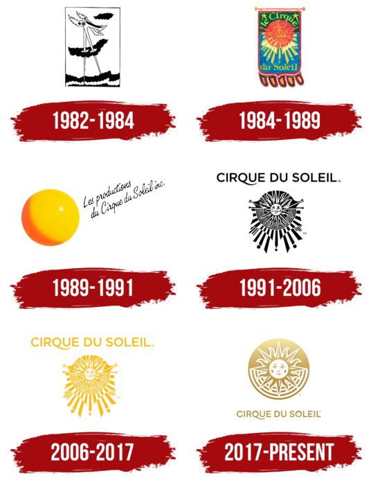
1982 – 1984
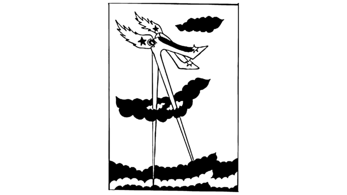
Since 1982, the circus has performed under a simple and concise emblem, consisting of an abstract image. On it, you could see the shoes of an unusual shape. The shoes had incredibly high heels. They were so large that they were pierced by elements that looked like clouds at the top and plunged into the ocean from below.
The picture was made in monochrome colors. Shoes, clouds, and the ocean were all black, with white as the background. Despite the strict palette, the emblem had a mysterious meaning associated with tricks and magic. But, such a logo did not exist for long. The circus soon received a more colorful and themed emblem.
1984 – 1989
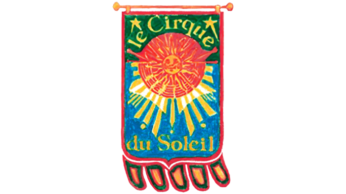
The circus was officially founded in 1984 in Canada. Gilles Ste-Croix and Guy Laliberte were involved in creating the updated show. These people managed to create a real Circus of the Sun, which today impresses viewers worldwide. At that moment, a bright logo appeared, perfectly reflecting the essence of the new project. It was a picture that looked like a banner. The main part was an imitation of red fabric, on which was placed the symbol of the sun with rays reaching the bottom of the picture.
Stars and an inscription denoting the name of the circus became a stylish addition. The first two words (le circus) were at the top of the banner, and the other two (du Soleil) were at the bottom. The coloring included several bright colors: red, blue, green, and yellow. The overall concept conveyed joy, fun, and carelessness.
1989 – 1991
A radical change in visual identity marked the beginning of the period. The circus received a more concise and simplified logo. The presented version was the complete opposite of its predecessor. Instead of a banner, a small blackened ball and a phrase appeared here, made in a special font, similar to a handwritten inscription.
As a phrase, the phrase was used: “les Productions du Circus du Soleil inc.” The ball was painted yellow and a darker shade. The classic black color was used for the lettering. This design decision aimed to update the sun symbol and create a more modern corporate identity.
1991 – 2006
In 1991, the circus already performed under a professional emblem, which was made by all the brand design requirements. In the center of the picture was the main symbol of Cirque du Soleil – the sun. It was a complex image consisting of lines and strokes of various shapes. They surrounded a smiling round face.
The mysterious figure was supplemented with the name of the circus. Cirque du Soleil was done in a straight thin sans-serif. The letter Q added a bizarre shape, and the tail smoothly extended under the letter U. The color scheme consisted of classic white and black. But, restrained colors did not make the emblem gloomy. Due to the fantastic picture, the logo evoked good positive associations with a fairy tale.
2006 – 2017
In 2006, the corporate identity changed again. This time they were minor. The content in the form of an inscription and the original picture of a smiling sun remained the same, which symbolized respect for traditions, but the colors have changed.
Instead of a strict achromatic palette, an elegant golden hue was combined with a neutral white background. The new performance was a logical continuation of the development of a spectacular show, which gradually reached a higher level. This version became a cult and later served as the basis for creating the modern emblem.
2017 – today
The Cirque du Soleil brand name changed again in 2017. Its new version was distinguished by simplicity, style, and a harmonious combination of colors. The designers removed unnecessary graphic elements and made the inscription more refined and the sun’s image more detailed.
The golden color used in the previous emblem has changed to a deeper and more metallic gold. The new logo format is associated with warmth, friendliness, and childish spontaneity. The sun symbolizes magic and fairy tales that circus artists give at each of their performances.
Font and Colors
The current version of the Cirque du Soleil logo exemplifies elegance, style, and expression. The color scheme is created from a light golden hue, symbolizing creativity and miracles, and a classic white color, which favorably emphasizes the main color. For the design of the inscription, a direct laconic font was used, which is in harmony with the image of the sun.
All letters are made in the same format and size, except Q. The wordmark stands out from the general background. It dilutes the severity due to the elongated end, which smoothly curves under the letter U. All this makes the logo mysterious and, at the same time, benevolent, like all Cirque du Soleil performances.
Cirque du Soleil color codes
| Vanilla | Hex color: | #f3e3a1 |
|---|---|---|
| RGB: | 243 227 161 | |
| CMYK: | 0 7 34 5 | |
| Pantone: | PMS 461 C |
| Sand | Hex color: | #c0a96b |
|---|---|---|
| RGB: | 192 169 107 | |
| CMYK: | 0 12 44 25 | |
| Pantone: | PMS 7562 C |
| Dark Goldenrod | Hex color: | #af822e |
|---|---|---|
| RGB: | 175 130 46 | |
| CMYK: | 0 26 74 31 | |
| Pantone: | PMS 7551 C |
