


![]() Cisco Logo PNG
Cisco Logo PNG
The company emblem splatters with energy and vigorous activity. The Cisco logo shows how, through active processes of development and invention, necessary and useful products are born that improve mankind’s lives.
Cisco Systems began at Stanford University, where Leonard Bosack and Sandy Lerner faced a basic campus problem: different buildings used incompatible networks. In 1984, they registered Cisco Systems, named after San Francisco, with a logo based on the Golden Gate Bridge. Early routers were assembled at home, and first-month orders passed $200,000.
A conflict with Stanford arose over rights to software and hardware. In 1987, the university licensed the technology to Cisco, and Sequoia Capital invested $2.5 million. John Morgridge became CEO in 1988. After Cisco went public in 1990, Lerner was fired, and Bosack resigned, leaving with about $170 million. Cisco’s growth then shifted to acquisitions. In 1993, it acquired Crescendo Communications and entered the network-switching market. From 1993 to 2000, it acquired 73 companies.
Under John Chambers, who became CEO in 1995, Cisco became a main supplier of routers and switches during the Internet boom. Revenue rose from about $2 billion to $19 billion by 2000. In March 2000, Cisco briefly became the world’s most valuable company, worth over $500 billion, ahead of Microsoft. The dot-com crash cut its share price by 85% over the course of a year, while Juniper Networks challenged it in the high-performance router market.
Cisco later diversified through deals including Scientific-Atlanta, Webex, AppDynamics, Duo, Starent Networks, and Splunk, expanding into security, cloud services, IP telephony, wireless networks, and software. In 2015, Chuck Robbins replaced Chambers as CEO. Under Robbins, Cisco pushed further into subscriptions and software. In December 2025, its stock finally passed its March 2000 peak.
Meaning and History
![]()
The IT company was founded by Sandy Lerner and Leonard Bosack, who were not only scientists but also spouses. Sandy was head of the computer hardware department at Stanford University’s Graduate School of Business, and Leonard was head of the computer science department at the same university. They co-developed local area network (LAN) technology and independently founded Cisco.
However, in 1986, they were forced to leave the university because the administration decided to file criminal lawsuits against scientists for appropriating programs, equipment, and other intellectual property that did not exist. It’s just that Lerner and Bosack used their facilities to create their IT products. A year after being fired, Stanford University gave them the software of a multi-protocol router and two computer boards. In addition to the two scientists, the early team included programmer Greg Satz, sales manager Richard Troiano, and CEO Bill Graves.
In the company’s name, its founders reflected their love for San Francisco, using the Golden Gate Bridge tower and a slightly new version of the city name for the logo. This idea was proposed by John Morgridge (the firm’s second head). The logo’s concept is to connect distant objects through technological innovation. In total, the corporation has four logos in its arsenal.
What is Cisco?
It is one of the world’s largest manufacturers of computing and telecommunications equipment. Its products are designed primarily for companies that offer communication services to their customers. Cisco was founded in 1984.
1984 – 1990
![]()
The debut symbolism accurately conveys the iconic bridge’s observation towers. They are depicted as digital graphs, consisting of thin lines of varying lengths, united at the top and bottom by solid stripes: on one side, they are curved; on the other, straight. The tops of the red structures are not pointed and look like miniature platforms. The emblem has no text; it was used only on nameplates.
1990 – 1996
![]()
The emblem was given a different color and style as part of the identity revision. The bridge has acquired an abstract quality and consists of white stripes of varying heights. It has no connecting elements, only a blue rectangle. At the bottom is a red-colored Cisco Systems label with elongated, elegant letters from the Sans Serif category.
1996 – 2006
![]()
After the redesign, the logo looks neater. The regrouping of the elements facilitated this. The vertical stripes have become more even, clearer, and fewer in number. Due to their increased width, they are smaller than before but take up the same space from edge to edge of the blue rectangle. The designers moved the inscription higher, making the letters large. In the word “Cisco,” they replaced the uppercase “C” with a lowercase “c” because it was previously uppercase.
2006 – today
![]()
To achieve a clear shape of the Internet signal reception bands while preserving the appearance of the legendary bridge, the developers have lengthened the two highest lines. Moreover, they were widely spaced, leaving a large gap between them. The company name is at the bottom and in lowercase. The designers removed the horizontal rectangle and offered three color options for the logo: black, light blue, and dark blue with red text. The authors of this version are Joe “Phenom” Finocchiaro and Jerry “The King” Kuyper.
Font and Colors
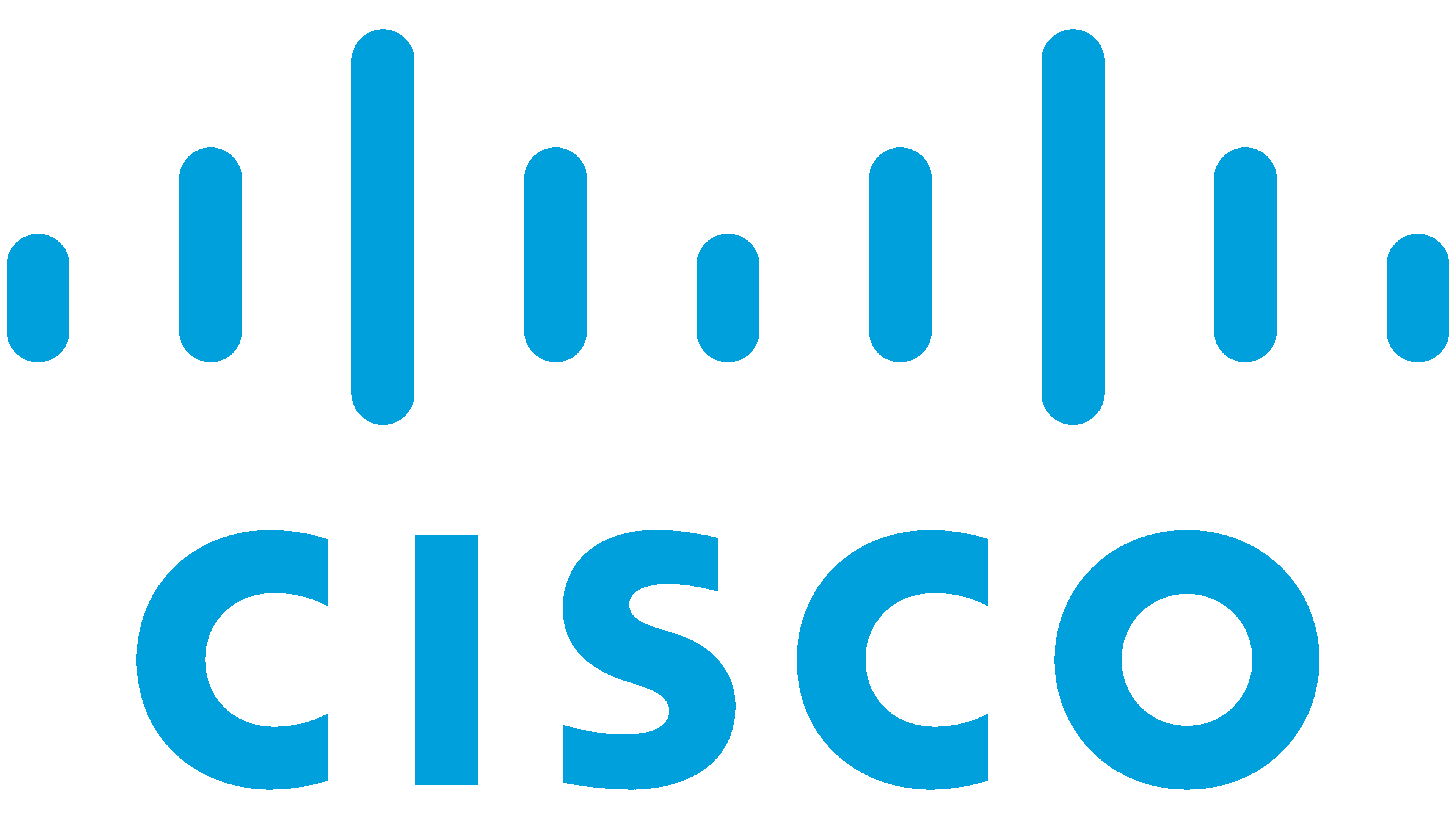
From the very beginning, the founders of the IT company focused on simple and understandable visualization. They chose a California landmark, the Golden Gate Bridge in San Francisco. The authors consistently combine the bridge with the signal reception diagram for the Internet connection to demonstrate the utility, usefulness, and practicality of their products.
The modern version of the logo uses a geometric typeface called Futura Bold. It is smooth and grotesque, with even cuts at the ends. Designer Paul Renner created it and first published it by Linotype.
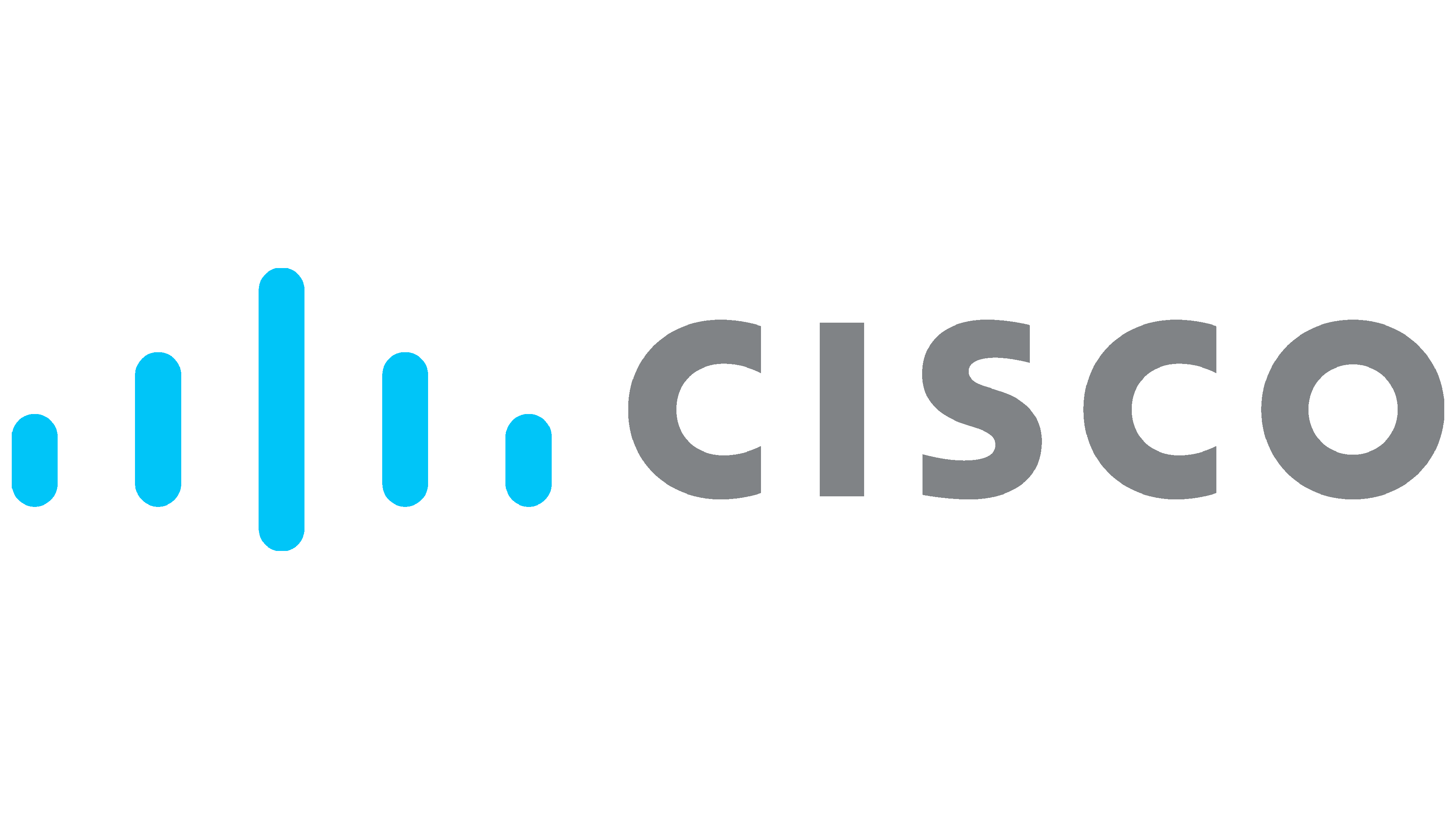
The current emblem’s color scheme echoes all previous modifications, as it comes in three versions. One logo is black, the second is blue, and the third consists of blue stripes and red lettering. The background is a neutral white color.
FAQ
Which bridge is the Cisco logo?
The bridge symbol in the Cisco logo represents the Golden Gate Bridge. This iconic structure is part of the brand, reflecting its roots in San Francisco. The logo features thick vertical lines that form an abstract rendition of the Golden Gate Bridge. These lines resemble Wi-Fi and network symbols, which are critical to the company’s industry. This design emphasizes the company’s principles of networking and promoting communication.
Is Cisco an IT company?
Yes, it’s an IT company. It offers many technology innovations, including networking, security, collaboration tools, and cloud management. As a network technology company, the brand has developed and refined the infrastructure that supports the Internet and enterprise networks. The brand is a leader in the IT sector, delivering innovative solutions that help securely connect and empower industries and communities worldwide.
Who made the Cisco logo?
John Morgridge, one of the company’s leaders, created the original logo. His vision created an iconic symbol reflecting the brand’s mission and values.
In 2006, designers Jerry Kuyper and Joe Finocchiaro updated the logo, giving it a modern look. They retained the essence of the original design while adding contemporary elements to reflect the evolving technological environment.
The new logo features a simplified, abstract image of the Golden Gate Bridge composed of thick vertical lines. These lines symbolize the iconic bridge and universal Wi-Fi and network signals, combining the brand’s geographic roots with its technological focus. The redesign was part of a larger effort to strengthen the company’s image as a technology leader. This approach ensures that the logo remains relevant to existing and new audiences.
What does the Cisco logo symbolize?
The logo is rich in symbolism, reflecting the brand’s heritage and core business. It features vertical lines reminiscent of radio waves, indicating the company’s focus on networks and telecommunications. It symbolizes the Golden Gate Bridge in San Francisco. This connection nods to the company’s roots and serves as a metaphor for its mission. The logo originally depicted the Golden Gate Bridge more explicitly but evolved into a more abstract shape. This dual symbolism of radio waves and the Golden Gate Bridge reinforces the brand’s identity as it strives to create seamless and reliable connections in the digital age.
Is Cisco a brand?
Yes, it is a globally recognized brand in information technology and networking. Its distinctive name, logo, and icon system are protected by copyright. The name comes from San Francisco, reflecting the company’s origins and its connection to the Golden Gate Bridge, which is symbolized in its logo. It offers a comprehensive portfolio of products and services, including networking, security, collaboration tools, and cloud management technologies. These solutions help businesses and communities securely connect and collaborate.