


![]() Citadel Logo PNG
Citadel Logo PNG
Precision is the guiding principle behind the Citadel logo. It’s as clean, precise, and uncompromising as the products it represents because firearms need to be handled with care. The style of the emblem is mature and classic, but with elements of individuality. It is a way to showcase the product, attract customers, and highlight the company’s long historical roots.
Citadel is tied to Armscor, the Arms Corporation of the Philippines, one of Asia’s major private firearms manufacturers. The company belongs to the Tuason family, whose role in the Philippine gun trade goes back more than a century. For much of the 20th century, Armscor focused on the domestic market, supplying the Philippine military and police.
A key part of Armscor’s business was the production of M1911-style pistols, based on the Browning design adopted by the US Army in 1911. The company built its reputation around affordable, practical versions of the 1911. In the United States, these pistols became known mainly through Rock Island Armory, a brand positioned below Springfield Armory and Kimber in price while targeting the same broad 1911 market.
Citadel appeared as another Armscor brand aimed at the US civilian market. Its lineup included 1911-format pistols, pump-action and semi-automatic shotguns, modern M1-style carbines, and other models for hunting, sport shooting, and self-defense. The brand occupied the value segment, with practical firearms priced below many American and Italian competitors.
One of Citadel’s better-known lines was the Boss series of tactical-style shotguns, featuring telescoping stocks, pistol grips, and extended magazines. In the 2010s, Armscor expanded Citadel to include .22 LR carbines modeled after the World War II-era M1 Carbine. Production was handled primarily at Armscor facilities in the Philippines, with US importers and distributors supporting sales in the US.
Meaning and History
![]()
Citadel has established itself as one of the most successful manufacturers of firearms. As a part of a large corporation, it participates in arming state power units. During its existence, the company developed and implemented projects involving exclusive technologies used in the manufacturing process of firearms. As a result, its samples were highly appreciated by experts and sold in various countries.
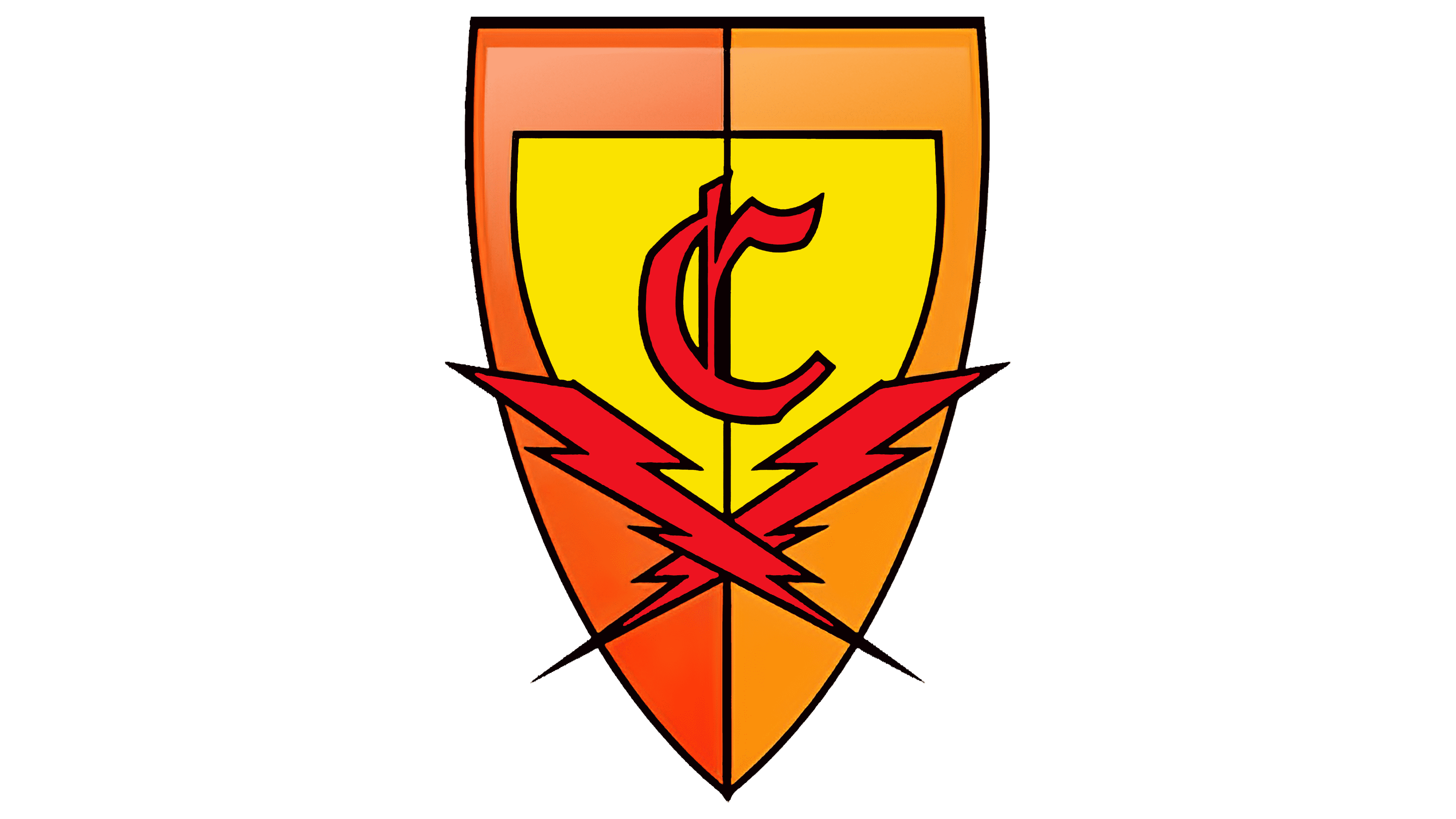
Citadel products are recognizable by their bold, masculine logo. It consists of the brand name in capital letters with characteristic serifs (spiky type) and a bright shield icon. The last element is a bright accent that symbolizes progressiveness. This is also evidenced by two crossed lightning bolts located on the shield. The overall concept is complemented by a bright, contrasting color scheme consisting of 3 shades.
What is Citadel?
Citadel is a trademark used by a firearms manufacturer. Since 1905, it has been privately owned by Armscor Corporation, known for its high-tech developments. In close cooperation, the company produces more than 100 thousand pistols and shotguns. All of them are created in accordance with the established standards and certifications.
A feature of Citadel’s visual identity is that it has not changed since its inception. The trademark uses a brutal logo that reflects its values and work principles. It is based on a strict inscription denoting the company’s name, complemented by a shield symbol. The first element is distinguished by classic, expressive coloring and a Gothic-style font.
Powerful letters show strength, confidence, and rigor. The second element is a shield with the letter C and two crossed lightning bolts on top. The chosen performance is associated with a sense of protection and a pronounced adherence to principles. The brand approaches production responsibly, strictly adhering to all standards, which directly affects product quality.
On the inscription itself, you can see the ebb created due to the play of shadows of a dark color. This is an additional emphasis on the company’s solidity and high status. Among the additional characteristics, one can single out the graphic symbol’s design. The shield is visually divided into two parts, painted in different shades. They are in balance with each other, as all stages of production are in the Citadel.
Coloring is a separate aspect of the visual concept. It includes expressive and contrasting shades. The designers have chosen them to complement each other and make the emblem memorable. The combination of the chosen colors resulted in a stylish and energetic logo that emphasizes the brand’s strength.
Font and Colors
The modern Citadel logo is presented in the original design. The style solution selected by the designers effectively emphasizes the brand’s best aspects. The font’s massive lines emphasize confidence and professionalism. Another characteristic is the Gothic style, associated with brutality.
Each word mark stands out clearly due to its clean lines, tight spacing, and sharp serifs. On the left side of the inscription is a stylized badge resembling a protective ammunition element. The thematic symbol perfectly balances the inscription, making the logo unique. It stands out in the first letter of the name of the company, C, and bright lightning.
They are crossed with one another, symbolizing special masculinity and strength, with the coloring chosen for its bright, stylish appeal. Shades of orange and yellow, as well as rich red, were used to decorate the shield. This palette demonstrates strength, energy, and progressiveness.
To balance the bright colors, the traditional black shade was also used. It contains thin lines separating the security symbol and the inscription’s main symbol. This color evokes associations with high status, reliability, and professionalism.