Only forward, up, and at high speed – this is the main message of the company logo. The Citroen logo has a lot of expressions, energy, and a desire for leadership. The symbols also speak of a bright, unforgettable design of cars that attracts attention on the road.
Citroen: Brand overview
Meaning and History
It is a revolutionary company in the world of mechanical engineering. She made several discoveries that have taken the industry to a high level. In addition to front-wheel drive, bearing structure, and autonomous suspension, she proposed a self-leveling system in 1954, disc brakes ten years later, and 1967 turning headlights for driving on winding roads. The manufacturer embodied all the innovations in his vehicles and subsequently awarded world and national awards. In addition, its products have been awarded the European Car of the Year award.
The company achieved its resounding success through difficult years of battles. Andre Citroën built a factory during the First World War, and after its end, he realized that he would be left with a modern enterprise without products. Then, he decided to reorient it to the manufacture of civilian vehicles since earlier, he had produced only military equipment. In particular, the owner decided to focus on the passenger car segment.
To do this, in 1917, he turned to engineer Jules Salomon for help in advance. The French industrialist challenged him to design the latest ten horsepower design with excellent equipment, superior durability, and less expensive than other cars. The result was Type A in 1919, and with it, Citroën. Its logo graced the first series of cars launched in the same year.
The identity is based on a gear with double chevrons. The 22-year-old founder of the company suggested the idea after visiting a factory in the Polish city of Lodz. He bought a patent for this technology because a helical gear gives more axial force and, in addition to another gear, greatly increases traction. Until then, the French company used a bevel gear mechanism on the rear axle. Therefore, the new technology became decisive in the production of passenger cars and was important.
In 2020, the FCA and PSA groups were announced to merge to form the large industry organization Stellantis, which Citroën and other brands will join in 2021. Naturally, a change in identity is also expected.
What is Citroen?
Citroen is a French brand of the Dutch company Stellantis N.V. It has been in existence since 1919 and produces a wide range of vehicles that are available almost all over the world, except for the USA, North Korea, Mexico, and Canada. In its early years, the brand was owned by André-Gustave Citroën, who used the Eiffel Tower as a billboard.
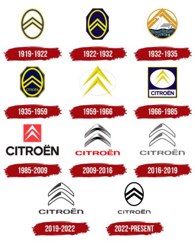
1919 – 1922
The debut emblem consisted of a herringbone pattern, repeating the location of the notches on the helical gears. The author chose two paired fragments for the logo since one would be unclear. He placed the zigzag lines in a vertical oval and connected them on the sides. All stripes were blue and double-edged – from the outside and the inside.
1922 – 1932
At that time, graphic design prevailed because the improvement of the emblem only affected the appearance of another geometric shape. There was no text. To represent the authenticity of the car brand, the developers placed an oval with herringbone strokes in an octagon. It was dyed dark blue, close to cobalt, and all other elements were yellow-lemon.
1932 – 1935
In parallel, another company designation was used at this time, conceptually different from the main one. It showed a swan swimming to the left under the chevrons, shaped like a mountain with double peaks. The bird was on improvised water, where waves of “moteurflottant” and “Citroen” were visible. She symbolized the fast-moving engines and nose shape on some of the signature models. The swan had no roundings, consisting entirely of short lines and corners. Its head and neck resembled the upper fragment of an octahedron. The colors in this variant were more varied and included a combination of white, black, blue, gold, and light blue.
1935 – 1959
After this transformation, the octagon got wider and had a thin yellow stripe along the edge. The blue color was shifted to the light palette, and the yellow remained. In addition, under the chevrons was the inscription “Citroen.” It was made in uppercase, except for the letter “i,” which remained lowercase. This period is considered legendary since the text first appeared in the logo.
1959 – 1966
The manufacturer has improved the design of the chevrons, so the herringbone pattern received pointed ends. It also had “edges” that made the logo bulge. The three-dimensional effect also appeared due to the combination of light and dark sides on the same stripes. All elements were placed in a horizontal white oval.
1966 – 1985
The designers enclosed a white oval with yellow chevrons in a blue and white square. The upper part was painted in a cobalt shade, and the lower was painted in a milky shade. The existing sign had the “Citroen” inscription executed in capital letters. A yellow edging strip ran along the edge of the geometric shape.
1985 – 2009
The result of a radical redesign was a new identity. The developers removed all the previous colors and elements – only the herringbone chevrons and the name of the automobile brand remained. Instead, a miniature red square and large black lettering made up of a sans serif typeface.
2009 – 2016
The brand removed the background to modernize the logo and made the triangular serifs “metallic.” To do this, she used the corresponding colors from the metallic spectrum – silver and gray, adding black to them. As a result, the logo came out in 3D. This effect was achieved thanks to the correct combination of shadows and highlights. At the bottom was the company name in an updated red font. The author of this version is the studio Landor Associates.
2016 – 2019
The current logo has no 3D effect, so the sign looks flat. This is necessary for better branding display in print format and on any media. There is a small shadow from the “cold metal” in the upper left part of both chevrons. The designers replaced the red letters with gray ones.
2019 – 2022
For its centennial anniversary, Citroen has given a small cosmetic update to the logo. Changes have only affected its color scheme: the light shade of gray has been replaced with a dark one to make the lettering and icon more expressive. At the same time, the shape of the two “boomerangs” and the style of the letters remained the same.
2022 – today
In September 2022, the French automaker Citroen introduced a redesigned emblem. This is a rethinking of the original logo created in 1919. The new version, like the old one, contains two curved stripes in a vertical oval. Only now is a highly visible black color used for the main elements. Another difference is the wider stripes, which inspire a sense of reliability and stability.
Since minimalism never went out of fashion, the current symbol, like several previous ones, is devoid of three-dimensionality. This is done to make the logo easy to use in the digital environment, especially on mobile device screens. However, the design of the inscription at the bottom of the logo has changed markedly. The letters have become more futuristic and have lost thickened lines. The two dots above the “Ë” no longer resemble an infinity symbol – the diacritic now resembles a dotted line.
Citroen: Interesting Facts
Citroën, a French car maker, is known for its creative designs and big contributions to car technology.
- Starting: Founded in 1919 by André Citroën, the company made waves in 1934 with the Traction Avant, the first mass-produced car with front-wheel drive, a single-body construction, and independent front suspension.
- Logo: The Citroën logo, two inverted “V” shapes, comes from André Citroën’s earlier invention of a helical gear. It’s a nod to the company’s focus on innovative engineering.
- Hydropneumatic Suspension: Citroën led the way by putting hydropneumatic suspension into mass production, first in the Traction Avant and then in the Citroën DS. This tech offered unmatched ride quality and handling.
- The Citroën DS: Launched in 1955, the DS was ahead of its time with its aerodynamic design and tech like semi-automatic transmission, power steering, and disc brakes. It became an icon.
- World War II Efforts: Citroën also played a part in the French Resistance, creating the TPV, which would evolve into the 2CV, in secret to keep it from the Nazis.
- The Citroën 2CV: Released in 1948, the 2CV was made affordable, simple, and able to handle rough roads. It became a symbol of French creativity.
- Racing Success: Citroën has been successful in the World Rally Championship, winning several times with cars like the Xsara, C4, and DS3, proving its engineering and performance.
- The Citroën XM: In 1989, the XM was introduced with a hydropneumatic self-leveling suspension and unique design, winning the European Car of the Year in 1990.
- Marketing: Citroën is known for its unique marketing, using special effects in ads and collaborating with fashion designers for special car editions.
- Ownership and Partnerships: In 1976, Citroën joined forces with Peugeot in the PSA Group, which has been part of Stellantis since 2021. Even after merging, Citroën has kept its unique identity, continuing to make cars known for innovative design and tech.
Citroën has always been about doing things differently, from its groundbreaking technology to designing some of the most memorable cars. This commitment to innovation and distinctiveness sets Citroën apart in the automotive world.
Font and Colors
Andre Citroën personally proposed the logo’s idea. The key element is two paired stripes, each connected by a herringbone. These are serifs from gears with helical edges, which made it possible to improve the proprietary engines.
Until 2022, the automotive brand used a custom-design typeface based on the Gotham typeface created by Tobias Frere-Jones. The designers only corrected the letters to add originality.
The official palette comprises several shades of blue, yellow, white, graphite, silver, and red.
From 2022, the Citroen logo will use a new custom font. The typeface is partially similar to Uniwars SemiBold by Typodermic Fonts Inc., but notable differences exist. For example, in the name of a car company, “R” is not solid – it has an open intra-letter space. In this version, the wordmark is completely black, as is the emblem, which is an oval with two curved stripes. By removing the chrome gray tint, the designers made the symbol clear and legible.
FAQ
Why does Citroën have two logos?
The brand uses two logos to market different types of cars. The traditional double chevron logo reflects its long history and emphasizes comfort and reliability. The chevrons represent gear teeth, referencing founder Andre Citroën’s early gear manufacturing business. This logo symbolizes Citroën’s classic cars, which provide a unique driving experience.
The DS logo, introduced in 2009 and established as its brand in 2014, signifies luxury and high performance. DS Automobiles was created for people who desire modern, high-class cars. They target customers who seek luxury and are interested in the latest designs and technologies.
Who makes Citroën?
André Citroën founded the brand on June 4, 1919. It started as an independent company but has changed hands several times.
In 1976, the brand joined the Peugeot family after Peugeot bought a majority stake, forming the PSA Group. This change helped stabilize the brand, which was struggling financially then. As part of the PSA Group, the company continued to create a unique range of cars known for their French styling and innovative features.
In 2021, Citroën changed hands again when the PSA Group merged with Fiat Chrysler Automobiles to create Stellantis, a new global car manufacturing company. This merger brought several major automobile brands together. The brand is now part of Stellantis and continues to offer unique vehicles worldwide.
What does the Citroën symbol mean?
The company’s V-shaped chevron logo is deeply connected to the brand’s history. These chevrons are inspired by gear teeth, specifically the type known as a chevron wheel. This design harkens back to brand founder André-Gustave Citroën and his original business, which produced gears of this unique shape.
When André-Gustave founded his automobile company in 1919, he chose a chevron gear design for the logo. This symbol pays tribute to the brand’s roots in engineering innovation and highlights its commitment to excellence and reliability in automobile manufacturing.
Did Citroën change its logo?
Citroën has updated its logo several times; the last change occurred in 2016. With this update, the design became simpler and more modern. The brand removed the silver gradient from the previous logo, opting for a flat, two-dimensional look. The text next to the logo turned gray. This change is part of a larger trend of companies simplifying their logos to make them appear clearer and more recognizable, especially on digital platforms.

