The CityJet logo showcases its Dublin roots and Irish heritage, highlighting its function as a European regional connector. The design represents the airline’s commitment to convenient and efficient travel for business people and tourists. It connects cities with a network that supports vibrant cultural and economic exchanges. The emblem signifies the airline’s dedication to personalized service, resonating with the warm and hospitable nature traditionally associated with Ireland.
CityJet: Brand overview
Founded in 1992 and headquartered in Swords, Dublin, CityJet boasts a history filled with exciting transformations.
In 1993, CityJet took to the air, launching its first flight between Dublin and London City Airport. Recognizing CityJet’s potential as a regional airline, Air France took the strategic step of acquiring the company in 2000 and integrating it into its extensive network.
In May 2014. Air France decided to sell CityJet to Intro Aviation, a German investment company.
In March 2016, founder Pat Byrne and a consortium of investors bought CityJet from Intro Aviation. This symbolized the airline’s homecoming, reflecting the founders’ continued commitment and confidence in the company’s potential.
In 2017, CityJet strategically shifted from scheduled flights to specialize in wet leasing and charter services, allowing the airline to meet the specific operational requirements of other carriers.
CityJet further strengthened its position as a trusted partner in the aviation industry by offering wet-leasing services to Scandinavian Airlines (SAS).
Meaning and History
What is CityJet?
It is an Irish regional airline based in Dublin. It operates a network of regional flights throughout Europe, focusing on providing efficient and reliable air transportation. The company offers scheduled flights and wet leases to other airlines, allowing aircraft and crews to operate flights on their behalf. The fleet consists mainly of regional aircraft suitable for short and medium-haul routes.
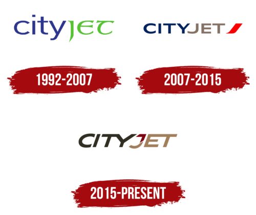
1992 – 2007
CityJet, founded in 1992 and actively operating until 2007, chose a particularly vibrant and symbolic name for its logo. It is visually and conceptually divided into two parts by different colors: blue and green. The division of the name is intentional—blue in the word “City” represents London, the capital of the United Kingdom, a regular destination for the company’s flights, while green in “Jet” reflects the company’s Irish roots and the national color of Ireland, with Dublin being one of its key destinations.
The logo’s color scheme emphasizes the sky and the green expanses of the United Kingdom, skillfully used to highlight the airline’s connection to these regions. The choice of fonts carries deep meaning: a strict and straightforward font for “City” reflects the business-like and solid character of London, while the font for “Jet” is in the style of Gaelic script, symbolizing Irish freedom and casualness.
CityJet was initially registered as Business City Direct, but it operated under the brand Virgin CityJet, which involved paying royalties to the Virgin Company. This arrangement allowed it to use a widely recognized brand to attract customers. The term “Jet” in the logo, while part of the aviation lexicon associated with jet engines, emphasizes the company’s focus on fast and convenient flights between major cities. This name indicates the company’s mission to provide efficient and comfortable air travel between key urban centers.
2007 – 2015
In 2007, after Air France became the new owner, significant changes were made to CityJet’s branding and route network. The expansion of flights to London and other major European cities required a revision of the corporate style, which was reflected in changes to the company’s thematic colors and fonts.
The new logo design features text in uppercase letters with a more modern and cohesive appearance. The smooth lines of the letters suggest the fluidity of flight and emphasize the company’s commitment to maximum comfort on board. The use of uppercase letters in the logo deliberately highlights the company’s focus on travel between major cities, underscored by the blue color of “City.”
The word “Jet” in the logo is now presented in a light coffee color, adding an airy and lively feel to the image. This color complements the concept of business travel and underscores the company’s reliability in adhering to schedules and swiftly moving passengers.
The logo is completed with the red letter “J,” stylized as an airplane taking off on a runway. This element adds dynamism to the logo and serves as a vivid accent, symbolizing speed and active development. It represents CityJet’s commitment to innovation and continuous service improvement, making the brand even more attractive and memorable among competitors.
2015 – today
CITYJET’s logo, which has been used since 2005, displays the word “CITYJET” in bold, italicized capital letters. This design creates an impression of movement, suggesting speed and efficiency. The logo uses three colors: dark gray for “CITY,” maroon for the top half of the “J,” and beige for the rest of the “J.” Some letters are connected, like “T” merging with “Y” and “E” merging with “T.”
The bold, italicized font shows motion and speed, key aspects of the airline. The different colors add depth and make the logo more interesting. The connected letters symbolize unity and cohesion, which are important for safety and reliability in aviation.
The dark gray color of “CITY” suggests strength and professionalism. The maroon top of the “J” adds elegance, while the beige bottom of the “J” adds warmth. These colors create a balanced and appealing look.
The unique connections between letters make the logo fluid and emphasize seamless travel, reflecting the airline’s dedication to a smooth passenger experience.
