 Scandinavian Airlines System (SAS) Logo PNG
The Scandinavian Airlines System (SAS) logo expresses the idea of boundless freedom and exciting journeys. The company’s main goal is to allow passengers to explore the world. At the same time, the emblem symbolizes progress, which makes air travel safe and reliable.
Scandinavian Airlines System (SAS): Brand overview
Scandinavian Airlines System (SAS) emerged in 1946 through a collaborative agreement among three airlines: Det Danske Luftfartselskab A/S (DDL) from Denmark, Det Norske Luftfartselskap A/S (DNL) from Norway, and Svensk Intercontinental Lufttrafik AB (SILA) from Sweden. This partnership aimed to pool resources for transatlantic flights.
On September 17, 1948, the consortium launched its first transatlantic flight from Stockholm to New York, using a Douglas DC-6. This milestone marked a new chapter in Scandinavian aviation.
On August 1, 1951, SAS was officially established, merging the operations of DDL, DNL, and Swedish Intercontinental Airlines (ABA, SILA’s successor). This merger formed the world’s first truly international airline owned by three countries.
The company pioneered polar routes in 1954, operating the first commercial flight from Copenhagen to Los Angeles over the North Pole, significantly reducing travel time between Europe and the U.S. West Coast.
In the early 1960s, jet aircraft like the Sud Aviation Caravelle and Douglas DC-8 were introduced, enhancing speed and comfort on its routes.
1965, the world’s first electronic booking system was launched, revolutionizing the airline industry.
By 1971, introducing the Boeing 747 into the fleet increased passenger capacity on popular routes and improved passenger comfort.
Throughout the 1980s, the company modernized its fleet and expanded its route network. The airline diversified its business by investing in the hotel industry.
As a co-founder of the global airline alliance Star Alliance in 1997, the company enhanced its collaboration with other carriers.
Following the September 11, 2001, terrorist attacks and the subsequent downturn in the aviation industry, severe financial challenges were faced. Between 2001 and 2004, significant restructuring took place, including workforce reductions and route optimization.
In 2006, the company sold its stake in the British airline Bmi and divested other non-core assets to focus on its primary airline operations.
From 2009 to 2012, further restructuring was implemented to boost efficiency and reduce costs, including selling regional subsidiaries and optimizing the fleet.
In 2013, the airline rebranded and introduced a new onboard product featuring enhanced cabins and a revamped food service to improve the passenger experience.
Between 2015 and 2019, an extensive fleet modernization program was embarked upon, with the order of new Airbus A320neo, A330, and A350 aircraft to replace older models and increase operational efficiency.
Like many airlines, it faced unprecedented challenges in 2020 and had to adapt its operations to drastically changed market conditions.
Meaning and History
What is the Scandinavian Airlines System (SAS)?
This is the flagship carrier of Denmark, Norway, and Sweden, based in Stockholm. It is known for its unique joint ownership model by the three Scandinavian countries. The company operates a diverse fleet, including Airbus A320neo and A350 aircraft, serving routes in Europe, North America, and Asia. A distinctive feature of the airline is its EuroBonus program, one of the first loyalty programs in Europe, allowing passengers to earn points for flights and purchases from partners.
Old
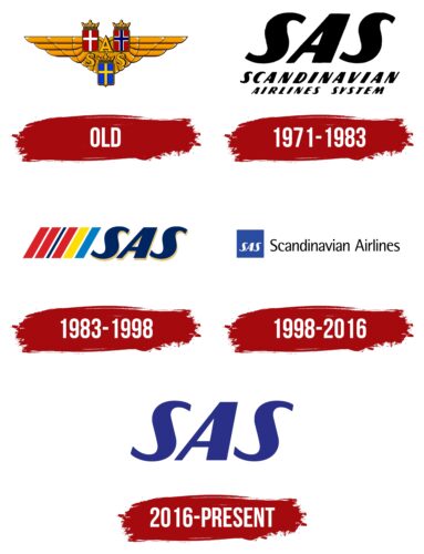
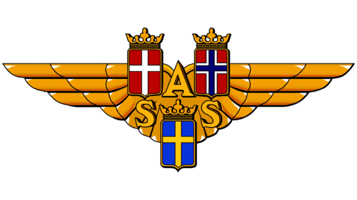
The Scandinavian Airlines System was created to serve the residents of Denmark, Norway, and Sweden. Its old logo includes the flags of these countries:
- A white cross on a red background (Denmark)
- A blue cross with a white outline on a red background (Norway)
- Yellow cross on a blue background (Sweden)
These flags are inverted and placed inside heraldic shields topped with golden crowns. This design showcases national pride and the close historical ties between the countries. The abbreviation “SAS” is arranged in a triangle to connect the three flags visually, reflecting the company’s presence in all Scandinavian countries. The three-dimensional shape of the letters demonstrates its progressiveness.
In the background, large wings of several rows of orange feathers symbolize flight and reaching new heights. This unique design asserts the airline’s dominance in the skies of Denmark, Norway, and Sweden.
Small white triangles at the edges of the feathers give the emblem a glossy texture as if it were made of real gold. This attempt to mimic the shine of precious metal signifies the company’s focus on premium services.
1971 – 1983
The updated logo features the brand name in two versions:
- As a short abbreviation
- In full form
The designers divided the text into three lines, placing the large “SAS” letters at the top, which became the airline’s most recognizable symbol. They lean to the right, giving the impression of moving forward quickly. This creates a sense of rapid flight, even though the emblem lacks obvious “airplane” imagery. The two “S” letters curve smoothly, resembling waves and evoking a sense of seaside relaxation.
The same font is used for the phrase “SCANDINAVIAN AIRLINES SYSTEM.” The only difference is the letter size: the first word is larger than the second and third words, emphasizing the region the company serves. In contrast to the bold and whimsical typography, the black color of the text conveys formality, strictness, and conservatism, showcasing the airline’s multifaceted nature.
1983 – 1998
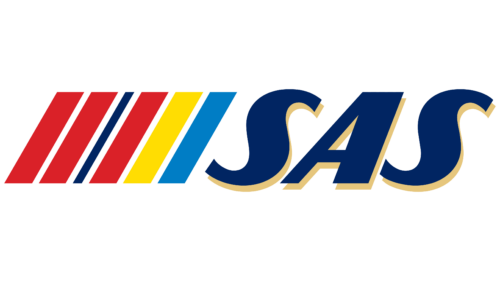
In 1983, designers found an original way to represent the Scandinavian countries without using their flags. They displayed the official colors of Denmark, Norway, and Sweden in six stripes: three red, one dark blue, one yellow, and one light blue. Thin white lines, also part of the flags, separate the stripes. The diagonal slant symbolizes increasing speed, relating to fast-flying airplanes and the company’s dynamic growth.
The geometric pattern style matches the “SAS” text font. The abbreviation is still in bold italics with recognizable wavy “S” letters. However, their shape is now more defined; the logo designers outlined sharp angles to convey the company’s reliability, stability, and competitiveness.
Each letter is colored dark blue, traditionally associated with the sky, and accented with golden shadows. As in the oldest Scandinavian Airlines System emblem, the gold palette creates a sense of prestige and exclusivity for the airline.
1998 – 2016
The logo was updated after SAS became a co-founder of Star Alliance. The designers achieved simplicity and clarity by removing associations with Denmark, Sweden, and Norway flags. The colorful palette was replaced with a restrained combination of black, white, and blue. Blue is associated with travel, as it has taken on a pleasant shade of the sky or ocean. This color is represented as a square. Its harmonious shape evokes a sense of balance and complements the “SAS” abbreviation inside. The letters are traditionally in bold italics, creating a sense of rapid flight.
The phrase “Scandinavian Airlines” conveys a different impression. The thin, sans-serif letters look strict and concise, demonstrating the company’s seriousness, reliability, and high professionalism. However, the font is slightly elongated and has many smooth curves. This style reflects dynamism and modernity, showing that the airline strives for progress and keeps up with new trends in the aviation industry.
2016 – today
Until 2016, the brand identity was geared toward business travelers. It became clear that Scandinavian Airlines’ main customers are tourists who fly to other countries for leisure and memorable experiences. The restrained geometric logo was replaced with a simple emblem, evoking a sense of ease and relaxation. This change establishes a close emotional connection between the airline and its passengers.
The wordmark contains only the short abbreviation “SAS,” which is enough to showcase the brand’s unique identity. The minimalist text is associated with warmth, care, and high-quality services, as the font has remained unchanged for several decades, becoming a “signature” of Scandinavian Airlines.
The smooth curves of the “S” letters make the emblem visually dynamic, symbolizing speed, which is crucial for any airline. The letters’ slanted shape and the strokes’ contrasting thickness create a dynamic combination, indicating a drive for progress. The dark blue color of the logo is associated with the sky, sea, and the cold climate of the Scandinavian countries where SAS originated. It also represents the brand’s reliability and professionalism.
