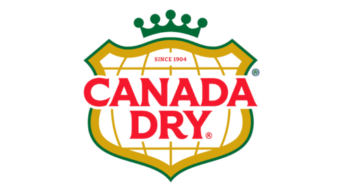
In early October 2022, Canada Dry announced a rebrand and introduced a new logo. She presented an emblem she claimed achieved the highest scores in all major areas during testing, including quick recognition.
The improved visual image of the brand was shown on 10/06/22. According to the owner, it will be common to all assets and grace the packaging of all branded products, including Tonic Water, Club Soda, and Ginger Ales. At the same time, the redesign is reminiscent of previous images and emblems used in the past, so there is a clear trend towards continuity. In this regard, Tebbie Chuchla, head of marketing for Keurig Dr. Pepper Canada, noted that the identity is based on nostalgia but looks to the future and is aimed at the company’s growth.
The brand’s focus on this strategy is purposeful. By developing his identity this way, he hopes to get an equally high response from regular and future customers. The old wide emblem, longitudinal stripes, and a map of Canada help show the connection between generations. At the same time, the sign is optimized for modern requirements and has a clean look.
The logo presents a corporate shield consisting not only of sharp elements but also rounded arches, half rectangles, and corners. In shape, it resembles a classic pentahedron. It has a double on the edge line: green (outer) and olive-gold (inner). The multi-structured frame shows the reliable protection of the quality of goods and the company’s readiness to withstand any difficulties.
The updated emblem also contains a grid of meridians and parallels drawn globally. This is an allegory for the worldwide reach of consumers and the availability of products in every corner of the globe. The year the company was founded is above. The title is in bold red font. The letters are decorated with miniature serifs, which are more like extensions.


