The components of the composition point and clearly “hit” unwanted skin rashes. The Clearasil logo shows that the product contains antibacterial compounds that eliminate the problem once and for all.
Clearasil: Brand overview
| Founded: | 1950 |
| Founder: | Reckitt |
| Headquarters: | United States |
| Website: | clearasil.us |
Meaning and History
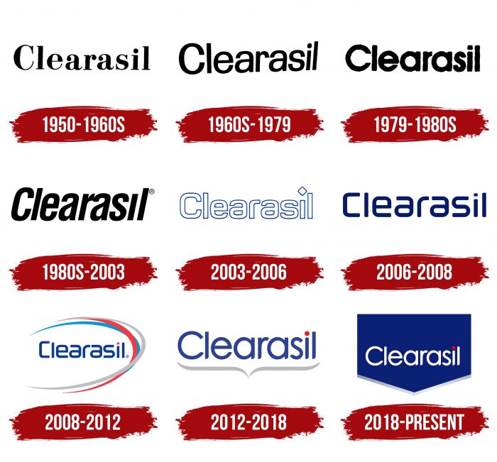
At all times, the emblem carried the name of the company, which it received from its debut acne treatment. Today, two variants of the logo are known, almost identical repeating each other. The exception is the single details that make each version unique.
What is Clearasil?
Clearasil is an American facial care brand. It produces dermatological cosmetics for combating acne on young skin. It was founded by Ivan Combe and Kedzie Teller in 1950. Reckitt now owns the brand.
1950 – the 1960s
The initial version of the logo included only one inscription – the name of the cosmetic product. It was done in a classic serif print. The letters resembled the style of the two typefaces: they were something between Scotch Modern Bold and Valencia Serial Xbold with some changes.
the 1960s – 1979
In this version, the developers have replaced the font. The letters were taller than before, the serifs disappeared, and there was a slight disparity. The fact is that the end of the word “Clearasil” has been slightly reduced and moved up. Instead of charcoal black, the designers suggested graphite black.
1979 – the 1980s
Keeping a single inscription in the logo, the developers focused on the typeface. They replaced it with another sans serif, wider and bolder.
the 1980s – 2003
The modified version of the title was done in a font similar to Newside FP Italic. It was a combination of uppercase (“C,” “I”) and lowercase letters (all others). The characters were bold, tall, italic, and tilted to the right. Two of them (“r” and “a”) were connected – they touched a little at the top.
2003 – 2006
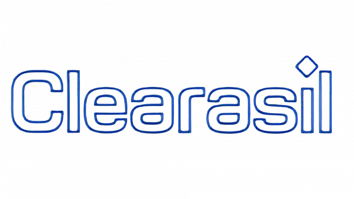
The evolution of the emblem led to the emergence of outline letters. They were made with thin blue lines and were hollow inside. Moreover, the developers have replaced the old typeface by removing italics. They also cut off the tail at “a,” rounded off the hat at “r,” and added an “i” rhombus, replacing the classic dot.
2006 – 2008
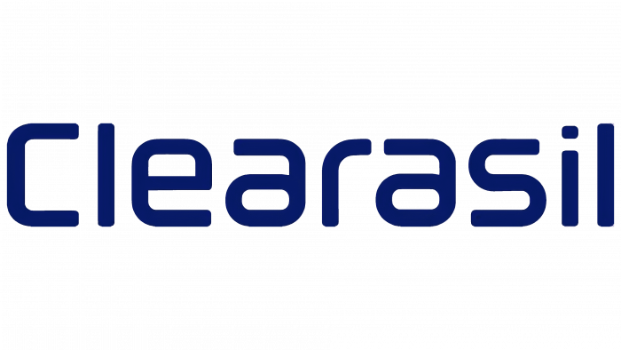
In 2006, the transition to a font used for two periods in a row took place. It was a simple typeface consisting of schematic letters of the same type: the characters were written in curved lines, which gave them geometricity. The “C” looks like a staple, and the “i” has a dot instead of a cube. The emblem was painted dark blue.
2008 – 2012
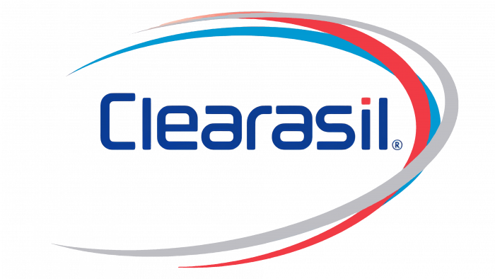
The company switched to a logo of a radically different style. Round signs were replaced by strictly geometric ones, with smooth transitions in the corner part. The developers cut off the lower fragment for the letters “a” and removed the upper one for the “r.” They made a dot above the “i” in the form of a miniature rectangle. To the right of the inscription, three multi-colored stripes go around it with a semi-oval. The blue, red, and gray lines are randomly placed, and in some places, they overlap. They have a thickened middle and pointed ends.
2012 – 2018
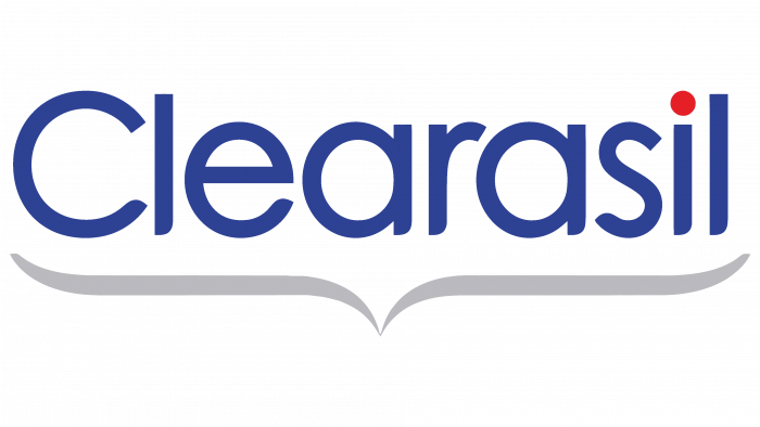
This version contains dark blue rounded letters. Moreover, the designers replaced the rhombus above the “i” with a red dot. They also added a curly brace, which they positioned horizontally, pointing downwards.
2018 – today
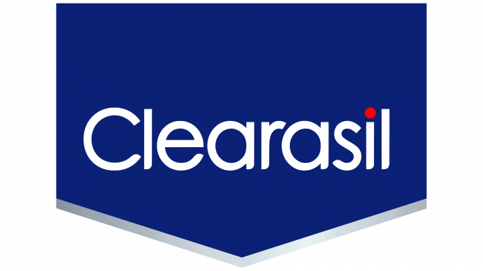
In the current version of the logo, the graphic structure has been completely changed. The bottom curly brace, which was added earlier, was corrected by the designers, turning it into a triangular pointer. Moreover, they significantly increased the emblem area and made it the background for the only inscription. Therefore, now the name of the cosmetic brand is on a wide rectangle.
The bottom of the geometric shape is pointed and emphasized by a gray stripe with a slight gradient: darker on the left and lighter on the right. The word “Clearasil” occupies the bottom half of the logo. There is a free blue space at the top. The white letters are in the same style as before. They stand out clearly against a dark background. At “l,” “a,” “i,” “r,” the bottom of the legs is cut off and rounded at a slight angle.
Clearasil: Interesting Facts
Clearasil is a brand that’s been helping people deal with acne since 1950. It’s one of the first companies to make products just for acne, which is a big deal for teenagers and young adults who often have this problem.
- Starting: Clearasil began with the goal of helping young people by focusing on acne treatments. They used science to create their products, including using benzoyl peroxide, an important ingredient that helps a lot with acne.
- Worldwide: It started in the United States, but now you can find Clearasil products worldwide. It’s a name many people know and trust when fighting acne.
- Learning About Skin: Clearasil isn’t just about selling products; they want to teach people, especially teens, how to take care of their skin, how to stop acne before it starts, and how to help them understand what’s true and what’s a myth about acne.
- Lots of Choices: Clearasil makes various products, such as cleansers, toners, and spot treatments. This means that no matter what kind of acne issue, a Clearasil product can probably help.
- Changing With Times: As times change and people want different things, Clearasil changes, too. They now offer products for acne, oily skin, uneven skin tone, and blemishes.
- Always Improving: Clearasil researches and develops new ways to fight acne. They’re always looking for the next best thing to help people have clearer skin.
- Talking to Teens: Their ads and campaigns are pretty famous, especially the ones aimed at teenagers. They focus on how acne can make you feel and how having clear skin can give you more confidence.
- More Than Acne: Clearasil offers products for overall skin health, such as moisturizers and treatments to shrink pores. Its goal is to help everyone have clear and healthy skin.
Clearasil has been around for a long time, always working on new ways to help people deal with acne and feel good about their skin.
Font and Colors
Brand names have a common element – the name of the company. It is present in all variants. The modern logo features an inverted curly brace that represents a pimple.
Both versions have different types of typefaces. In the first emblem, it is contoured, with several truncated elements on the letters. The second logo uses a combination of streamlined uppercase and lowercase characters. The basic font type is plain sans serif. The main colors are blue, red, silver.
Clearasil color codes
| Blue | Hex color: | #0b2076 |
|---|---|---|
| RGB: | 11 32 118 | |
| CMYK: | 91 73 0 54 | |
| Pantone: | PMS 2747 C |
| Silver | Hex color: | #b4b5b8 |
|---|---|---|
| RGB: | 180 181 184 | |
| CMYK: | 2 2 0 28 | |
| Pantone: | PMS 421 C |
| Red | Hex color: | #fd0001 |
|---|---|---|
| RGB: | 253 0 1 | |
| CMYK: | 0 100 100 1 | |
| Pantone: | PMS 1655 C |
