A TV channel covering financial and business news, it maintains its popularity with a recognizable CNBC logo. Moreover, CNBC’s emblem has a catchy design with a slight asymmetry. This does not fully convey the brand’s essence, but it expresses its desire to stand out from the background of the gray mass.
CNBC: Brand overview
| Founded: | April 17, 1989 |
| Founder: | Comcast |
| Headquarters: | Englewood Cliffs, New Jersey, U.S. |
| Website: | cnbc.com |
Business and financial news coverage is the main focus of CNBC, America’s leading commercial news channel. The channel was founded in April 1989 by two companies, NBC and Cablevision, whose mission was to cover consumer and business news. Two years later, the company became the owner of a competing financial channel, Financial News Network, which allowed it to increase its coverage, the number of regular viewers, and significantly increase its workforce. After buying the share owned by Cablevision, NBC began to independently influence the channel’s organizational policy and the formation of news topics and programs.
Today, NBC continually broadcasts breaking business and financial news on both domestic U.S. and international markets during weekdays and weekends. Weekends and after-hours, there are documentaries and reality shows on the channel’s main topics. As NBC has grown and expanded, it has created many regional affiliates and a network of versions, starting in 1995 with broadcasts in European and Asian countries. This process is still underway today, with more and more countries being covered.
All this development process is reflected in the brand’s logo, which has changed following the significant changes in the company’s history. During its 32 years of existence, the channel has made four dramatic changes to its visual identity, retaining only the abbreviation of the company name. This provided the necessary brand recognition in the future, demonstrating its success and adherence to its traditions.
Meaning and History
The channel started its “first steps” as a satellite television service in 1979. It aired old movies, educational programs, and entertainment shows. Low-budget offerings were not particularly conducive to success and rapid business growth. In June 1988, the company leased a transponder from the Tempo Channel, the basis of which the entire broadcast is restarted. Tom Rogers, the future executive chairman of Engine Media, is in charge of the process. And already in 1989, its new co-owners Cablevision and NBC used the channel as a Consumer News and Business Channel, locating the main office in Fort Lee (New Jersey). The acronym for the company’s name became CNBC.
Having gone through great hardships – a constant battle with the Financial Channel, overcoming skepticism from providers who thought the Financial News Network met all their needs – CNBC had already met 17 million homes in 1990. That number, however, was not even half of FNN’s reach. But providence was destined to provide CNBC with a lucky break – FNN had financial problems, which provided the opportunity to buy a competitor as early as May 21, 1991.
Thanks to the launch of Euro-Asian channels in the nineties, the company has grown significantly, increasing the number of its viewers. And as early as 2003, the company moved its office to 900 Sylvan Avenue (Route 9W) in Englewood Cliffs, New Jersey. Here begins a new era in the company’s development, with digital video and new studios. The visual construction of the television programs provides the ability to follow real-time news reports, weather forecasts, and stock prices – NYSE, NASDAQ, and AMEX in constant updating mode. There is also a dynamic bar at the top of the screen that constantly updates indices and prices of various world market commodities.
1989 – 1991
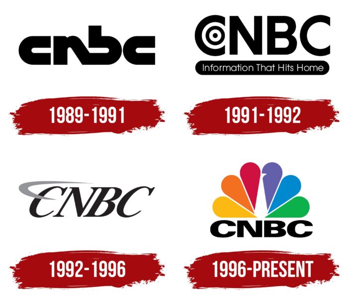
CNBC radically changed its information focus and began to fight for a new consumer of its offerings. The ways of achieving its goals had not yet been precisely defined, and a new image of the company was beginning to take shape. This was also reflected in the logo, which lasted two years and was changed because it did not correspond to the spirit and philosophy of the channel. The logo showed the abbreviation of the company’s name in black and lowercase letters. The middle letters “n” and “b” were joined at the bottom. All the letters were slightly elongated horizontally. In a sense, it was a tribute to the fashion or tradition that existed among TV stations worldwide, which practiced a somewhat similar style in their names.
1991 – 1992
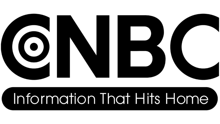
The victorious ’91 merger with FNN demanded a new approach to its image, which led to a change in logo style. Thanks to the large black uppercase lettering, the retained name was easy to read and remember. The middle part of the “C” had circles, one inside the other, alternating white and black. In their center, there was a black dot. This symbol had a double meaning. It resembled a target, a goal, which spoke to the essence of the channel’s existence – to hit the exact target with its information, providing the accuracy that would allow the viewer to solve his business problems victoriously. At the same time, such a symbol also resembled the spread of waves on the air, which pointed to the company’s profile as a television channel.
Beneath the name, on a black rectangular plate with rounded left and right ends, in white, not very large typeface, was the text Information That Hits Home. This slogan is a characteristic of the company’s main goal.
1992 – 1996
In 1992, the network’s daytime business programming that had existed for some time under the name “CNBC / FNN Daytime,” which was supposed to echo the name of the bought-out channel to facilitate the transition and adaptation of its viewers, was canceled. In anticipation of anticipated changes in the company’s operations and management, and light of the beginning of changes in advertising technology thanks to advances in modern technology, it was decided to adjust its own visual identity. The new logo was the same “in black” abbreviation, written in capital letters in a slightly modified Bookseller Bk Reduced Bold italic font. Its slant to the right represents both the drive forward and the effort to overcome many difficulties to convey only important and up-to-date information to the viewer. Above the first letter was made in gray color sign, changing its thickness along the entire length, beginning and ending in dots, covering the letter with a semicircle.
1996 – today
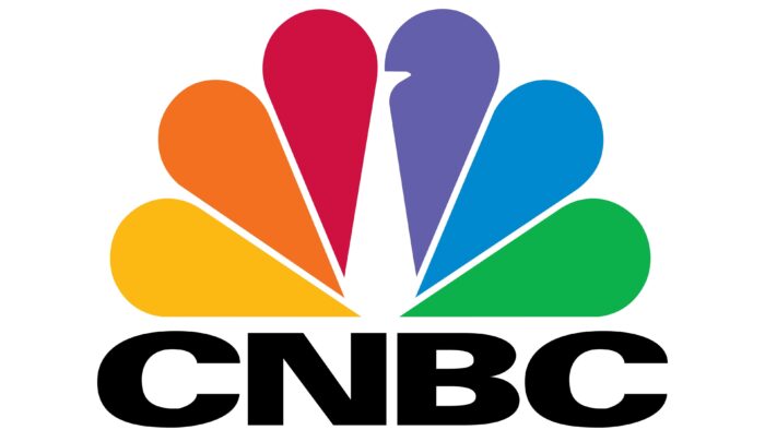
On May 12, 1996, a new brand sign was launched, which is the official symbol of the channel. Keeping the abbreviation of the name, it was the first time during the channel’s existence that colorfulness in all rainbow shades was used. The use of the so-called “peacock tail” – if you look closely at the image, you can see the stylized contours of a bird formed by unfilled voids between the central petals, gave the name to the logo itself – NBC Peacock, which ensured a better perception of the emblem, its memorability. In this way, the developers demonstrated a connection with the color television and extensive coverage of their units to viewers of different countries and nationalities. At the same time, such a variety of colors indicates the most complete and accurate presentation of information covering numerous business and finance areas, forming a “business kaleidoscope. However, the peacock symbolizes fame, importance, honesty, and longevity, just as CNBC positions itself.
CNBC: Interesting Facts
CNBC is a top name in business news, offering updates on the financial markets and business insights.
- Start-Up in Exciting Times: CNBC kicked off on April 17, 1989, when more people became interested in the stock market. This timing helped CNBC meet the rising need for up-to-the-minute financial news.
- Growth Through Merger: In 1991, CNBC took a big step by merging with the Financial News Network (FNN), which boosted its audience and confirmed its spot as a top business news channel. This move helped CNBC by bringing in more resources and people from FNN.
- Worldwide Presence: CNBC reaches a global audience, with channels in Europe, Asia, and Africa, plus its main channel in the U.S. This global network lets CNBC offer wide-ranging coverage of the world’s financial markets.
- Embracing Digital: CNBC launched CNBC.com to share news, analysis, and financial data online, reaching more people and keeping up with how they get their news.
- Unique Shows: CNBC offers news, reality shows, documentaries, and special reports on business, finance, and starting a business. Popular shows include “Mad Money with Jim Cramer” and “Shark Tank.”
- Morning Show ‘Squawk Box’: “Squawk Box” is CNBC’s morning show, blends business news with interviews and discussions. It’s designed for investors and the average person and shapes the financial conversation for the day.
- Color-Coded Ticker: CNBC uses colors on its stock ticker for quick updates: green indicates prices are up, red shows they’re down, and blue means no change. This system makes it easy to follow the market’s direction.
- Unique Headquarters: CNBC’s headquarters are in Englewood Cliffs, New Jersey, showing its dedication to offering a fresh take on financial news, separate from the usual New York City scene.
- Giving Back: CNBC participates in charity work, focusing on financial education and community projects. These efforts are part of its mission to improve financial knowledge and give back.
- Influential Interviews: CNBC is known for its impactful interviews with CEOs, world leaders, and financial experts. These conversations often grab headlines and sway the markets, showing CNBC’s significant role in finance worldwide.
These points highlight CNBC’s journey from a groundbreaking TV channel to a digital news platform, its effect on financial news consumption, and its lasting influence on finance and investment worldwide.
Font and Colors
Radical changes were made to the logo, first of all, in its visual presentation to the viewer. Rainbow multicolored “peacock’s tail,” made in 6 bright colors. Each color is one petal. Located in a semicircle, the symbol is grouped to be symmetrical. Its two outermost petals were horizontal, highlighting the conventional border above the abbreviation of the company name. The name is rendered in traditional black using the Univers Next Pro 940 Extended Extra font. Symmetry in the placement of each element of the logo – the text and the “tail,” which provides an easy visual perception of the entire composition. The entire composition provides the convenience of its placement on branded products, the screen, the Internet, not cluttering the space but maintaining its appeal.
CNBC color codes
| Selective Yellow | Hex color: | #fcb913 |
|---|---|---|
| RGB: | 252 185 19 | |
| CMYK: | 0 27 92 1 | |
| Pantone: | PMS 7549 C |
| Pumpkin | Hex color: | #f37020 |
|---|---|---|
| RGB: | 243 112 32 | |
| CMYK: | 0 54 87 5 | |
| Pantone: | PMS 1585 C |
| Rich Carmine | Hex color: | #cf1141 |
|---|---|---|
| RGB: | 207 17 65 | |
| CMYK: | 0 92 67 19 | |
| Pantone: | PMS 192 C |
| Slate Blue | Hex color: | #635fab |
|---|---|---|
| RGB: | 99 95 171 | |
| CMYK: | 42 44 0 33 | |
| Pantone: | PMS 272 C |
| Green Blue | Hex color: | #0089cf |
|---|---|---|
| RGB: | 0 137 207 | |
| CMYK: | 100 34 0 19 | |
| Pantone: | PMS Process Blue C |
| Pigment Green | Hex color: | #0cb14b |
|---|---|---|
| RGB: | 12 177 75 | |
| CMYK: | 93 0 38 51 | |
| Pantone: | PMS 354 C |
| Black | Hex color: | #000000 |
|---|---|---|
| RGB: | 0 0 0 | |
| CMYK: | 0 0 0 100 | |
| Pantone: | PMS Process Black C |
