


![]() Coachella Logo PNG
Coachella Logo PNG
The Coachella logo is informal, just like the festival it represents. It captures the spirit of creativity, the rich potential of the participants, and their desire to break free from established norms. Its minimalist design hides each individual’s maximum possibilities.
Coachella, or as it’s officially known, the Coachella Valley Music and Arts Festival, has been an annual creative event since 1999. It unfolds in Indio, California, on the grounds of the Empire Polo Club. The stage area is the vast expanse of Coachella Valley, stretching into the Colorado Desert. Across this terrain, music of various genres, including electro, dance, hip-hop, rock, indie, pop, and many others, plays continuously for two days. In this polyphonic atmosphere, sculptures and artistic installations, also presented at the festival, harmoniously fit in. Its founders are Paul Tollett and Rick Van Santen, and the organizer is Goldenvoice, a subsidiary of AEG Presents.
Coachella, a beacon of the music and arts festival scene, began in 1999 at the Empire Polo Club in Indio, California. Created by Paul Tollett and Rick Van Santen of Goldenvoice, part of AEG Live, the festival was inspired by a Pearl Jam concert held at the same location in 1993, during the band’s boycott of Ticketmaster venues.
The first Coachella was a two-day affair that attracted about 25,000 fans, with headliners Beck, Tool, and Rage Against the Machine. Although it took a break in 2001 due to financial struggles, the festival returned in 2002 and hasn’t missed a year since.
Growing from its humble beginnings, Coachella expanded to a three-day event in 2007 and then to two weekends in 2012, allowing for a wider range of music spanning rock, hip-hop, electronic, and indie genres. However, Coachella’s identity transcends music; it’s also a cultural icon, famed for its diverse lineup and striking art installations that transform the desert landscape into an artistic wonderland each year.
Legends like Paul McCartney, Prince, Daft Punk, Radiohead, Dr. Dre, Snoop Dogg, and Beyoncé have graced its stages, solidifying Coachella’s reputation as a must-visit music event. It’s become a cultural phenomenon, known for its trend-setting crowd of celebrities and influencers, which adds to its allure.
Today, Coachella is more than just a festival; it’s an annual pilgrimage for hundreds of thousands from across the globe, celebrating not just music and art but the very essence of culture and creativity that shapes the festival experience today.
Meaning and History
![]()
This grand international festival has been held in the USA since 1993, when the rock band Pearl Jam began performing at the Empire Polo Club, bypassing Ticketmaster. It made it a tradition only after the creative event demonstrated its viability. Therefore, every autumn in October, Coachella Valley, located in the Colorado Desert, becomes a magnet for creative individuals from all over the country and beyond. Participants display the fruits of their creativity, from sculptures to songs. The festival bears a symbolic name: it is named after its location. Since 1999, it has become permanent and acquired its own identity, affirming the originality, whimsy, and uniqueness of one of the most extraordinary music and arts festivals in the United States.
What is Coachella?
Coachella is the abbreviated name of the two-day creative event Coachella Valley Music and Arts Festival, which unfolds annually in the Coachella Valley of the Colorado Desert. It is held at the Empire Polo Club in Indio, California. It was initiated by Paul Tollett and Rick Van Santen, who organized it in 1999 with the support of Goldenvoice.
1999 – today
![]()
The Coachella logo consists of text. It presents the name of the cultural event and indicates its type. The most prominent element of the emblem is the short name. It occupies the entire top line, catching the eye with its semi-translucent glyphs. The sense of semi-translucency arises from the lines that form the inscription’s visual incompleteness. All letters are uneven in thickness and vary in length:
- Their legs are of different lengths.
- Crossbars look like knotty sticks.
- The stroke heights are completely different.

This style emphasizes individuality among festival participants, unifying creative personalities with their views of the world.
On the contrary, the second line consists of an inscription where each glyph is a work of geometric precision. All the letters are smooth, even, refined, and identical in height and width. Angles and curves are perfectly balanced, creating a sense of complete harmony. The bottom row contains the expanded name of the musical event. The spacing between characters is wide, but the large gap between words makes them appear as a whole and makes them easy to read.
Font and Colors
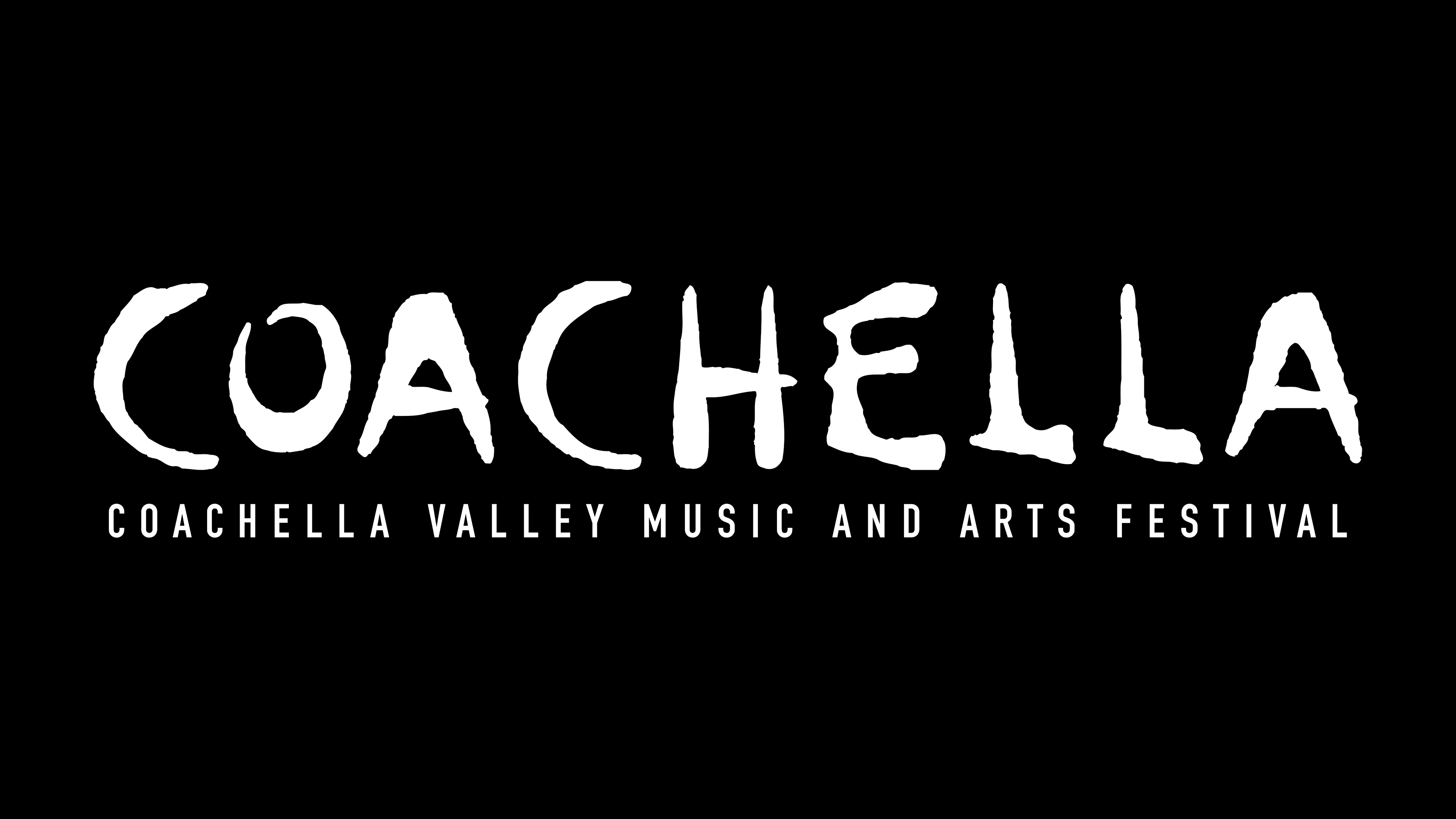
The top inscription in the Coachella logo is executed in a custom typeface. Like the festival, it impressed fans, so later (in 2014), designer Jimmy Lesondak developed a similar set of letters based on it, naming it ChellaType Regular. The text in the bottom row is typed in a strict font, reminiscent of TGL 0-1451 Engschrift Regular, with minor modifications. The emblem’s color is classic black.