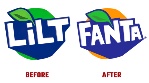
In February this year, the Coca-Cola company announced that it was changing the name and look of its popular drink with grapefruit and pineapple. It had been around for nearly half a century and was in great demand in the UK, so this decision caused concern among its fans. However, the brand owner said that only the outside of the bottles had been changed, while their contents remained the same.
As a result, at the end of winter 2022, the first batches of Fanta Pineapple & Grapefruit instead of Lilt Soda entered the market. The producer poured the carbonated drink into three kinds of containers (300 ml, 500 ml, and 2000 ml) and decorated them with a label with a new logo. It is made in the style of Fanta logos, which shows the intention of the brand owner to produce “tropical sweetness” under this brand in the future.
There are graphic images and text on the badge. The first one is the background, and the second one is the name. The inscription is concentrated in the upper part. Each letter seems to be taken in an improvised frame, corresponding to the glyph’s height, width, and shape. That is, the background is uneven: in one place, it is higher; in another – lower. Regarding the text, it can also be noted that it is characterized by the following:
- block characters;
- light color;
- capital font;
- elongated feet.
The base on which the name is located is geometric. It looks like an inverted triangle with the tip pointing downward or like a large arrow pointing to the bottle’s contents. The center of the figure is shifted to the left, so it looks slanted. The lettering is also diagonal. But despite the rebranding, the iconic grapefruit-pineapple flavor remains unchanged.


