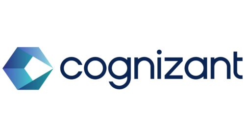
The Cognizant logo embodies the process of transformation and the implementation of digital technologies, which is the company’s area of expertise. Each element of the emblem signifies a well-orchestrated, phased movement toward a goal under the leadership of a field expert.
Cognizant: Brand overview
| Founded: | 26 January 1994 |
| Founder: | Kumar Mahadeva, Francisco D’Souza |
| Headquarters: | Teaneck, New Jersey, U.S. |
| Website: | cognizant.com |
Initiated in 1994 as Dun & Bradstreet Satyam Software, Cognizant began as an internal tech division of Dun & Bradstreet, situated in Chennai, India. Two years later, the firm ventured beyond its parent company to serve external clients and became an independent organization called Cognizant. In 1997, the company relocated its headquarters to the United States and went public the following year, securing a spot on the NASDAQ.
Throughout the first decade of the 2000s, Cognizant experienced significant growth by diversifying its service offerings. It evolved from primarily focusing on application maintenance to embracing other fields, such as systems integration, consultancy, and business process outsourcing. Some notable achievements for the company include surpassing the $1 billion revenue mark in 2003 and joining the ranks of the Fortune 500 in 2011.
As it stands today, Cognizant is a multinational entity specializing in technology and consulting services, employing over 300,000 people across the globe. The company offers its expertise to a broad range of sectors, including but not limited to healthcare, financial services, manufacturing, and retail. Persistent in pursuing innovation, Cognizant allocates resources to emerging technologies like artificial intelligence, data analytics, cloud solutions, and digital engineering. These investments aim to cement its reputation as a frontrunner in facilitating digital transformations for enterprises.
Meaning and History
Cognizant was originally founded as a technological division of Dun & Bradstreet in 1994 and initially handled internal tasks. Its first logo likely appeared in 1996 when the enterprise started serving external clients or in 1998 when Dun & Bradstreet split into IMS Health and Nielsen Media Research, making the division a subsidiary of IMS Health that went public. Two subsequent emblem changes are linked to the company’s growth and globalization stages.
What is Cognizant?
An American company founded in India that is hired for managing IT projects, websites, social media moderation, developing internet strategies, call handling, implementing CRM, ERP, etc. The giant’s services are in such high demand that it entered the Fortune 500 (at the 185th position) in 2011 and serves 177 companies from that list. Revenue stands at around 16 billion dollars.
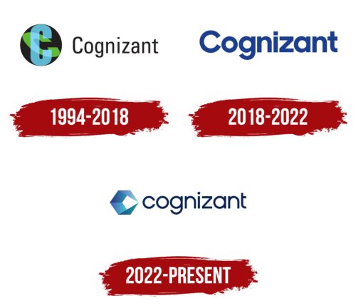
1994 – 2018
Cognizant’s first emblem consisted of an image and an inscription.
A round black sphere resembled the Earth. Inside it, on two planes, two letters ‘C’ were inscribed, representing the first letters in the organization’s name. These symbols looked like meridians and parallels. The image conveyed that:
- The company provides services globally. Local and regional centers are located in England, Australia, China, the Philippines, Canada, Mexico, and Brazil.
- The firm was established as a transnational entity. The vertical C indicates America’s involvement through the parent company Dun & Bradstreet. Horizontal placement hints at a partner in India – Satyam Computer Services, which invested 25% of the funds. The headquarters is located in the United States, with operational capacities in Chennai and other Indian cities.
- Cognizant’s work aims to assist companies in gaining global recognition and expanding their operational reach through the integration of internet technologies.
The name Cognizant derives from the mission – to make clients more informed about management processes, client needs, and other business matters. It aids in accumulating personal experience.
The subtle inscription of the name resembles a web, hinting at the World Wide Web. Neat, clustered oval-shaped letters represent an emerging, yet ambitious and meticulously operating, company.
2018 – 2022
The transformation of the logo in 2018 presented a successful global corporation whose offices span all continents and countries. The absence of graphic elements emphasized the serious bifurcation of the giant’s structure both vertically and horizontally.
Separate divisions worked with the fields of finance, health, enterprises, business, and banking. In each area, there were structures for analytics, technology implementation, mobile applications, and computations.
Due to the diversity of activities, geographic and national differences, the primary identifier uniting all structures was chosen as the corporate name.
The font of the inscription was changed to a larger and wider one, indicating growth and development. Clients of the company include Adobe, Amazon, and Google. A saturated blue background points to the technological direction of the giant and its work in the digital sphere.
2022 – today
In 2022, Cognizant underwent a reorganization, selling some assets and crystallizing key work directions. The period’s logo received a modern symbol, consisting of a blue strip folded into a three-dimensional quadrilateral. The ends of the fabric touch at thin angles on one side of the figure. The design resembles:
- The letter C in a specific technological style.
- A nut, as a prototype for constructing a new business system, transformation.
- A folder, symbolizing record-keeping and outsourcing work.
Three completed sides underline the organization’s tasks: modernize technologies, rethink processes, and transform experience into new steps. The effect of the touching ends conveys the idea of business meeting its consumer, reaching as many people worldwide as possible.
The interior space of the figure points its sharp end forward and resembles a rocket heading towards a goal.
Based on comments from Cognizant, the symbol signifies the company’s work in digitizing and transforming client businesses, which aids their progress and keeps them relevant to contemporary trends.
Font and Colors
Shades of blue dominate the logo’s color palette. Light colors emphasize cloud technology, computer software, data transmission, and collection. The dark blue in the corporate name signals professionalism and experience, as Cognizant operates across 20 different industries.
The font used for the company name resembles Yaro St Regular—a modern, revamped sans-serif variant with a modified “t.” The absence of a capital letter in the name signifies the company’s service-oriented role, promoting the growth of other companies rather than itself.
Cognizant color codes
| Space Cadet | Hex color: | #092452 |
|---|---|---|
| RGB: | 9 36 82 | |
| CMYK: | 89 56 0 68 | |
| Pantone: | PMS 655 C |
| Han Blue | Hex color: | #4864bc |
|---|---|---|
| RGB: | 72 100 188 | |
| CMYK: | 62 47 0 26 | |
| Pantone: | PMS 7455 C |
| Maximum Blue | Hex color: | #41b5c8 |
|---|---|---|
| RGB: | 65 181 200 | |
| CMYK: | 68 9 0 22 | |
| Pantone: | PMS 3125 C |
