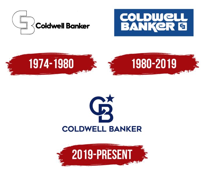
The Coldwell Banker logo represents the stability and prestige of the company. It is designed in calm tones that speak of reliability, innovation, and the company’s desire to achieve even more. All the elements are harmoniously combined and optimally blended against the neutral background.
Coldwell Banker: Brand overview
| Founded: | August 27, 1906 |
| Founder: | Colbert Coldwell, Albert Nion Tucker, John Conant Lynch |
| Headquarters: | Madison, New Jersey, United States |
| Website: | coldwellbanker.com |
Coldwell Banker is a well-known brand of American origin that has an extensive network of offices in the United States and other countries. It is managed by the large state corporation Realogy and is headquartered in New Jersey (Madison). Coldwell Banker’s specialization is directly related to real estate and transactions in this area.
The company has its unique logo, which demonstrates the desire and principles of its work. This is a contrasting badge that consists of the brand name and a stylish graphic element. The picture represents the first two letters of the name, which are originally superimposed on each other. The sign is complemented by the image of a star, symbolizing innovation and high achievements.
Meaning and History
Coldwell Banker is an American franchise operating for over 100 years. It is deservedly called one of the oldest in all of America. Over the entire work period, the company has constantly changed, developed, and introduced new technologies. In the process, its structure also expanded. Today, offices can be seen in more than 40 countries.
The visual identity of the oldest franchise has also changed several times. The modern version was formed relatively recently, about three years ago. It is a confident rectangular emblem in which the inscription in the form of a company name and a graphic symbol are harmoniously placed. The words Coldwell Banker are at the bottom.
They are made in a straight, flowing sans-serif typeface. At the top of the logo, there is a thematic symbol consisting of the first two letters of the name. A small star complements it. Combining these elements emphasizes the reliability, professionalism, and international level of the brand.
What is Coldwell Banker?
Coldwell Banker is a modern corporation with a worldwide reputation. The main office is located in America (New Jersey), and in other countries, the company has many branches. There are about 3 thousand of them. In addition to core management, they also report to parent company Realogy, which owns Coldwell Banker.
1909 – 1974
The company’s creation was due to the desire to ensure security in the field of real estate. The idea arose directly after a series of devastating fires and an earthquake in San Francisco. Colbert Colbert, Albert Tucker, and John Lynch formed a small real estate company in 1906. Already in 1914, Benjamin Bunker joined them. The new association received a new name – Coldwell Banker. The company developed rapidly, and already in 1961, it became a corporation.
1974 – 1980
The brand’s rise to a new level was accompanied by changes in the structure and the emergence of a unique corporate identity. Coldwell Banker has already worked under a stylish, laconic logo that combines classic and modern design. This reflected the essence of the company itself. She valued her past, but at the same time, she was eager to develop and innovate in the real estate industry.
The classics appeared in an achromatic color scheme consisting of white and black shades and a direct thin ExtraBold typeface. The shape of the letters resembled the printing style used in some editions. As a stylish addition to the inscription, a monogram consisting of the letters C and B was used.
They had square-shaped recesses in which their points of contact were located. A feature of word marks was that they were drawn with black outlines. The inside was completely white. This design demonstrated stability, trust, and authority in combination with a massive form.
1980 – 2019
From 1980, Coldwell Banker began to use a completely new logo. The result of the redesign is a more modern and refined emblem. It featured the brand’s name in large, confident letters and a reduced monogram from the previous version. All this was inside a rectangle filled with a rich blue. The shade symbolized reliability, strong positions in the market, stability, and trust.
The company’s values were also confirmed by using white for the lettering and the monogram. He demonstrated purity, transparency, and conscientiousness. These colors are harmoniously distributed. The inscription was painted white, blue was chosen for the background, and they were completely connected in the monogram. The new execution symbolized respect for the past of the company, as well as openness to new solutions.
2019 – today
Just a few years ago, Coldwell Banker rebranded again. This time, a unique, stylish version of the logo was created, which is still used today. It has no rectangle restrictions, just a white background without any lines. On it, you can see the company’s name, but it has shifted to the bottom.
Instead of a thick font with unusual cuts, a more refined and strict format was already used, which gave the emblem a more modern look. In the center is an expressive monogram complemented by a small five-pointed star. All elements are made in the same style and painted in the same color – blue. The intersecting letters of the monogram demonstrated the high status of the company and the strengthening of its position in the real estate sector.
The star denoted impressive achievements that repeatedly happened over the entire period of the company’s activity. In addition, the five-pointed star can also be interpreted as a symbol of the international level. Coldwell Banker Corporation has improved its services and products so that they are appreciated in many countries outside the United States.
Font and Colors
The stylish corporate badge of the company is made in Wordmark format. This style is great for brands in the financial industry. In this case, the emblem consists of a wordmark that includes two lines and a graphic symbol of crossed letters C and B. The lettering used a soft and thin font, symbolizing the brand’s dedication.
It is quite neat and, due to its sophistication, harmonizes perfectly with the monogram. The latter is more expressive. It consists of two large letters, originally superimposed on each other. There is also a star at the top of the monogram. The icon expands the semantic load of the general concept. Together with the inscription and stylized letters, it symbolizes high achievements.
The color palette consists of only two colors: white and blue. All logo symbols are painted in a rich blue tint, and white is used for the background. This palette was not chosen by chance. She demonstrates trust, openness, goodwill, and professionalism. White also emphasizes the openness of the brand and its honesty towards customers and partners. These qualities are the core values of one of the oldest franchises in the United States of America – Coldwell Banker.
Coldwell Bankers color codes
| Royal Blue | Hex color: | #0c2162 |
|---|---|---|
| RGB: | 12 33 98 | |
| CMYK: | 88 66 0 62 | |
| Pantone: | PMS 280 C |


