Goods necessary for everyday life at affordable prices – this is the main motto of the emblem. The Coles logo is filled with vitality and a tireless desire to help customers. The sign speaks of the popularity and prevalence of chain stores.
Coles: Brand overview
| Founded: | 1914 |
| Founder: | George Coles |
| Headquarters: | Hawthorn East, Victoria, Australia |
| Website: | coles.com.au |
Meaning and History
Coles Supermarkets’ visual identity is supported by many specialists who work on all aspects – right down to in-store graphics. Initially, the retailer’s marketing engine was slogans emphasizing low prices. They changed as often as logos because the company tried to be relevant, regardless of the era.
The foundation for the retailer’s development was laid by George James Coles, the entrepreneur who opened the Coles Variety Store in 1914. As the business expanded, dozens of other stores joined the first outlet. The assortment was also constantly changing: everything started with ready-made food, then the shelves were filled with electrical appliances and cosmetics. In the 1950s, supermarkets began to operate on the principle of self-service. But the actual history of Coles logos goes back to the 1960s because that’s when the retail chain changed course and switched mostly to food products.
What is Coles?
Coles Group Limited is an Australian company that runs retail chains. It owns such big brands as Coles Express (fuel sales), Coles Online (home delivery), Coles Liquor (liquor sales), and Coles Supermarkets (several hundred retail stores).
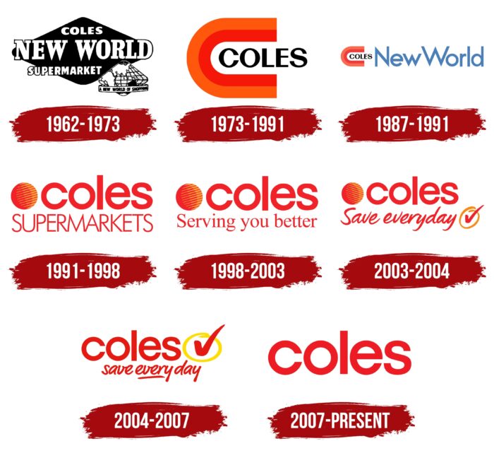
1962 – 1973
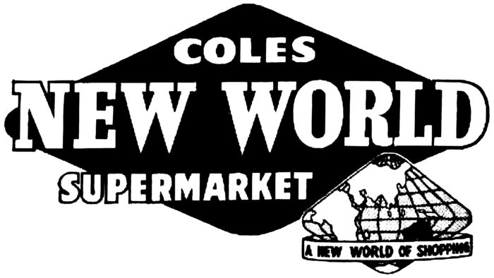
As part of the “tomorrow’s shops, today” program, the supermarkets got the name Coles New World and a new logo, which consisted of two rhombuses with rounded corners. One geometric figure was large and black. It was in the center and contained a white inscription divided into three parts: in the first line – “COLES,” in the second – “NEW WORLD,” in the third – “SUPERMARKETS.” Notably, the word combination in the middle was written in bold type with rectangular serifs, while the designers used a rounded grotesque for the outermost words.
The second rhombus was shown in the lower right corner. It contained part of a map with two oceans (the Pacific and Indian), Africa, Asia, Antarctica, and Australia itself, highlighted in black for some reason. The irregularly shaped globe was encircled by a white ribbon titled “A NEW WORLD OF SHOPPING.” This slogan was about Coles’ improved concept of opening freestanding stores with a parking lot. The identity at that time was related to the space age, as it was space that was associated with innovation.
1973 – 1991
In the 1970s, the company changed its marketing approach again, emphasizing innovation and lowering the cost of goods. And its logo, designed in 1973, was to attract even more customers because the figure in the shape of the letter “C” symbolized a magnet attracting success, affordable prices, and, of course, new customers. This “C” looked very bright because it consisted of two connected strips of orange and red. In the free space between the two horizontal strokes was the black word “COLES” – or rather, the initial letters were inside, and the last “E” and “S” looked out. They used a high-contrast, sans serif font. The logo change coincided with the opening of Coles stores in all Australian capitals.
1987 – 1991
Since the supermarkets were still called Coles New World, the designers decided to reflect this in a new graphic sign. They kept the two-color “C” with the black word and added the blue word “New World” on the right side, written in a pointed, sans serif font. The size of the elements was very different: one half of the logo was disproportionately small, and the other half was too big.
1991 – 1998
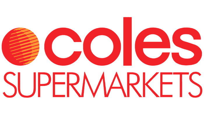
In the early 1990s, the retail chain was renamed Coles Supermarkets and began to introduce Internet technology actively. At the same time, the color red became the basis of its visual identity. It was in everything – even in the logo, which now consisted of two words. At the top was the first part of the brand name, written in lowercase letters and complimented on the left side by a red-orange circle. Judging by its slanted axis, it imitated the globe, so the reference to the New World space theme was still there. The word “SUPERMARKETS,” at the bottom, stood in capitalized thin letters at very narrow intervals. The designers used radically different fonts so that the two lines were the same length for visual balance.
1998 – 2003
In 1998, the supermarket chain became known simply as Coles, which slightly changed the logo. The designers made the color palette not as bright as before and placed its slogan “Serving you better” under the company name. It was written in a standard serif font similar to Times New Roman. This advertising slogan was used until 2003.
2003 – 2004
In 2003, the old slogan was replaced by a new one: “Save everyday.” The designers left it at the bottom but changed the typeface to handwritten and placed a red checkmark to the right of the phrase, encircled by an orange ring. This checkmark was meant to symbolize the availability of a full assortment – everything customers might need on the list.
2004 – 2007
After another redesign, the red-orange ball was removed, although it was used on supermarket signs until 2010. The creators of the logo made the checkmark bolder and moved it to the top so that it was to the right of the word “coles.” The ring around it became bright yellow. The slogan was made slightly smaller, and the first “s” was moved to lower case. At the same time, the designers emphasized the “ever” part in “everyday” to increase the semantic emphasis.
2007 – today
After 93 years since the company was founded, it has a current logo, adopted after the chain of stores was taken over by the Australian conglomerate Wesfarmers. It consists of one word, “coles,” written in the red circular font. All other elements were removed, perhaps because of an attempt to follow fashionable minimalism. This allowed the supermarket chain to focus only on its name.
Font and Colors
Cards, C-magnets, balloons, and checkmarks are a thing of the past – now, the Coles trademark is incredibly simple. Since its adoption in 2007, the company had time to leave Wesfarmers and become independent again, but such large-scale changes did not affect its logo. The thing is that the name of the trading network is remembered by the customers exactly as it remains to this day: minimalistic, red, and consisting of large letters.
The bold geometric grotesque used in the word mark Coles has several counterparts. First of all, it is similar to the Avant-Garde Gothic Demi Bold created by Herb Lubalin & Tom Carnase. It also resembles Touche Medium by Indian Type Foundry, Sonny Gothic Regular by W Foundry, and (to a lesser extent) Qanelas Soft Semi Bold by Radomir Tinkov.
The red color (shade PANTONE 485 C) was not chosen by chance. It attracts customers’ attention with its brightness and is also associated with discounts because most promotional activities traditionally use exactly red palettes.
Coles color codes
| Pigment Red | Hex color: | #ed1c22 |
|---|---|---|
| RGB: | 237 28 34 | |
| CMYK: | 0 88 86 7 | |
| Pantone: | PMS Bright Red C |
