


![]() Color Street Logo PNG
Color Street Logo PNG
The Color Street logo features bright colors that can be used to decorate clients’ nails. The elements of the emblem are like well-groomed fingers with a neat manicure and perfect coverage. Whether it will be neutral and inconspicuous or bright and saturated is up to the customers.
Color Street began in 1988, when Fa Park, a Korean musician who had moved to the United States on a scholarship, noticed a woman struggling to paint her nails amid New York traffic. He bought nail polish at a pharmacy and started testing it on paper, drying it with a hair dryer, and studying how the film behaved. His first patent was filed that same year.
For the next 17 years, Park taught music while studying nail polish chemistry and machine engineering. He needed a strip that felt dry on top but stayed moist underneath so it could bond to the nail. By 2005, his work had produced a large patent portfolio, which later grew to about 70 protected inventions. L’Oreal and Revlon tried to buy the technology, but Park kept control.
The first major commercial order came in 2005: one million strips for Avon. Private-label work followed for Sephora, Sally Hansen, and OPI, giving Park factory scale and industry credibility. His larger aim was still to be a direct consumer brand rather than remain only a supplier to cosmetics companies.
Color Street launched in June 2017 with more than 1,400 independent “stylists” and 62 nail-strip designs. Unlike Jamberry’s vinyl stickers, Color Street uses real nail polish with a base, color, and top coat in a single strip. Sales reached about $120 million in 2018, and the stylist network grew to over 44,000 by 2021. The brand entered Canada that year, added makeup in 2022, and kept production in Clifton, New Jersey.
Meaning and History
This cosmetic brand started with problems. More precisely, from the seen problems, when a cab passenger tried to quickly clean her nails and paint them in the car. Fa Park watched the sad action at a traffic light, and when he arrived home, he immediately went to the store to buy nail polish to begin the experiments. He applied nail polish under unequal conditions to different paper types until he got the perfect one. In the end, the entrepreneur discovered a unique formula, which he patented and began to implement in production.
The brand concept is built on the principle of beauty and practicality. These are incredibly bright tones with easy application, quick drying, and easy removal. In its fashionable nail polishes, the manufacturer reflects, first of all, modernity, and secondly, universality. The logo embodies this idea by using a basic palette for nail art. These are delightful colors, 100% lacquered, shiny, with an impeccably glossy surface.
What is Color Street?
This direct-sales company transformed the approach to at-home manicures by offering innovative nail polish strips that deliver a perfect manicure in minutes. The brand offers a variety of designs, from classic solid colors to intricate patterns, as well as seasonal collections. Regardless of skill level, anyone can achieve a professional manicure thanks to a network of independent stylists delivering salon-quality polish directly to the home.
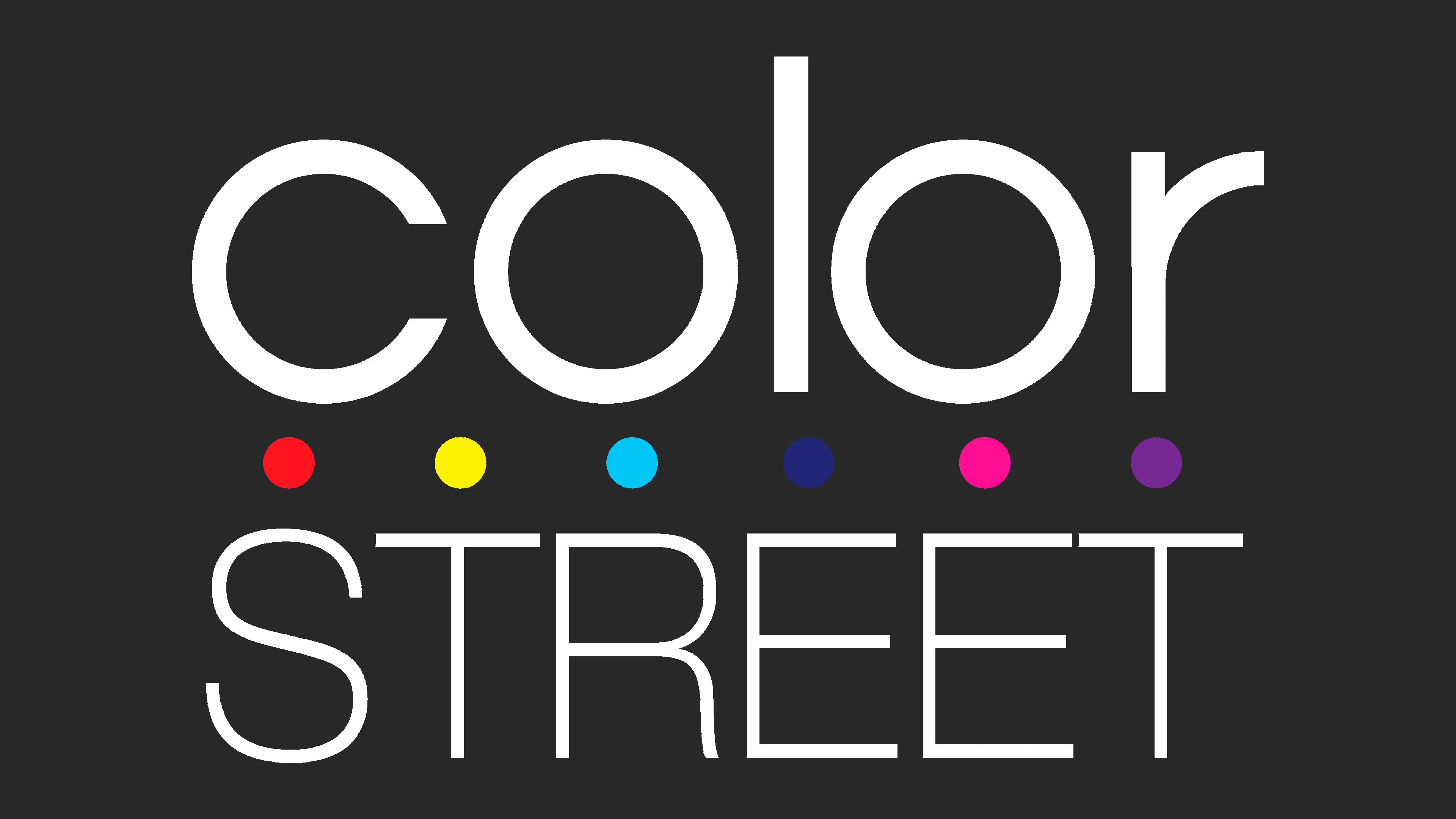
The combination of modernity, brightness, and practicality of the products is reflected in the brand logo. On the one hand, it has strict black elements; on the other hand, it contains magical, iridescent inclusions. Such a combination conveys a sense of celebration even in a business casual setting. The logo has two basic parts: text and graphics. They are both very simple, light, and not overloaded with many details. They clearly show the simplicity that the cosmetics company aspires to in its patented nail polishes.
The lettering is the brand name, composed of two words in different styles. The first fragment of the word combination is at the top. It is written in lower-case bold type. The letters are spaced optimally, making them easy to read and comprehend. The characters are rounded, streamlined, and chopped. There are no abrupt transitions. The second half of the name occupies the bottom line. The second half is made to contrast with the first because its signs are as thin as possible, with clear right angles both inside and outside. The word is written in capital letters and placed almost side by side.
The graphic part consists of colorful spots of the neon spectrum. They convey the mood of the brand’s products, embody the tone of the nail polishes, and represent the brand’s core range. The six dots divide the company name into two, preventing it from merging. They look like dotted lines drawn with thin brushes on white paper. The miniature circles are colored in red, yellow, blue, navy blue, pink, and purple. Bright accents immediately catch the eye, even at a glance at the logo; they attract and intrigue, making you interested in the products.
Font and Colors
Color Street has just one personal identity mark to make the brand recognizable. It hasn’t changed since its inception and was approved early in the brand’s career. This symbolism contains two opposites: practicality and brightness. The company’s founder emphasizes the idea of a shared image. That in any situation, in any clothing, there is bound to be a place for colorfulness, in the form of glossy, well-groomed nails.
Two types of garnish are used in the logo. The first part of the name is written in a font reminiscent of Avalon Book by FontSite Inc. as much as possible, but with thicker letters. The second word is written in a typeface close to Aovel Sans Regular, which designer Alvaro Thomaz created.
The color palette of the emblem is bright and saturated, edging into the neon spectrum. It is dominated by red, purple, navy blue, yellow, pink, and sky blue. The letters are colored in black, which makes them stand out wonderfully against the white background.