


![]() Columbus Blue Jackets Logo PNG
Columbus Blue Jackets Logo PNG
No hockey attribute can be used in the emblem to show a direct connection to hockey and a great love for it. This is proven. For example, the team chose the Columbus Blue Jackets emblem, featuring a star and flag in a patriotic style, removing the stick. It created an imbalance in the symbolism and was not well-received by fans.
The state of Ohio (especially its northern part near Detroit) has always been fond of hockey. However, NHL officials did not seem interested in establishing a franchise there. “Cleveland Barons,” having moved from California in the 1970s, were merged with “Minnesota North Stars” just two seasons later. At the end of the 1990s, Cleveland was not the most famous sports city. Although the baseball club played in Major League Baseball, the basketball team consistently lost seasons and did not make the playoffs; a new football team was planned only to replace the one that ran away to Baltimore. Under these conditions, Ohio residents decided to establish a hockey team in Columbus, the state’s capital, a rapidly growing city. At that time, it was the hometown of the professional soccer club “Crew.” This didn’t mean hockey wouldn’t have competition; the city was literally obsessed with college football, but it wouldn’t be as fierce as in Cleveland.
The NHL Commissioner, Gary Bettman, approved the proposal, as he was keen to maintain interest in hockey in Ohio. But city authorities didn’t want to allocate public funds for sports facilities. It was decided to hold a referendum, which showed that Columbus residents did not want a state-funded arena. Columbus’s hopes for an NHL offer faded. Unexpectedly, the insurance and financial company Nationwide announced that it would pay for the construction of a $150 million arena.
In 2000, the “Columbus Blue Jackets” played their first regular season in the NHL. The “Name the Team” contest showed that over 14,000 fans supported the “Columbus Blue Jackets” option. The team was named after the Union soldiers’ uniforms during the Civil War (1861-1865). Ohio is proud of its key role in providing the Northern Army with troops, officers, and supplies. It gathered more soldiers than any other state. Several leading generals were from Ohio, including Ulysses Grant (future President of the USA), William Sherman, James Garfield (future President of the USA), and George Custer. Finally, the Union’s dark blue uniforms were sewn right in Columbus. The name turned out to be doubly relevant. Moreover, Blue Jacket was the chief of the Shawnee Indians, known for his militant defense of the tribe’s lands in Ohio in the late XVIII – early XIX century.
Meaning and History
![]()
The “Columbus Blue Jackets” team began play in Ohio in November 1997 as part of the NHL’s expansion. Although the “Columbus Blue Jackets” have only three logos, they are legendary identifiers. They are dedicated to the entire population of Ohio, particularly the city of Columbus, as a tribute to the country’s enormous support during the Civil War. All emblems are connected to the franchise’s name and symbolize patriotism, courage, fearlessness, and the drive for victory.
So now it’s clear where the name Blue Jackets came from. By the way, the famous cannon that fires at home games when the “Blue Jackets” score a goal is a tribute to Ohio’s history. The official mascot of the “Columbus Blue Jackets” is Stinger, a bright green bug with red eyes.
The team’s color palette consists of blue, red, and white, which are the colors of the flags of Ohio and the USA. However, the team’s emblem let the fans down a bit with its neon-green stinger. Overall, it was not attractive. The original logo was a red ribbon with stars unfolded into the shape of the letters “CB,” with a stick cutting through the center to depict “J.” An additional silver star crowning the stick symbolized Columbus as the state capital. The logo resembled a Christmas tree very much.
The franchise’s alternative logo was a wasp. A wasp? Why? It might seem a bit strange, but it’s a play on words. Yellowjacket is the common name for predatory social wasps in North America. Inspired by this symmetry, the club invented a new insect unknown to nature – a wasp in a Yankee soldier’s jacket with a stick. Luckily, fans disliked this malevolent insect, which led to its “death” a few years later.
In 2003, the “Blue Jackets” received a new dark-blue jersey featuring two new logos.
What is Columbus Blue Jackets?
The Columbus Blue Jackets are an NHL hockey club, a member of the Metropolitan Division, and a representative of the Eastern Conference. It is based in Columbus, Ohio. The team plays its home matches at the local Nationwide Arena.
2000 – 2003
![]()
In 2000, the team introduced its first logo, which consisted of an emblem and an inscription. The emblem was a red ribbon with 13 stars symbolizing the 13 colonies. A yellow J-shaped stick cuts through the center with a silver star on top, symbolizing Columbus. The team name, “Blue Jackets,” written in white and framed with a red border, was located under the city’s name. The entire logo was placed on a dark blue background.
2004 – 2007
![]()
For the next four years, the emblem remained practically the same as the previous one. The red ribbon with thirteen white stars, the yellow J-shaped stick, and the silver Ohio star were still present, but this time, the text elements were removed completely.
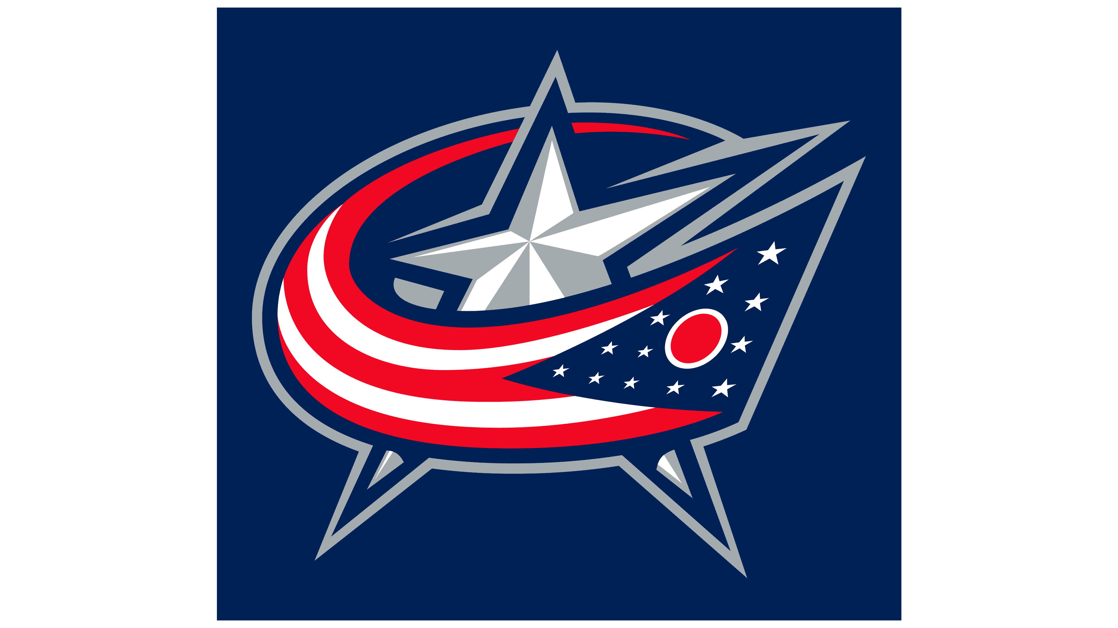
2008 – today
![]()
Eleven years ago, there was another logo change as part of the redesign for the new season, sponsored by Reebok. Now, a version with a large silver star is used. It is surrounded by the Ohio flag, wrapped around it in the form of the letter C. The beginning of the panel (where the pole should be) is on the right, then bends left and up to form a loop. Two lower rays of the five-pointed star extend beyond the flag and form sharp triangles. The right and upper rays are fully visible, while the left is hidden behind the panel, so it appears smaller.
The logo also consists of twelve small stars and a circle between them. White and red stripes occupy the rest. All elements are outlined by a dark blue line that expands upward and becomes the flag’s shadow.
Font and Colors
The debut version is an unusual monogram “CBJ,” an abbreviation of the phrase “Columbus Blue Jackets.” The red stripes and yellow sticks are positioned to make the letters easy to read. The signs have sharp angles, and at the top of the improvised letter “j,” a large star proudly stands in place of a dot. There are smaller stars on the ribbon. The second emblem is also an abbreviation, this time of the word “Columbus.” It refers to the city where the franchise is located.
The abbreviation is made in a custom font. The name at the bottom of the very first logo is done in a classic serif font. Capital letters “B” and “J” seem larger than the rest, although all symbols are uppercase.
According to the Pantone color matching system, the emblem contains the official colors of the hockey club: blue PMS 282, plain silver PMS 429, and red PMS 186. It also uses metallic silver PMS 877 and white.
FAQ
What does the Columbus Blue Jackets’ emblem mean?
The team’s logo reflects patriotism. Initially, it was a red ribbon studded with stars and surrounding a yellow stick. Then, it was replaced by the US flag, wrapped around a large silver star. In total, the emblem has 13 stars, symbolizing the American colonies.
Who designed the “Columbus Blue Jackets” logo?
Designer Ken Loh designed the original logo. He styled the first letters of the word “Blue Jackets” as graphic elements: “B” was depicted as a twisting red ribbon, and “J” was a yellow hockey stick.
What is the mascot of the “Columbus Blue Jackets”?
The mascot of the “Columbus Blue Jackets” is Stinger. This bug is bright green. The anthropomorphic character wears the team’s uniform and bears the number 00 because it appeared in 2000.
Where did the name “Columbus Blue Jackets” come from?
The name comes from two significant factors. Columbus is the birthplace of the hockey team. Blue Jackets is a tribute to Ohio’s historical heritage, including its participation in the Civil War and the patriotism of its residents.