Commscope’s logo twists like a digital highway of cables. This emblem represents a leading cable manufacturer that facilitates adding new users to the network, thus expanding the online world.
Commscope: Brand overview
| Founded: | 1976 |
| Founder: | Frank M. Drendel |
| Headquarters: | Hickory, North Carolina, U.S. |
| Website: | commscope.com |
Emerging as a subset of Superior Continental Cable in 1953, CommScope started its journey in Hickory, North Carolina. The parent company branched out in 1961, forming a specialized unit called Comm/Scope to concentrate on the coaxial cable market. In 1976, entrepreneurs Frank Drendel and Jearld Leonhardt gained control of the CommScope product line from Continental Telephone, thereby establishing CommScope as an autonomous entity.
The company grew organically and through strategic acquisitions during the ensuing decades, specifically the 1980s and 1990s. It widened its reach beyond the United States, entering markets in Europe, Asia, and Latin America. A pivotal moment in its corporate history came in 1997 when it separated from General Instrument and took the leap to go public. Shortly after, the company achieved another significant milestone, surpassing $1 billion in yearly revenue by 2000.
In 2011, a notable development was the acquisition of Andrew Corporation, a major player in wireless network infrastructure. This move considerably broadened CommScope’s range of offerings. Today, the company stands as an international leader in communications network infrastructure, boasting a workforce of over 30,000 people across the globe. CommScope remains at the forefront of technological advances and focuses on innovative developments in 5G networks, WiFi 6, fiber optic solutions, small cellular technologies, and intelligent networking software.
Meaning and History
CommScope originated as a product line of Superior Continental Cable. Yet the brand’s logo remains unknown because the fate of the brand changed quickly over the years. A year later, in 1976, the brand was bought by two business partners, making Commscope an independent company. After two more years, the company became part of the Valtech brand and changed ownership several times until 1997, when it regained its independence following a split from General Instrument. Since then, the company has undergone multiple logo changes. Major rebrandings coincide with significant acquisitions that expanded Commscope’s capabilities.
What is Commscope?
An American company that manufactures cables and creates network connections. Its solutions include copper options like GigaSPEED and fiber-optic choices like LazrSPEED and TeraSPEED. Every day, 1.6 kilometers of CommScope cables are laid around the world.
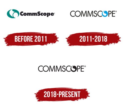
before 2011
The company emblem provides an accurate representation of Commscope’s business focus. The graphic element is a green oval stretching a white cable. The coloring of the design speaks to the expansion of networks and the emergence of new infrastructure nodes.
The cable’s movement from a distance toward the viewer creates the illusion of immediacy and readiness to act right here and now. The smooth curve gives the symbol an elegant and visually pleasing quality.
To the right of the design, a closely grouped bold lettering follows. The font indicates the junction of cables to create a comprehensive network. Two capital letters divide the name into components: Comm from “communications” and scope.
2011 – 2018
In 2011, after acquiring Andrew Corporation, the company logo changed to a lighter and freer design. The company name is rendered in slim capital letters, indicating expansion. The final letter “O” has transformed into a blue circle with a white stripe, resembling a schematic representation of a cable. Interestingly, the blue part of the design resembles a wire as well. The figure points to cable connections, network expansion, and a link between Commscope’s clients and the outside world.
2018 – today
After merging with Arris International, the company logo changed its color scheme to black and white. This change resembles the Yin and Yang duality and conveys:
- Merger of two companies.
- Emergence of two directions: cable and satellite.
- Formation of connected branching systems.
- Bidirectional information transfer within the wires.
The design evokes a feeling of submersion underground, where a modern high-speed digital highway runs.
The design and font of the inscription remain unchanged.
Font and Colors
The black-and-white palette hints at the cyclical process of laying new lines (white) and the subsequent company globalization (black). The more clients Commscope serves, the larger the corporation becomes. Black corresponds to the outer coating of fiber optic cables. White represents the pulse or data packet flow, which appears as bright flickers moving within the network.
The font used for the inscription is Montreal Serial Regular. Each glyph resembles a separate wire bent to form the necessary letter.
Commscope color codes
| Raisin Black | Hex color: | #231f20 |
|---|---|---|
| RGB: | 35 31 32 | |
| CMYK: | 0 11 9 86 | |
| Pantone: | PMS Neutral Black C |


