The Community Fibre logo is associated with speed and advanced technology, as the London provider offers one of the fastest internet networks in the UK. The designers incorporated connectivity, continuity, stability, and determination into the emblem, effectively capturing the company’s essence.
Community Fibre: Brand overview
Community Fibre’s history started in 2010 in London, United Kingdom. A group of businesspeople and tech experts launched the company because they recognized the need for high-speed internet access in London’s residential districts, especially social housing.
The company was founded to offer low-cost, high-speed internet to those living in social housing in London. The founders believed that having access to broadband internet depended heavily on social cohesion and economic growth.
Early on, the business concentrated on establishing connections with London’s housing organizations and municipal governments. This was crucial for obtaining permits to install fiber-optic networks in residential areas.
2012 marked a critical turning point for the firm. The company’s first major contract involved connecting social housing in the Wandsworth neighborhood of South London. This project allowed the company to showcase its capabilities and served as a springboard for future expansion.
2013, the business began expanding its network to connect more homes in various London districts. Unlike traditional copper networks, the company’s fully fiber-optic network enabled faster internet speeds.
In 2014, the firm made a major technological advancement by offering internet speeds of up to 1 Gbps to private homes—a groundbreaking service in the London market.
The company attracted its first major investment in 2015, which allowed it to expand its workforce and accelerate network deployment. That same year, the business began offering services to small businesses in addition to residential homes.
The year 2016 saw substantial growth. At the time, the greatest project in the company’s history was the internet provision for a major residential complex in East London, which was won through a tender.
When the company connected its 10,000th house to its network in 2017, it reached a major milestone. This achievement highlighted the business’s rapid growth and the increasing demand for its services.
The firm accomplished a noteworthy financial milestone in 2018. The British railway workers’ pension fund, RPMI Railpen, contributed £50 million to the company. These monies went toward enhancing services and growing the network.
In 2019, the company revealed an ambitious plan to connect one million London homes to its network by 2023. This plan reflected the company’s confidence in its growth and market potential.
2020 saw several noteworthy developments. £400 million in fresh investments were obtained from DTCP and Warburg Pincus, two private equity funds. The company greatly expedited the implementation of its network thanks to this funding.
As part of its ongoing expansion, the business started offering services in new parts of London in 2021. In keeping with its goal of being a technological pioneer, the corporation started testing 10 Gbps technology.
The company ushered in 2022 with the release of new goods and services. To compete with the biggest telecom companies, the company started providing internet service packages that included television and phone service.
In 2023, the company expanded its fiber-optic internet network as part of its aggressive growth strategy in London. By connecting its one-millionth home to the network, the company reached a milestone that solidified its position as one of the leading high-speed internet providers in the UK capital. This expansion was funded by additional contributions from existing shareholders, enabling the firm to rapidly extend its network into new areas of London.
That year, the enterprise introduced a brand-new digital inclusion program to give elderly and low-income families access to high-speed internet. The company demonstrated its commitment to decreasing digital inequality by offering free digital literacy training courses and subsidized rate plans as part of this campaign.
The firm may be the first operator in London to provide residential customers with speeds this high. In early 2024, it said it would begin testing 10 Gbps technology. This technical triumph demonstrated the business’s dedication to remaining at the forefront of broadband innovation.
In addition, the company has announced its intention to roll out its network in several other UK cities, extending its services beyond London. With this change, the provider entered a new growth stage and became a nationwide player in the broadband industry, replacing its previous role as a local provider in London.
Meaning and History
What is Community Fibre?
It is a UK-based Internet Service Provider (ISP) specializing in providing high-speed fiber optic broadband services. The company provides fast and reliable internet connections to residential and business customers, predominantly in urban areas. It offers competitive prices and excellent customer service, making high-speed internet available to a wide audience. The company guarantees customers a stable and reliable Internet experience using the latest fiber optic technology.
2013 – today
The Community Fibre logo has two parts: a graphic element and a text mark. The text includes the company name, split into two lines and aligned to the left. The text is in a balanced, sans-serif font, giving it a modern and clean appearance. The only hint of a serif is in the letter “i,” where a rectangular protrusion visually connects it to the adjacent letters with straight horizontal strokes. This creates a sense of unity, embodying the concept behind one of the fastest providers in the UK.
Combining the “ty” glyphs in the word “Community” further conveys the idea of unity and connection. The horizontal stroke of the “t,” which touches the diagonal line of the “y” due to the narrow spacing between the letters, links them. The inseparability of “ty” adds dynamism to the logo, highlighting the company’s commitment to creating a fast and reliable internet network.
The soft, rounded lines of most letters, combined with the tapered ends of “m,” “u,” “n,” “b,” and “r,” evoke a sense of fluidity, balance, and stability. This reflects the high quality of services the provider offers to London residents. The geometric font with uniform stroke thickness helps visually balance the text, making it clear and memorable.
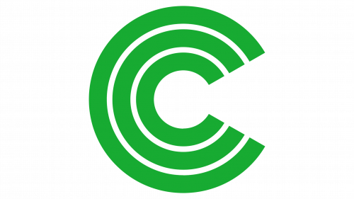
The graphic element is a stylized “C” composed of three arc-shaped lines of varying sizes. Essentially, these are three identical letters placed inside one another. Their design symbolizes communication, connection, and continuity, reflecting the essence of a company focused on providing broadband Internet access. The emblem also resembles:
- A cross-section of a fiber optic cable indicates that Community Fibre uses only fiber-optic networks.
- A radar signal represents the concept of coverage and reach.
- A keyhole, suggesting that the provider opens the door to high-speed Internet for its customers.
- A Wi-Fi symbol directly references the company’s field and high service quality.
- A target symbolizes precise and targeted solutions.
Although this association was unintended, the layered “C” resembles a stylized copyright symbol. By using elements in a geometric style, the designers aimed to emphasize Community Fibre’s modernity, technological advancement, and innovation.
The logo is rendered in green, linking the text and graphic emblem. Green represents harmony, safety, and trust, creating a positive brand perception. Additionally, green symbolizes growth and progress, underscoring the Internet provider’s commitment to expanding its network and implementing the latest technologies.
