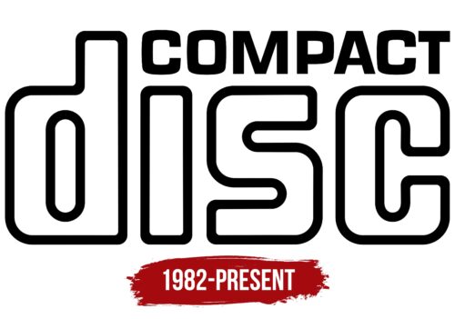
The Compact Disc logo is confident and strong. The emblem creates an impression of a spacious storage unit, ready to accept user-required information. The logo conveys reliability, speed, and simplicity.
Compact Disc: Brand overview
| Founded: | 1982 |
| Founder: | Philips, Sony |
The inception of the compact disc, or CD, technology was a collaborative effort between Philips and Sony in the late ’70s and early ’80s. This digital medium was designed to store and play audio, revolutionizing how we interacted with music and sound. The first public prototype introduction came in 1979, with commercial versions hitting the shelves in Japan by 1982 and spreading to Europe and North America by 1983.
Initially, a compact disc could house up to 74 minutes of stereo audio and had a diameter of 12 centimeters. This original version became recognized as the CD-DA, short for Compact Disc Digital Audio. Within a few years of its launch, by 1985, CDs began to win the hearts of consumers as they started to prefer them over traditional vinyl records and cassette tapes.
Towards the late ’80s and throughout the ’90s, technological advancements in manufacturing techniques allowed these discs to store up to 80 minutes of audio and, eventually, up to 700MB of data by the end of the century. This evolution didn’t just stop at music; the CD’s technology paved the way for variations like the CD-ROM for data storage, the writable CD-R, and even adaptations for automotive and portable CD players.
CDs remained the primary mode for audio storage and playback for nearly two decades. However, the landscape began to shift toward the end of the 2000s as digital distribution channels and streaming services gained momentum. Although CDs were a ubiquitous part of global culture – evidenced by over 200 billion units sold by 2007 – their popularity took a nosedive post-2008 as alternative means of accessing music, such as streaming and downloading, became more prevalent.
Meaning and History
The first compact disc was launched by Philips and Sony in 1982 as a pilot project in Japan. The medium was given the full name Digital Audio Compact Disc, and a new logo was designed for it. The first commercial disc produced that same year was an ABBA album called “The Visitors” by the record company Polygram. From that point, the “Compact Disc” emblem, placed on the top part of all discs, gained annual recognition.
Advancements in technology and the introduction of different disc formats did not affect the general appearance of the logo. To differentiate, below the main emblem inscription, the disc range’s name was indicated on a separate oval background, for example, “digital video” for VCD or “interactive” for Philips CD-i.
What is a Compact Disc?
An outdated format for storing data, music, and video where tiny indentations were applied to polycarbonate in a spiral track, later read by a laser “needle.” The disc had a storage capacity of up to 870MB. Popular from 1985 to the early 2000s. By 2007, 200 billion discs had been sold. Subsequently, streaming services and flash drives replaced this technology.
1982 – today
The logo of the discs consists of the name written on two levels. Interestingly, the original invention was planned to be named Mini Disc or Compact Rack, but ultimately, the now-famous Compact Disc was chosen due to the popularity of Compact Cassette. The name successfully continued the theme of recording media and was received more favorably by customers.
The neat black inscription Compact is in uppercase letters. The closely positioned characters symbolize the compressed placement of information.
Below, in white letters with a bold black outline, is the word Disc. The inscription looks hollow, like a spacious storage unit. The bends of the black outline resemble the tracks where information is read. Each letter is like an individual sector on the disk surface.
The color choice indicates the usual light shade of the products, where polycarbonate plastic was covered with a layer of aluminum and protective varnish.
The large size of the inscription represents an impressive amount of data. At its appearance, the disk’s size was 60 times larger than a computer’s hard disk.
The placement of the word Compact at the top line level of the letter d symbolizes the principle of well-thought-out information layout, where no voids or free spaces are left on the disk. The letter “C” effectively replaces the dot on the “I.”
Font and Colors
The logo is built on the contrast of black and white. The former indicates the heavyweight, large volume of information the disc can store—up to 74 minutes of music recordings.
Interestingly, the original disk capacity was intended to be 60 minutes, but the director of Sony wanted the Ninth Symphony of Beethoven to fit entirely on the compact. Thus, the disk size increased to 74 minutes.
The hue signifies the global, widespread use of disks. By 2004, up to 30 billion units were sold annually.
White signifies space, data recording, and the input of new information. Light shades create a sense of lightness, and the disks’ small weight was just 33 grams.
The font of the inscription is Navine Black. Rounded letter corners hint at the disk’s circular shape. Meanwhile, the square silhouettes are similar to packaging boxes.
Compact Disc color codes
| Black | Hex color: | #000000 |
|---|---|---|
| RGB: | 0 0 0 | |
| CMYK: | 0 0 0 100 | |
| Pantone: | PMS Process Black C |


