Judging by the visual image, the software and computer components of the company are constantly being improved, and are open to introducing new technologies. The Compaq logo represents a firm that is focused on customer needs.
Compaq: Brand overview
| Founded: | February 16, 1982 |
| Founder: | Rod Canion, Jim Harris, Bill Murto |
| Headquarters: | Harris County, Texas, U.S. |
| Website: | compaq.com |
Meaning and History
Nowadays, it isn’t easy to imagine life without our electronic assistants – phones, laptops, and computers, but few people know and remember how it all began. The first giants of the international markets for personal computers and, later, laptops are now losing their recognition, being replaced by more fashionable models, more aggressive marketing of newcomers to the market, and, in general, more sophisticated ways to compete for their market segment. And yet, there is one company that still has not lost its chips, and, accordingly, the buyer, and this is the world-famous PC manufacturer Compaq in the past.
1982 – 1993
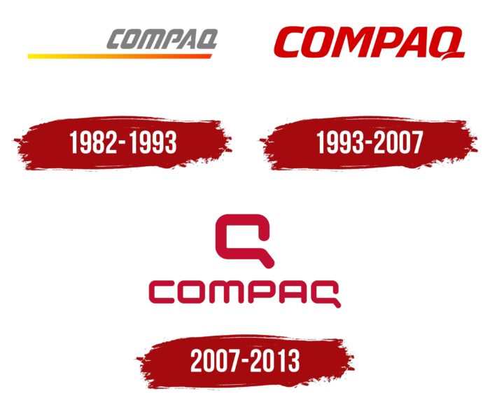
Since its founding, the company has maintained a minimalistic style in the logo, creating it in dark gray, simple and clear, containing only the company’s name. Personifying the laconic acronym “Compatibility and quality” (in translation, compatibility, and quality). The letters were presented in a slightly rounded font, tilted slightly to the right, with a yellow to red gradient stroke under the overall logo added color.
1993 – 2007
Since 1993, the company’s logo has undergone a color change from gray to red, adding sharp corners to the letter “M,” and the letter “Q” at the end of the tail received a small slit. At the same time, “P” and “A” lost it. Despite the color, the symbolism has not changed; the word Compaq has remained and remains the company’s main logo.
Since the takeover, most of Compaq’s products have been named after the parent company HP 2000 series, and yet despite this, the company’s logo has been preserved and in 2013 received its current look. With minor changes, it is used for the Brazilian, Indian, Middle Eastern markets and a number of countries in Southeast Asia.
2007 – 2013
In 2013, an updated and currently final logo was presented to the public, which changed color to scarlet, rounding the letters again, the logo did not change the recognizable word. Of the important, the design of the last letter of the word “Q” has changed, the cut at the tail (lower right side) has expanded, resembling the Latin letter “C” – the first letter of the name, as well as the last “Q,” thereby making it possible to shorten the famous logo and make a reference, in fact, to the full name of the company. Since then, the latest models have adopted a single “Q” on their caps without risking losing their identity.
Font and Colors
Today’s Compaq logo resonates with a longstanding minimalist agenda. At first glance, it is monotonous and uncomplicated. But it has the same rich meaning as color if you look closely. Red-orange gives a good contrast against a white background; it looks energetic and attracts attention. The rounded edges of the letters, the very word “Compaq” on the logo without slopes, “Q” and “C” combined into one semantic field – as if they say to the consumer: “We are reliable and up-to-date.”
Compaq color codes
| Red | Hex color: | #c20e31 |
|---|---|---|
| RGB: | 194 14 49 | |
| CMYK: | 0 92 75 24 | |
| Pantone: | PMS 185 C |
