The Contra logo embodies the spirit of high-energy gameplay, sci-fi themes, and intense action. It serves as a visual representation of the game’s thrilling adventures, futuristic elements, and immersive gameplay. The combination of fiery symbolism, vibrant colors, and distinct typography creates a memorable and engaging logo that resonates with fans of the Contra franchise.
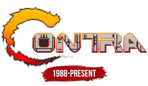
The Contra logo features a stylized inscription where the letter “C” resembles fiery flames. This letter is designed in vibrant colors such as orange, red, and yellow, creating a visually striking element. The remaining glyphs in the logo exhibit unique designs that reflect the sci-fi theme of the game. The “N” has rounded corners at the ends of its diagonal line, the “T” lacks the right part of its horizontal line, and the “R” has a narrow opening on the left side. The letters “ONTRA” are outlined in orange-red and filled with a light gray color, accentuated by dark gray patches and stripes.
The Contra emblem carries several symbolic elements that contribute to its meaning. The fiery “C” symbolizes intensity, energy, and action, reflecting the fast-paced gameplay and excitement of the Contra brand. The vibrant color palette of orange, red, and yellow further enhances the dynamic and adventurous nature of the game. The unique designs of the individual glyphs add a touch of futuristic aesthetics, representing the sci-fi theme and technological aspects of the game. The contrasting colors and intricate details in the typography create a visually captivating logo that captures the essence of the Contra gaming experience.
Contra: Brand overview
| Founded: | February 20, 1987 |
| Founder: | Konami |
| Headquarters: | Tokyo, Japan |
“Contra” stands as a monument to the world of run-and-gun video games, its name etched into the annals of digital history. This prodigious creation of Konami, launched in 1986, quickly turned into a beacon for gamers worldwide, seducing them with its blindingly swift gameplay and no-mercy difficulty. It first saw the light of day on February 20, 1987, and remains an ageless favorite among the gaming community.
Konami’s Computer Entertainment Division, captained by the dynamic duo Koji Hiroshita and Shinji Hirano, left no stone unturned to breathe life into the masterful creation known as “Contra.” Imbibing the spirit of cult classics such as “Aliens” and “Rambo,” as well as harnessing the thrill of arcade gems like “Commando” and “Green Beret,” they sculpted a game brimming with slick visuals, mind-bending levels, and epic boss battles. “Contra” truly stood as a testament to their dedication.
Upon its arcade release in 1987, “Contra” transcended geographical boundaries, quickly becoming a sensation in game centers worldwide. Its journey didn’t stop there. The game soon found a home on the Nintendo Entertainment System (NES) in 1988, where it witnessed an explosion in popularity, etching its legacy in the hearts of gamers everywhere.
Since its launch in 1987, “Contra” has evolved into a veritable jewel in Konami’s crown. Its ruthless difficulty and cooperative gameplay invited two players to band together and face its heart-racing challenges. This gameplay dynamic helped “Contra” carve its place in the gaming world, contributing to the shaping of the run-and-gun genre. As the years rolled by, a myriad of sequels and spin-offs joined the franchise, fortifying its place as an enduring video game classic.
Meaning and History
The brand identity of this notable game has evolved to become synonymous with relentless action and tactical strategy. Its mark lies in its challenging gameplay, a defining feature that has allowed it to stand out from its competition and resonate with its dedicated player base. The identity transcends the physical game, as it has seeped into pop culture, becoming a reference point for intense, action-packed gaming.
Visually, the brand is instantly recognizable by its distinct militaristic and alien design elements, creating a unique aesthetic that conveys the heart-racing energy of the gameplay. Its consistent use of these elements has strengthened its identity and made it instantly identifiable to both ardent fans and casual players alike.
Another vital aspect of its branding is the sense of nostalgia it invokes. The platform has managed to hold onto its roots while evolving with the times, always delivering the heart-pounding action that first made it a hit. Its ability to maintain its essence while incorporating innovative features and advancements positions it as a brand that is both classic and contemporary. By doing so, the company ensures a continual appeal to both the generation of gamers who grew up with it and new players who are just discovering its exciting world.
What is Contra?
Established as a mesmerizing coin-operated arcade video game, Contra came into existence in 1986, enchanting the gaming world with its release on February 20, 1987. The iconic title was developed and published by Konami, a Japanese entertainment company, and was welcomed by players across the globe for its innovative and exhilarating run-and-gun gameplay. The initial coin-operated version quickly gained traction, leading the company to adapt the game for various home consoles to broaden its reach.
The first versions of this electrifying video game captured the attention of an entire generation of gamers, thus positioning the platform as a pioneer in the realm of arcade games. Its narrative, which follows soldiers battling alien forces, was groundbreaking in its ability to immerse players in a thrilling, high-stakes environment. The game’s success was so profound that it sparked a series of sequels, spin-offs, and even a franchise spanning over three decades, all inspired by the original, captivating concept.
The Contra logo employs a distinct stylization that reflects the game’s energetic, action-packed theme. The ‘C’ is styled to resemble a flame, rendered in vibrant colors such as orange, red, and yellow, which perhaps symbolizes the explosive and fiery action inherent in the game.
The rest of the characters display a unique design that embodies the game’s sci-fi genre. The curved edges of the ‘N,’ the missing right part of the ‘T’s horizontal line, and the narrow opening in ‘R’ all contribute to creating an aesthetic that is reminiscent of futuristic, alien technology, which is central to the game’s storyline.
The letters ‘ONTRA,’ highlighted by an orange-red contour and filled with a light-gray hue interspersed with dark gray spots and stripes, reinforce the emblem’s unique visual identity while possibly alluding to the gritty, war-torn environments encountered in the game.
Contra color codes
| Selective Yellow | Hex color: | #ffb700 |
|---|---|---|
| RGB: | 255 183 0 | |
| CMYK: | 0 28 100 0 | |
| Pantone: | PMS 7549 C |
| Red | Hex color: | #ff0000 |
|---|---|---|
| RGB: | 255 0 0 | |
| CMYK: | 0 100 100 0 | |
| Pantone: | PMS 1655 C |
| Raisin Black | Hex color: | #28272c |
|---|---|---|
| RGB: | 40 39 44 | |
| CMYK: | 9 11 0 83 | |
| Pantone: | PMS 426 C |
| Silver | Hex color: | #c4c3c0 |
|---|---|---|
| RGB: | 196 195 192 | |
| CMYK: | 0 1 2 23 | |
| Pantone: | PMS 420 C |


