The Coors Light logo demonstrates freshness, coolness, and lack of excessive strength. The company’s drinks perfectly quench your thirst and taste great. The emblem hints at the opportunity to relax and escape from the daily hustle and bustle.
Coors Light: Brand overview
Meaning and History
The most famous feature of Coors Light is its label, which changes color from white to blue as the temperature drops. It is adorned with mountain peaks and echoes the brand’s updated logo. As for the packages and boxes, they depict valleys with conifers and blue skies. Marketers have developed such a visual design to emphasize the “cold taste” of the beer. By the way, the emblem did not always contain mountains: earlier, it was an inscription with an unusual shape of letters.
What is Coors Light?
Coors Light is a beer brand created by the Coors Brewing Company in 1978, now owned by the Molson Coors Beverage Company. This brand produces alcoholic beverages with a strength of 4.2% (in the U.S.) or 4% (in Canada). It became known because of the special cans that change color at low temperatures.
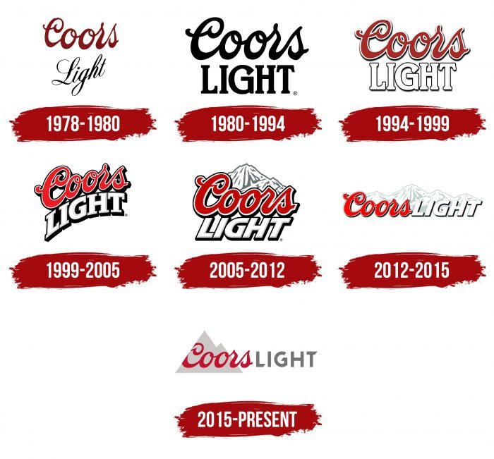
1978 – 1980
Initially, the cans and bottles were labeled “Coors Light.” The designers used two versions of the handwritten font: bold and thinner. The first word was at the top, and the second was directly below it, and the line with “Light” was uneven, almost diagonal. Dividing the logo into two-color blocks (dark red and black) made focusing on the product name possible.
1980 – 1994
After the redesign, the word “Coors” became black. The font changed to “Light.” The developers chose a bold serif, making the capital letters look like Roman columns.
1994 – 1999
At the end of the 20th century, the brand switched to a colored emblem, with the first half of the name red with a white outline and the second half white with a black border. Due to the stroke and shadows, the letter spacing in the word “Light” has decreased so much that the letters begin to touch.
1999 – 2005
Marketers considered that the new millennium requires modern design solutions, so they curved the inscription. The word “Coors” looked like it was rolling down the “Light,” which evoked associations with a falling drop. The second part has additional gray shadows, while all the letters in the title have acquired a black base.
2005 – 2012
In 2005, the text was aligned. The word “Light” became italicized and lost its iconic serifs. In the background were snow-capped white and gray mountains. There was also a curved version without mountains.
2012 – 2015
For the first time, the logo designers have placed the inscription in one line. To do this, they had to stretch the mountain landscape so that the background was not empty. But the font has hardly changed.
2015 – today
In 2015, the brewery brand received a new visual identity. The style is dominated by minimalism: the mountains in the Coors Light logo look like two gray triangles merged. The first word from the brand name is written across the graphic icon and partially goes beyond it, and the second is next to it in the same line. At the same time, for “LIGHT,” a straight dark gray font with cut ends of the letters “L,” “G,” and “T” is used. The developer of this design is Turner Duckworth. He also created the design for the packaging of an alcoholic drink.
Coors Light: Interesting Facts
Coors Light, also known as the “Silver Bullet,” is a top choice for light beer lovers in the U.S. and worldwide, debuting in 1978 by Coors Brewing Company. It’s celebrated for its refreshing, clean taste.
- Rocky Mountain Water: Brewed in Golden, Colorado, the beer’s unique taste is attributed to the pure water from the Rocky Mountains used in its brewing process.
- Cold Certified Packaging: Its bottles and cans have a “Cold Certified” label that turns blue when the beer is perfectly chilled, highlighting its refreshing quality.
- Growing Popularity: Launched when Americans started to prefer lighter beers, Coors Light quickly became the Coors Brewing Company’s best-seller and one of the U.S.’s most popular beers.
- Frost Brewed: Coors Light’s brewing at lower temperatures makes it smoother, a key feature that attracts drinkers.
- Sports Partnerships: The brand is linked with major sports, including the NFL and NASCAR, enhancing its profile in American culture.
- Silver Bullet Train Ads: Advertising campaigns feature a silver bullet train, symbolizing the beer’s cold, crisp taste and quick delivery.
- Vented Wide Mouth Can: In 2008, it introduced a vented can for a smoother pour, showing its commitment to improving the drinking experience.
- International Appeal: In addition to the U.S., Coors Light is popular in countries like Canada and the UK, underscoring its global appeal.
- Supporting Communities: Coors Light is involved in charitable actions, including veteran support and responsible drinking campaigns.
Coors Light’s success comes from its blend of quality, innovative brewing, and savvy marketing. Its efforts in sustainability and community support further showcase its dedication not just to beer making but also to making a difference in society and the environment.
Font and Colors
The main symbol of Coors Light is the mountains. The logo probably depicts a “2D model” of the Colorado Rockies, simplified as much as possible. Due to the combination of mountain peaks and red lettering, the brand has been repeatedly criticized because its logo resembles the pattern on Evian mineral water bottles. Despite this, the company is in no hurry to change the badge because it is associated with cleanliness, coolness, and freshness.
The word “Coors” uses a swirling font that mimics handwritten text. The typeface for “LIGHT” is individual, sans serif. L, G, and T have partially cut edges to make the lettering distinctive. The color scheme is restrained: the designers combined red (# D31245), gray (# 717073), and silver (# D1D3D4) to make the logo noble.
FAQ
What is the Coors Light saying?
Coors Light’s slogan, “When the mountains turn blue, it gets as cold as the Rockies,” is memorable and iconic. This tagline connects the brand to the Rocky Mountains, emphasizing the refreshing coolness and purity of the beer. The cans use thermochromatic ink that changes color to blue when the beer reaches a certain low temperature.
Despite its strong connection to the Rocky Mountains, your beer may not be brewed there. The brand, owned by Molson Coors Beverage Company, has several breweries in the United States and other countries. While the branding emphasizes Rocky Mountain heritage, production may occur in facilities away from the mountains.
What does the light mean in Coors Light?
A “light” beer has fewer calories, a lighter consistency, and a lower alcohol content than regular beer. This appeals to health-conscious consumers who want to enjoy beer without the extra calories and alcohol.
The term “light” was first used by the Coors Brewing Company for its Coors Banquet beer, marketed as “America’s light, light beer.” Even though calorie counting was not common then, Coors Banquet’s lower calorie content was noticeable. The term “light” shows the brand’s desire to offer a drink that is enjoyable and refreshing while being low in calories.
What is the Coors Light logo?
The logo has evolved into a sleek, minimalist emblem. It features mountain peaks represented by two light gray triangles, symbolizing the Rocky Mountains and the cold, refreshing qualities of the beer.
The word “Coors” is written in a distinctive red font using the brand’s unique typeface. Next to “Coors” is “LIGHT” in dark gray capital letters. The capital letters convey strength and clarity. The horizontal strokes of the letters L, G, and T are cut at the same angle, adding uniformity and modernity to the design. This angular design element complements the logo’s minimalist aesthetic. The overall design of the Coors Light logo is clean and streamlined, reflecting the brand’s commitment to simplicity and quality.
What mountains are on the Coors Light logo?
The logo features the Rocky Mountains, specifically Wilson Peak in Colorado’s San Juan Mountains. At an elevation of 14,023 feet, Wilson Peak symbolizes the grandeur and beauty of the Rocky Mountains. This pinnacle perfectly reflects the brand’s focus on cold, refreshing beer. The logo design uses two light gray triangles to capture the silhouette of Wilson Peak in a recognizable form.
By including Wilson Peak, the brand taps into the powerful imagery and associations of the Rocky Mountains. Mountains symbolize natural beauty, adventure, and a clean environment. These elements align with the brand’s vision of creating beers representing the Rockies while providing a refreshing experience.
