The logo of Copa Airlines symbolizes its connection to its home country, Panama, and its crucial role as a bridge across the Americas. Reflecting Panama’s location as a hub between North and South America, the logo represents the airline’s mission to facilitate cultural connections and enhance accessibility throughout the continent. It embodies the company’s commitment to uniting diverse cultures and destinations, fostering exchanges that enhance access to and from Latin America.
Copa Airlines: Brand overview
The history of Copa Airlines began on June 21, 1944, when a group of Panamanian investors, led by Carlos Novey and the Panamanian government, established Compañía Panameña de Aviación (COPA). The airline was created to connect Panamanian cities by air and boost the country’s tourism industry. Initially, COPA operated with three Douglas DC-3 aircraft, providing flights between Panama City and other domestic cities.
In 1947, the airline expanded internationally by introducing regular routes to Medellin (Colombia), Havana (Cuba), and Miami (USA). The fleet was upgraded with more advanced Douglas DC-4 and DC-6 aircraft, enabling longer flights and improved passenger comfort.
Throughout the 1960s, the company continued to grow by extending its route network to Central American and Caribbean countries. The airline introduced its first jet aircraft, the BAC 1-11, which reduced travel times on key routes.
In 1966, it established a training center for pilots and flight attendants to enhance safety and service standards. The 1970s posed challenges due to escalating fuel prices, regional political instability, and intensified competition. Consequently 1980, the airline was privatized and acquired by a group of Panamanian investors led by businessman Ricardo Mariscal. The new leadership implemented a significant restructuring, modernizing the fleet and optimizing the route network.
In the 1990s, the company experienced substantial growth, expanding its presence in South America with new flights to Buenos Aires (Argentina), Lima (Peru), Quito (Ecuador), and other major cities in the region. The fleet was enhanced with modern Boeing 737 aircraft, becoming the mainstay of its operations for years. A pivotal moment in its history was establishing its hub at Tocumen International Airport (now named Tocumen International Airport after Juan Santamaría) in Panama City in 1992. This strategically located airport became a vital transit hub for passengers traveling between North and South America, with layovers in Panama. The convenient hub location and well-coordinated flight connections offered the airline an extensive regional route network.
In 1998, the company allied with American Continental Airlines (now part of United Airlines). This partnership enabled the airline to expand its international route network through code-sharing agreements and coordinated flight schedules with Continental. Passengers benefitted from seamless connections and high service standards from both airlines.
In 2005, the airline went public on the New York Stock Exchange, becoming the first Latin American airline to list its shares on this prestigious platform. The capital from this move facilitated fleet renewal and expansion and investments in route network development and service quality enhancements.
During the 2000s and 2010s, the company experienced growth and innovation. The airline expanded its flight frequencies on important routes, introduced numerous new routes to countries in the Americas and the Caribbean, and upgraded its fleet with the latest Boeing 737NG models – the 737-700, 737-800, and 737- 900ER These new aircraft were known for their fuel efficiency, reliability, and passenger comfort. One of the key developments during this time was introducing the “Hub of the Americas” concept at Tocumen International Airport in Panama. The company established a unique hub airport facilitating seamless and quick connections between flights from North and South America to the Caribbean, leveraging Panama’s location in the continent’s heart and an efficient wave system for arrivals and departures. This allowed the airline to attract many transit passengers and offer a wide range of nonstop routes between cities in the Americas.
In 2019, the company was honored with the prestigious Skytrax award for being the best airline in Central America and the Caribbean. Additionally, OAG recognized the airline as the world’s most punctual airline. It operates flights to over 75 destinations in 30 countries across North, Central, South America and the Caribbean. With a fleet of over 100 modern Boeing 737 aircraft, the company is a key player in the rapidly expanding Latin American aviation market.
Meaning and History
What is Copa Airlines?
It is Panama’s national airline, headquartered in Panama City. It flies throughout the Americas, connecting North, Central, South, and Caribbean. Known for its high standards, it offers various classes of service, including economy and business. The airline’s hub at Tocumen International Airport is a key connecting hub for passengers traveling between North and South America. The company is a member of Star Alliance, offering passengers travel through partnerships with other international airlines.
1947 – 1957
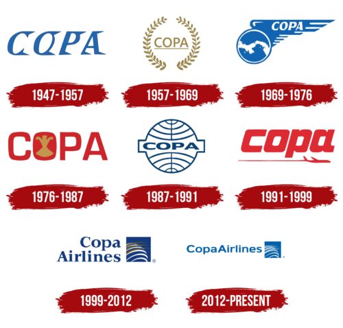
Copa Airlines, established in 1947, swiftly established its unique style within the international aviation market. In its first decade, from 1947 to 1957, the company unveiled its initial logo, which embodied grandeur. The word “Copa” appeared in large uppercase letters on a white background, with each letter highlighted by shadows above and below, giving the inscription a pronounced volume and depth.
This emblem served as a visual representation of the brand’s ambitious goal to connect Panama with the rest of the world. “Copa” is a shortened form of the company’s full name, Compañía Panameña de Aviación, reflecting its dedication to Panamanian roots. The use of blue in the design symbolized the sky, fitting for an airline aiming to dominate airspace.
The rightward triangular serifs on the letters were deeply meaningful. They were suggestive of shadows, reminiscent of wings, air directional indicators, and traces of a swiftly moving airplane. These elements enhanced the association with aviation and flight, highlighting the company’s dynamic and progressive character.
1957 – 1969
In 1957, Copa Airlines significantly expanded its air transport. Along with increasing routes and global connections, the company updated its corporate emblem, which resembled a gold medal, signaling its increasing influence in the aviation industry.
The new design included a wreath of two laurel branches that framed and highlighted the brand name. Traditionally, laurel branches symbolize victory and success, reflecting the company’s achievements at that time. The brand name appeared as if placed on a pedestal of honor, emphasizing the high status and respect the company had earned internationally.
The logo’s elements were crafted in pure gold, emphasizing luxury and the airline’s quality of services. The gold color was eye-catching, symbolizing stability, reliability, and high service levels synonymous with Copa Airlines.
The new emblem was not merely a branding element but a strong declaration of the company’s intentions to pursue further success and victories in aviation. It acknowledged past achievements and anticipated future triumphs, strengthening Copa Airlines’ image as an industry leader.
1969 – 1976
After Copa Airlines acquired more modern aircraft, the company recognized a real opportunity to expand its geographic reach to a global level. The updated emblem vividly reflected this shift to new possibilities and confidence. It featured an image of the Earth adorned with large wings that express speed and mobility. The wings elegantly framed the brand name, emphasizing its international presence.
The image of the Earth moving swiftly forward symbolized the company’s dynamic development and accelerated international expansion. The visual representation of the planet emphasizes that the world is constantly changing, and Copa Airlines’ air transport plays a key role in this process. The new airplanes, with improved features and increased efficiency, allow travelers from Panama to reach the most remote corners of the world easily.
1976 – 1987
The government of Panama’s acquisition of Copa Airlines marked a significant chapter in the company’s history, during which it flourished. This period was characterized by improvements in operational performance and an expansion of the route network, accompanied by a change in corporate image, as reflected in a new logo design.
The logo’s bright and conspicuous red letters symbolized the new energy and direction the company embraced following the ownership change. A standout feature is the letter “O,” filled in and adorned with a golden image of the heart of Panama’s famous orchid, Flor del Espíritu Santo. This detail is visually appealing and carries deep significance.
The orchid Flor del Espíritu Santo, a national symbol of Panama, was intentionally chosen for the logo. Its inclusion highlights the airline’s country of origin, emphasizing its roots and cultural heritage. The golden image of the orchid resembles a graceful figure in dance, evoking the world-renowned Panamanian carnival. This carnival is the second largest in the world, after Brazil’s, and the comparison in the logo reinforces Copa Airlines’ connection with Panama’s festive culture and traditions.
1987 – 1991
The emblem of Copa Airlines was redesigned and presented as a medal, symbolizing achievements and high status akin to those given to world champions in sports. At the center of this medal, the Earth is detailed with meridians and parallels, giving it an appearance of scientific precision and global reach.
This design choice echoes the symbolism of Pan American World Airways, which had privatized the carrier then. Comparing the two logos shows interesting differences: while the parent company’s emblem features the Earth in blue with white stripes emphasizing the meridians and parallels, Copa’s version presents it in white with blue lines. This method visually distinguishes Copa from Pan American and adds a sense of lightness and airiness to the symbol, metaphorically emphasizing the emblem’s and the company’s capability for flight.
1991 – 1999
The Copa Airlines logo, created in bold red, symbolizes the company’s confidence and market dominance in Latin American air transport. Despite the visual heft of the letters, they appear light and airy, thanks to a thin line drawn beneath them. This line represents the trail of a passing airplane, adding dynamics and a sense of forward movement, underscoring the company’s speed and mobility.
This design element enhances the logo and carries profound meaning. It instantly signals to viewers Copa Airlines’ leading position in the aviation industry of Latin America, emphasizing that the company excels in this sector. The phrase “COPA – the winner” strengthens this impression, representing the company’s achievements and success.
The logo reflects the realization of the bold visions of the company’s founders. Copa Airlines has pursued ambitious goals since its inception, and the modern logo affirms that these objectives have been achieved. The logo serves as a reminder that the bold ideas foundational to the company have come to fruition, with Copa Airlines now occupying a leading market position, continuing to evolve and broaden its horizons.
1999 – 2012
The emblem of Copa Airlines, introduced at the turn of the new millennium, symbolizes a new era in the company’s history and strengthening strategic ties with Continental Airlines. This partnership is reflected in the emblem’s design, which emphasizes the global aspects of collaboration and the expansion of the route network.
The logo features a square window opening onto the sky, symbolizing the new opportunities and perspectives available to passengers and the company. This element highlights Copa Airlines’ focus on the future and its readiness to embrace innovations and changes in the aviation industry.
At the center of the emblem, the Earth spins, surrounded by swiftly moving Copa Airlines planes. These planes are so fast that they leave only golden lines cutting through the sky. The gold color of the planes’ trails adds visual splendor and symbolizes the high quality and prestige of the airline’s services.
2012 – today
The Copa Airlines logo, first seen in 2012 on a Boeing 737-800, features United Blue, a color named after United Airlines. This blue is used in a square with white lines. Most lines curve downward, symbolizing the Earth’s longitude, while three stripes point upward as stylized jets, representing global reach. Next to this square is “CopaAirlines” in blue, written as a single word.
The United Blue color honors United Airlines and shows a strong connection. The upward-pointing jets symbolize the airline’s growth and expansion. Writing “CopaAirlines” as one word emphasizes unity and seamless service.
The curved white lines suggest a global network, emphasizing international presence and connectivity. The upward stripes, resembling jets, add a dynamic and forward-looking aspect, reflecting ambition and growth.
The bold blue of “CopaAirlines” complements the United Blue and enhances visibility and memorability. The combined name highlights the airline’s commitment to providing a seamless travel experience.
The choice of United Blue, associated with trust, reliability, and professionalism, reinforces the airline’s brand values and dedication to high standards of service and safety.
