


![]()
Correlation Risk Partners, a company specializing in insurance and risk management solutions, has introduced a refreshed brand identity, including a bold new logo and modernized visuals. The rebranding reflects the company’s focus on innovation, collaboration, and the value of partnerships in achieving shared goals.
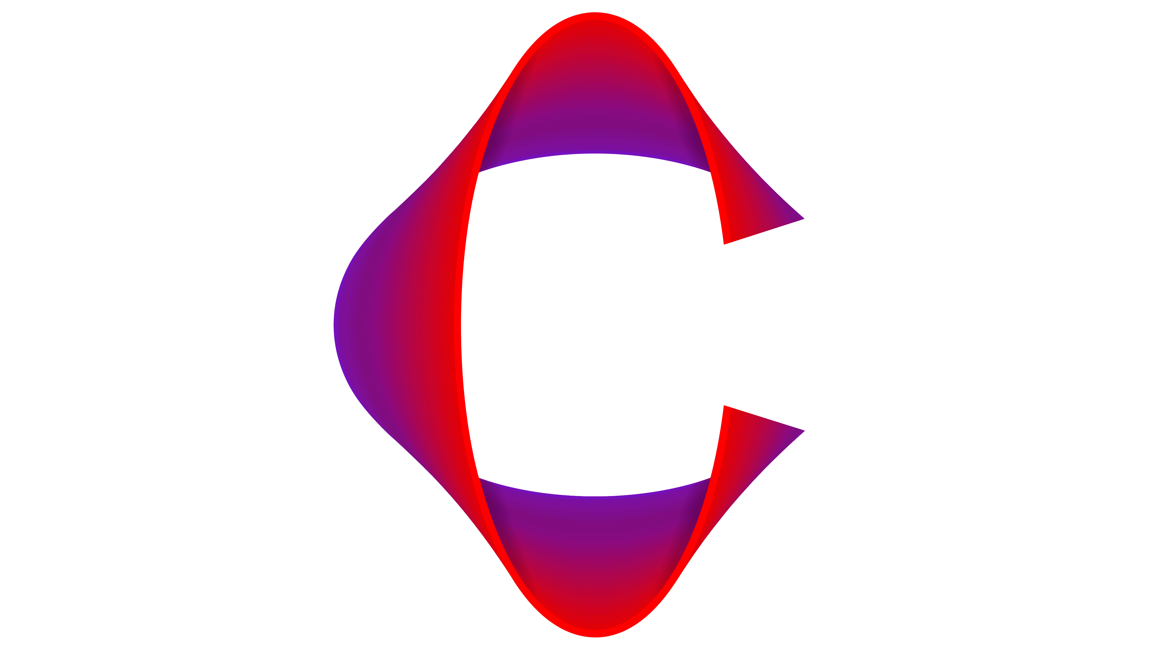
The new logo’s heart is a three-dimensional “C,” designed with purple and red gradients. This striking element emphasizes connection, adaptability, and progress. The gradient effect adds depth and motion, underscoring the company’s dynamic approach to tackling challenges in the risk management sector.
![]()
The color palette blends shades of purple and red, balancing stability and energy. Purple conveys confidence and reliability, while red injects vitality and forward momentum. Together, these colors communicate a mix of trustworthiness and innovation—crucial qualities in the insurance and risk management industries.
The logo’s typography features a modern geometric style that reinforces professionalism and strength. Uppercase letters convey stability and decisiveness, aligning with Correlation’s values of expertise and resilience. The clean, precise lines of the font work seamlessly with the gradient-filled emblem, creating a cohesive and impactful design.
This new branding replaces the previous logo, which used muted gray and burgundy tones and a minimalist design. While the earlier logo emphasized reliability, it lacked the vibrancy and energy of the new identity. The updated design signals a shift toward a more engaging and contemporary image, appealing to modern audiences while maintaining a foundation of trust and dependability.
The new slogan, “Together Pays Off,” encapsulates Correlation’s belief in the power of collaboration. It highlights the company’s dedication to building strong partnerships and achieving shared success in navigating complex risk challenges.
![]()
The logo’s volumetric design and gradient details reflect the company’s adaptability and agility in an ever-evolving industry. These elements emphasize Correlation’s focus on data-driven insights and innovative problem-solving, positioning the brand as forward-thinking and client-focused.
With its vibrant colors, modern typography, and emphasis on connection and movement, the new identity showcases Correlation Risk Partners as a leader in risk management. The rebranding reinforces the company’s core values while presenting a fresh and dynamic image, ready to meet the demands of a rapidly changing world.