The Costa logo is a sign of high comfort, convenience, and good-naturedness. The tourist emblem represents first-class service, excellent cabins, a pleasant atmosphere, and responsible staff. Seeking to present itself in a favorable light, the company took a simple but elite symbolism and classic design as a basis.
Costa: Brand overview
| Founded: | 1854 |
| Founder: | Carnival Corporation & plc |
| Headquarters: | Genoa, Italy |
| Website: | costacruises.com |
Meaning and History
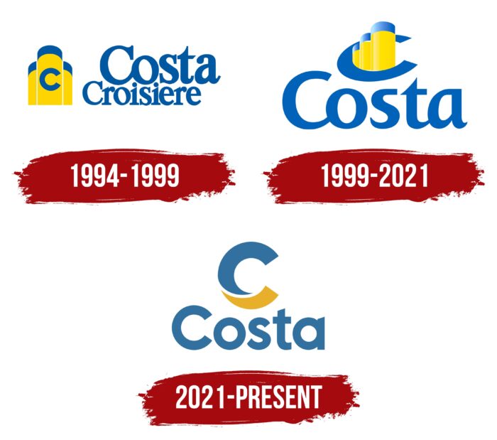
Visual recognition of the brand is high among lovers of sea travel. Three variants of the Costa Cruises logo have been presented during the company’s entire existence. Thanks to similar styling and a yellow and blue color palette, they all looked almost identical.
Costa Cruises is focused on three main areas, namely cruises, food, and sustainability. Therefore, the development of the brand will be observed in the future, given the ambitions of the project.
What is Costa?
This is one of the most famous brands associated with sea cruises. Every year, up to ten million people use the services of Costa Cruises, which brings the company billions of dollars in revenue.
1994 – 1999
The first version of the logo was introduced in 1994. It was a verbal inscription and an emblem depicted on the left. If we talk about it in more detail, these are three steamship pipes pressed against each other. The main part of them is painted yellow, and only the top is blue. The middle of the pipes shows the first letter of the name, namely “C.” It’s an uppercase blue letter in a classic bold sans-serif.
On the right, the company’s name is presented in two lines, namely “Costa Crociere.” It also used a classic bold sans-serif with rounded ends. Considering that some letters have connecting lines between letters, we can also talk about the use of italics. All letters were dark blue. The first word is slightly larger than the second.
1999 – 2021
The first redesign brought two new logo variations. One of them was used for the international market, and the second was the Italian version of Costa.
The main logo was also the emblem, and the company’s name was located at the bottom. The layout of the pipes was changed now, they all went diagonally, and the first one seemed much closer to the user than the last one. The letter “C” is now drawn around the pipes instead of on them. The font for the “Costa” wordmark remains identical, but it does feature a blue gradient that makes the logo even more eye-catching.
The Italian version of the Costa Crociere logo is as similar as possible to the generally accepted one, but one more line with the word “Crociere” has been added.
2021 – today
The latest redesign to date took place in 2021. As a result, the logo has become more simple and concise regarding details. Costa has removed the pipes, which means fewer references to the cruise theme in the image. The emblem was a wave-shaped letter “C,” the top of which was painted blue and the bottom yellow. At the same time, a white horizontal line was present between these colors. The emblem looks three-dimensional and modern and arouses genuine interest in the target audience.
The font for the word inscription was also simplified. There were no elongated lines in the letters, and they looked more natural. The blue color remained unchanged, but the gradient was no longer used.
Font and Colors
The logo was based on a classic bold sans-serif font. The first versions also used elements of italic style, which made the inscription more handwritten and interesting. However, subsequent simplification led to a more confident appearance.
A pleasant yellow and blue color palette was chosen for the Costa logo. Yellow can be associated with the sun, while blue can be associated with the sky and the sea. Moreover, bright shades evoke positive emotions in people and make them decide to change their lives and go on a trip on a luxury liner of a world famous company.
Costa color codes
| Xanthous | Hex color: | #e7af2a |
|---|---|---|
| RGB: | 231 175 42 | |
| CMYK: | 0 24 82 9 | |
| Pantone: | PMS 1235 C |
| Bice Blue | Hex color: | #3270a0 |
|---|---|---|
| RGB: | 50 112 160 | |
| CMYK: | 69 30 0 37 | |
| Pantone: | PMS 7690 C |


