The Coty logo is confident and strong. Demonstrates the company’s weight in today’s fashion industry. It highlights the achievements of the brand. It shows how even and smoothly the decorations are laid down, creating a perfect look.
Coty: Brand overview
| Founded: | 1904 |
| Founder: | François Coty |
| Headquarters: | New York, U.S. |
| Website: | coty.com |
Coty is a French international cosmetics company headquartered in France, England, Switzerland, and the United States. It was founded in the early 20th century. It owns and supports about 77 brands of decorative cosmetics and fragrances, face, body, and hair care products of Consumer Beauty, Luxury, and Professional Beauty lines.
The cosmetics giant Coty has its roots firmly embedded in Paris, France, where it was established by François Coty in 1904. Coty, an entrepreneur and innovator in the perfume world, made his breakthrough in the fragrance industry with his initial offering, “La Rose Jacqueminot,” in 1905.
Over the ensuing decade, François Coty continued to diversify his portfolio of fragrances, further solidifying Coty’s position in the industry. By 1914, his vision had extended beyond France’s boundaries, establishing subsidiaries across several major European cities and expanding the company’s footprint to 20 countries.
As the 1920s and 1930s rolled in, Coty broadened its horizons by delving into the realm of makeup. It introduced one of the earliest powder compacts, a pioneering move that added another dimension to its growing profile. During this period, Coty further fortified its presence in the cosmetics space by acquiring well-known brands like Rimmel.
By the mid-20th century, Coty had become the most prominent perfume company globally, with an expanded presence across North America and successful fragrance launches, such as Emeraude.
Coty debuted on the public market in the 1960s, marking a significant milestone in the company’s growth journey. The era also witnessed the acquisition of beauty brands like Lancaster and Chloe, allowing Coty to continue its international expansion.
Entering the 1990s, Coty seized the opportunity to broaden its market reach through strategic acquisitions, incorporating brands like Rimmel and Sally Hansen nail polishes. Its venture into mass-market distribution transformed Coty’s landscape, setting it on a path to become a global powerhouse in the beauty industry.
The 21st century saw Coty delving into celebrity fragrances, securing licenses for brands like Kylie Jenner and Katy Perry fragrances. These acquisitions further enhanced Coty’s influence and presence in the fragrance industry.
Today, Coty is one of the world’s leading beauty conglomerates, with a staggering annual revenue exceeding $9 billion. The company’s portfolio is home to 77 brands across all major beauty segments, demonstrating the diversity and scale of its operations.
Although Coty’s headquarters is in New York City, the company’s global reach extends to over 130 countries. Coty’s journey, marked by strategic expansions and acquisitions, reflects its enduring spirit of innovation and commitment to delivering beauty and fragrance products of the highest quality.
Meaning and History
A verbal identity has always been at the heart of each Coty logo. The company tries to convey its vision of the world and its goals through font and color. The change of emblems shows how the company’s vision of beauty and femininity has changed and how it has grown and developed. The smooth flowing of colors conveys the main concept of the brand: “Beauty is like water; it’s formless, it constantly flows and evolves, and no one can dictate what is beautiful or not. With its brightly colored signs, the brand shows that it embraces all the variety of forms and looks of beauty on the planet. The brand is proud of its roots and specifically emphasizes the year of its foundation. A century of history allows us to talk about a significant contribution to the fashion industry, complementing the palette of modern cosmetics.
What is Coty?
A French beauty leader with over $9 billion in revenues, offering hair and skin care products, decorative color cosmetics, and perfumes. The company’s products are produced and sold in 150 countries by 20,000 employees.
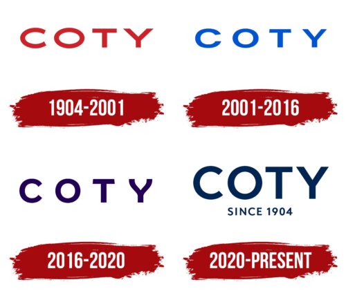
1904 – 2001
For the first logo, the brand name written in the red font was chosen. The name of the brand came from the founder Francois Spoturno. He was a famous industrialist who was fond of perfumery. He created his masterpieces under the pseudonym of Coty.
The founder wrote his nickname unusually, putting the letter C separately and connecting it with the rest of the word with a long bridge. This created the impression of a plume and caused an association with a fragrance. Because in the beginning, the famous brand sold only perfume.
A completely different font was chosen for the logo. Its red capital letters convey expression and persistence. This shows the deep passion of Francois for his business and the unusually fast rise to the top: the first perfume (Rose Jacqueminot) made the master super-popular. The product was refused for sale, and Spoturno broke the bottle right in the middle of the hall. Visitors were captivated by the fragrance and wished to buy it. So through persistence and confidence in their craftsmanship, Coty gained many customers. The logo shows these qualities.
The smooth glyphs, smooth curves, and absence of serifs demonstrate a perfect combination of components forming a single light symphony of the scent.
2001 – 2016
In 2001, a change of management took place, and Bernd Beetz, who became Chairman of the Board of Directors, started the process of reforms, deciding for the first time in almost a century to change the company’s visual identity.
The lettering letters are slightly changed and given a blue tone instead of red. The change showed a shift in emphasis from love and emotion to personality and individuality. The main focus of the next years becomes the purchase of brands of famous and popular leaders of society, actors, and athletes (David & Victoria Beckham, JLo Beauty, Lovely Jessica Parker, etc.).
With the new emblem, the company showed that now in its products, it will focus on customers and their needs.
2016 – 2020
The company becomes the world’s third cosmetics retailer.
The logo of this period received more harmonious and proportional letters, showing the company’s development in all cosmetic directions. There is a large distance between the symbols, indicating growth and expansion. The dark purple hue is an indicator of the power and concentration of a large number of brands in one office. In 2015-16 alone, Coty increased its portfolio by more than 40 brands.
2020 – today
In 2020, the company was headed by the former head of L’Oréal Paris, SUE Y. NABI. She brought a fresh breath to the brand’s management, and Coty’s stock skyrocketed. NABI initiated a renewal of the visual identity, which became clearer and stronger.
The letters of the logo grew larger and took on a darker coloring. And underneath the brand name, the year of foundation was added to emphasize the company’s weight and experience.
The inscription’s letters are closer, representing a precise understanding of the firm’s goals and mission. The company intends to occupy a specific segment in the cosmetics sector and fully focus on customer needs.
Font and Colors
The main color of the brand is dark blue. The shade shows wisdom, experience, and impressive age. The brand already has a list of loyal fans and a desire to become a reliable partner for all comers. The color conveys purposefulness, calmness, and confidence in the future.
The font is simple and smooth, similar to several variants: FF Mark Bold, Freud Bold, and Facundo Bold, which speaks to its versatility. Like the company’s cosmetics, it is suitable for anyone who wants to use it.
Coty color codes
| Cool Black | Hex color: | #012553 |
|---|---|---|
| RGB: | 1 37 83 | |
| CMYK: | 99 55 0 67 | |
| Pantone: | PMS 655 C |


