Covergirl logo demonstrates the company’s globality and scale, sales all over the world. Every customer can count on flawless makeup and attention as if a girl from the pages of fashion magazines.
Covergirl: Brand overview
| Founded: | January 1961 |
| Founder: | Noxzema Chemical Company |
| Headquarters: | Maryland, U.S. |
| Website: | covergirl.com |
Covergirl is an American brand of decorative cosmetics and skincare products at an affordable price. It was originally launched by the chemical company Noxzema as a therapeutic makeup product in 1961 and has been owned by the Coty Group since 2016. It is headquartered in Maryland.
Meaning and History
The company’s visual mark changes are related to the brand’s transition to new owners. However, the owners’ idea of the brand is not very different, so there is no cardinal logo transformation after the purchase. In all the emblems, there is a desire to show Covergirl as a brand for a wide range of female representatives, regardless of age, territory of residence, and skin color. At the same time, in the inscriptions of the emblems, it is clear that the cosmetics brand highlights the individuality of each woman, making her the center of attention.
What is Covergirl?
A well-known U.S. cosmetics brand whose products are sold all over the world. Offers products with decorative and therapeutic effects. It uses popular actresses, models, athletes, and presenters to promote it.
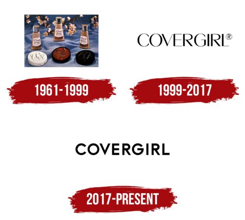
1961 – 1999
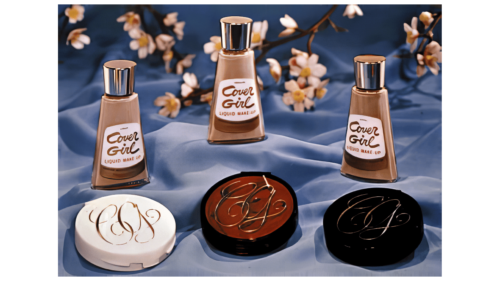
Noxzema promoted Covergirl by giving its samples to famous models and other celebrities who appeared on the covers of fashion magazines. That is why the first logo had two variants:
- Presentable, as if for a magazine photo, in the form of an intertwined monogram of the first letters of the compound name C and G. The gilded and voluminous symbols were placed on a white, red, and black background.
- An ornate but more conventional logo in the form of the name placed on two levels.
The gold letters further emphasized the eliteness and peculiarity of the brand. The sign’s duality showed that the brand goods were meant both for the famous and famous and for women who aspired to become such.
The red, black, and white background hinted at black, Hispanic, and light-skinned people. This emblem shows that the company is aware of women’s needs. It’s tailored to individual needs, so women can get the product that’s perfect for them and always look their best.
1999 – 2017
In 1989, Procter & Gamble became the owner of the brand. To increase sales, the company decides to update the image of its acquisition to make the identity more modern. The changes were timed to coincide with the entry into the new millennium.
The logo style remained verbal, but the monogram was no longer used. The name of the brand was written in capital letters with different thicknesses glyph, making the inscription elegant. There was a twist in the font, a hint that there is something special in every woman and she can change the world. This echoed the large-scale projects to improve life on earth launched by Procter & Gamble for the brand.
The emphasis on the name is related to the desire of women to imitate popular and famous heroines, with the dream of becoming a recognized beauty and getting on the cover of magazines. Buying cosmetics that are used by their favorite stars, female customers joined the high circles, the elite. One step closer to popularity and standards of beauty. And the logo subconsciously perpetuates the feeling of getting closer to Olympus.
2017 – today
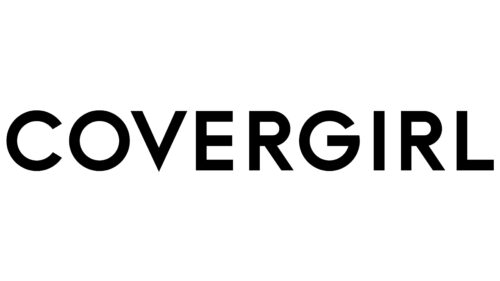
In 2016, the company was bought by Coty, Inc. and brought its perspective to the understanding of visual identity. The lettering changes the font, echoing the image characteristic of Coty’s logo – smooth, clear letters with flowing roundings.
The emblem speaks of the sustainability of confidence in one’s future. “We become what we strive for, what we use,” is the brand’s new message. And the company creates a product that helps a woman stand out and become a noticeable personality.
Font and Colors
The main color of the logo is black. It says that it is safe to buy the brand’s products. They are time-tested and environmentally safe. The shade conveys to the customers a wave of calm and understanding that the cosmetics will emphasize their individual features and set accents. It’s like a black outline in a pattern.
The font is similar to Cosmata Bold, with a sharp V base resembling a tick. It shows: Covergirl is the best choice.
Covergirl color codes
| Black | Hex color: | #000000 |
|---|---|---|
| RGB: | 0 0 0 | |
| CMYK: | 0 0 0 100 | |
| Pantone: | PMS Process Black C |

