The Cricket Wireless logo demonstrates reliability and uninterrupted communication. Emphasizes a large number of service users. The symbols of the emblem are like pointers directing to a living source, a special point from which access to the Internet is possible.
Cricket Wireless: Brand overview
| Founded: | March 17, 1999 |
| Founder: | AT&T |
| Headquarters: | Atlanta, Georgia, United States |
| Website: | cricketwireless.com |
Meaning and History
The provider was not intended to be a full-scale resource covering the entire country. Its primary task was to provide services in a limited signal area. In 2014, AT&T bought it from Leap Wireless International and merged with Aio Wireless. At the time of the acquisition, the subscriber base was already about 4.5 million consumers.
Its initial area of coverage was Chattanooga, Tennessee. Since then, the provider has been considered a mid-range organization targeting small rural markets. However, today it is the company that first gained access to the 5G network, which was deployed in August 2020.
In the fall of 2007, MetroPCS announced a merger with Leap Wireless and reported a $ 5.3 billion deal. That was exactly the amount she was willing to shell out for Cricket Wireless. However, less than two weeks later, Leap turned down the offer, and two months later officially withdrew the application. In December of that year, Cricket acquired Hargray Communications Group, a state-of-the-art wireless communications service.
In September 2008, Cricket signed a 10-year roaming contract with MetroPCS. They jointly launched Premium Extended Coverage, a partner service that includes 14 wireless companies. Then a contract was signed for a 5-year 3G EVDO Sprint application.
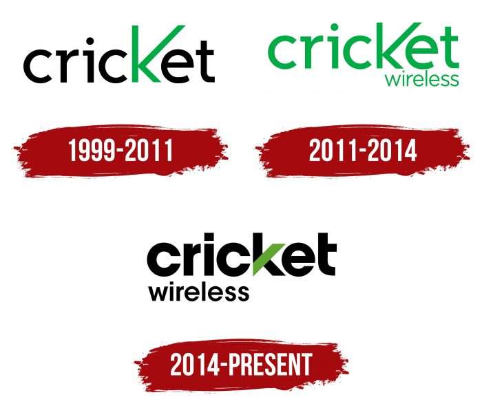
In the summer of 2013, AT&T agreed to acquire the parent company, for which it paid $ 1.2 billion. The deal was approved by the FCC almost a year later. At the end of 2016, the operator finally closed the 2G network but retained the original identity. In total, this brand has three emblems.
What is Cricket Wireless?
Cricket Wireless is a subsidiary of the telecommunications holding company AT&T Inc. It was established in 1999 and initially belonged to Leap Wireless International but changed ownership in 2014. Its specialization is wireless services, including broadband internet and cellular connections. Its service area covers the entire United States, with quality coverage provided by the extensive AT&T network.
1999 – 2011
The corporate logo consists of only one element – the name of the wireless service. At the same time, the word “Cricket” combines both text and graphic functions. The fact is that his “K” is interestingly played, which differs significantly from the rest of the letters in color, size, and style of design. The designers lengthened its upper parts so high that the lines’ junction went deep down, which makes the symbol look like the Latin “V” sign. The rest of the elements are made in a sleek, narrow sans serif font, where both “c” and “e” are perfectly round.
2011 – 2014
In 2011, the previous logo was slightly corrected. To make the change, the designers only had to replace the black letters with green (like the “K”) and add the second half of the brand name, Wireless, at the bottom right. The lettering is in a subtle variation of the same font. The rest remains the same – lower case, a precise v-shaped corner, and a shortened bottom half of the semicircular “e.”
2014 – today
An emblem with more solid lettering is now used. It is in wide, bold type, emphasizing the diagonal “K” stroke rather than the entire letter. The top line is occupied by the word “Cricket” with almost perfectly round “c” and aligned “e,” the bottom of which is now proportional to the top. Also, the designers have removed the protruding strokes from the “r,” “I,” and half of the bar “t.” In the second row, they placed the word “Wireless” by repainting it black and shifting it to the left.
Cricket Wireless: Interesting Facts
Cricket Wireless, part of AT&T Inc., is a big name in the U.S. prepaid mobile market and is known for its wallet-friendly plans and extensive coverage.
- Starting Small: In 1999, Leap Wireless International launched Cricket with unlimited local and long-distance calls in specific areas. It has since grown to offer services all over the U.S.
- Joining AT&T: In 2014, AT&T bought Cricket’s parent company for $1.2 billion, helping Cricket grow its prepaid customer base and improve services with AT&T’s wide network.
- No-Contract Plans: Cricket’s big draw is its prepaid plans, which offer more freedom without needing long-term contracts or credit checks.
- Unlimited Data: Cricket was a front-runner in providing affordable unlimited data plans, meeting the increasing demand for data among smartphone users.
- Music Streaming: In 2010, Cricket started Muve Music, a music service with some plans. Though it ended in 2014 after AT&T’s buyout, it was an early effort to combine music streaming with phone service.
- Group Discounts: With “Group Save” discounts, customers can lower their bills by adding more lines to their account, a great option for families and groups.
- Wide Coverage: Using AT&T’s network, Cricket offers reliable service across most of the U.S., a major plus for prepaid users wanting broad network access.
- International Services: Cricket also has affordable plans for international calls and texts, including unlimited texting to many countries, helping customers stay in touch with loved ones overseas.
- Stores Nationwide: Cricket’s strong retail presence makes it easy for customers to get help, sign up, or buy accessories nationwide.
- Helping Communities: Cricket is dedicated to community service and participating in charitable activities that support education, sustainability, and military families.
Cricket Wireless’s mix of no-contract services and the strength of AT&T’s network has made it a standout in the competitive prepaid phone market. Its commitment to innovation and customer service has won over many customers.
Font and Colors
From the very beginning, the logo design revolved around two important elements – green and the original stylized “K.” Whatever changes occurred incorporate symbols; these two factors were always present, even if the designers slightly adjusted them. The current version contains a unique letter with a trapezoidal stroke in the olive shade.
For the debut version, the developers have chosen a typeface in the style of the 30s of the last century, which resembles the Trebuchet created by Vincent Connare. In the latest logo, it is replaced by the geometric sans-serif type ITC Avant Garde Gothic Bold. It was written by designers Herb Lubalin and Tom Carnase and released in the 1970s.
The color of the logo is also unique, although it is associated with the most popular spectrum – green. The debut emblem uses a combination of black with a swamp hue # 00ac42, and the modern logo uses a combination of olive green # 60a82c.
Cricket Wireless color codes
| Olive Green | Hex color: | #60a82c |
|---|---|---|
| RGB: | 96 168 44 | |
| CMYK: | 43 0 74 34 | |
| Pantone: | PMS 361 C |
| Black | Hex color: | #000000 |
|---|---|---|
| RGB: | 0 0 0 | |
| CMYK: | 0 0 0 100 | |
| Pantone: | PMS Process Black C |

