Crucial: Brand overview
Emerging in 1996 as a subsidiary of Micron Technology, Crucial marked a significant shift in the way computer memory was marketed to the general public. Micron Technology was founded in 1978 in Boise, Idaho, and quickly became a leading manufacturer of DRAM, flash memory, and a number of other semiconductor products. By launching Crucial, Micron sought to bridge the gap between everyday computer users and the often complex world of hardware upgrades by offering the public a more affordable way to improve the performance of their computers.
Crucial was received very positively, allowing ordinary people to perform memory upgrades without hiring professionals. Soon after, the brand began to expand its global presence, establishing online platforms in Europe and Asia. Beyond memory upgrades, Crucial began offering a wide range of products, including solid-state drives (SSDs), specialized RAM for gaming, and various computer peripherals.
By taking advantage of Micron’s vertically integrated manufacturing and significant investment in research and development, Crucial has been able to offer innovative and reliable storage and memory solutions without sacrificing price. The company’s website further simplifies the upgrade process by including tools to help consumers find products that are compatible with their existing hardware.
Today, Crucial is the global consumer-focused division of Micron Technology, and its products are available at leading retailers worldwide. The Crucial brand is an extension of Micron’s overall goal of providing innovative memory and storage technologies to major original equipment manufacturers (OEMs) and individual consumers. Overall, the Crucial journey reflects Micron’s commitment to becoming a major player in the memory and storage market, effectively translating complex semiconductor technologies into consumer-friendly solutions.
Meaning and History
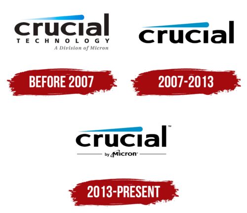
before 2007
2007 – 2013
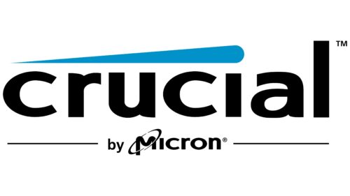
2013 – today
The Crucial logo has a complex shape, including the name and other elements neatly arranged around the text. Above it is a single blue stripe, pointed on the left and rounded on the right. It starts with the letter “i” and looks like a smudged dot. Below it is the text “by Micron,” framed on both sides by thin lines of equal size. The letter “M” has a makeshift orbit consisting of a diagonal oval. The central text is typed in bold lowercase with even lettering, except for the letters “i” and “l.”
The blue stripe above the text looks like a paint stroke as if someone quickly applied it with a brush. It’s a small detail, but it catches the eye. The “by Micron” at the bottom is like a small signature, letting you know who’s behind it all. The oval around the “M” resembles a ring around the planet, as if the logo is saying, “Hey, we’re in the tech world, and we’re walking a circle of innovation or something.”
Crucial color codes
| Rich Electric Blue | Hex color: | #0092c8 |
|---|---|---|
| RGB: | 0 146 200 | |
| CMYK: | 100 27 0 22 | |
| Pantone: | PMS 639 C |
| Black | Hex color: | #000000 |
|---|---|---|
| RGB: | 0 0 0 | |
| CMYK: | 0 0 0 100 | |
| Pantone: | PMS Process Black C |


