CTM: Brand overview
In 1981, CTM (Companhia de Telecomunicações de Macau), a division of Hong Kong conglomerate CITIC Pacific, initially operated under an exclusive license, making it the only organization authorized to offer telecommunications services in Macau. In the 1980s and 1990s, the company was instrumental in building Macau’s basic telephone infrastructure and introducing modern technologies such as mobile communications, Internet access, and broadband.
In 2009, there was a change of ownership when CTM came under the umbrella of CITIC Telecom International, another division of the larger CITIC Group. This change was accompanied by significant financial support, allowing CTM’s existing networks to be modernized. Although CTM lost its monopoly in 2012 due to the deregulation of Macau’s telecommunications sector, it retained its dominant position, remaining the only comprehensive telecommunications service provider in the region.
CTM has achieved a number of significant milestones over the years. The company pioneered 3G services in 2006, introduced 4G LTE in 2014, and plans to roll out 5G technology in 2019. In addition, the company has expanded its operations to the neighboring Guangdong province in mainland China. Currently, CTM continues to play an important role in the development of Macau’s telecommunications landscape. Under the umbrella of CITIC Group, CTM is focusing on transforming Macau into a smart city by deploying next-generation 5G networks and services.
Meaning and History
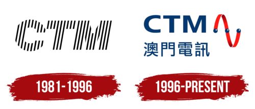
1981 – 1996
1996 – today
The logo is a segment of telecommunications signals connecting three dots. A thin ribbon rises and falls, forming arc-shaped figures in a mirror image. It is colored red with a gradient: lighter at the ends and darker in the middle. The dark blue circles have white highlights as if the light source is coming from the right side. Next to the symbol is the company name in two languages: English (top) and Chinese (bottom). The abbreviation is typed in a bold sans-serif font, and the second line has slender Chinese characters.
The red ribbon is reminiscent of a roller coaster: it goes up and down but stays in place. This creates a kind of dynamic atmosphere. Blue circles with white spots look like tiny planets in space as if they were illuminated by a nearby star. The company’s name is written in two languages, which suggests that it aims for global reach but does so in a calm manner without being too flashy.
CTM color codes
| Dark Midnight Blue | Hex color: | #063870 |
|---|---|---|
| RGB: | 6 56 112 | |
| CMYK: | 95 50 0 56 | |
| Pantone: | PMS 294 C |
| Neon Red | Hex color: | #ff1b15 |
|---|---|---|
| RGB: | 255 27 21 | |
| CMYK: | 0 89 92 0 | |
| Pantone: | PMS 172 C |


