


![]() Daihatsu Logo PNG
Daihatsu Logo PNG
Higher, better, and faster, this is the main motto of the emblem. Brand manufacturers are constantly improving. The Daihatsu logo conveys the ideals of design and engineering. The strength and reliability of the company’s machines are encrypted in massive signs.
Daihatsu began in Osaka in 1907 as Hatsudoki Seizo Co., Ltd., founded by engineers led by Dr. Yoshiaki Yasunaga of Osaka Higher Technical School with local business partners. Its first goal was to build Japanese internal combustion engines, which had previously been imported without drawings or technical documentation. In December 1907, the company tested Japan’s first 6-horsepower suction gas engine.
The Daihatsu name first appeared in 1930 on the HA three-wheeler and the Daihatsu Diesel Engine. The name came from a customer-made shortening of “Osaka engine manufacturer.” In 1931, Daihatsu launched a three-wheeled vehicle with a 500 cc engine. In 1937, it introduced the small four-wheeled FA Model. After wartime production, the company was renamed Daihatsu Motor Co., Ltd. on December 1, 1951.
In 1957, Daihatsu released the Midget, a small three-wheeled truck built for shops and delivery businesses. It became a major postwar success in Japan. In 1958, Daihatsu introduced its first four-wheeled passenger car, the Bimby. The Compagno followed in 1963 with sedan, convertible, wagon, and van versions. The current D logo also appeared in 1963. By September 1, 1964, Daihatsu had built its millionth vehicle.
In 1965, the Compagno Berlina entered the British market, becoming the first Japanese car officially sold there. Daihatsu began working with Toyota in 1967, while competing with Suzuki and Honda in the small-car market. Toyota took control in 1998 and full ownership in 2016. Daihatsu then focused on kei cars and Southeast Asia, including Perodua-linked models, before a crash-test scandal disrupted production in late 2023.
Meaning and History
![]()
The predecessor of Daihatsu was engaged in manufacturing gas engines, which confirmed its name: “Hatsudoki Seizo” translates from Japanese as “engine manufacturer.” Renaming the company, the developers took the first hieroglyph from Osaka (because the plant is located there). Still, they chose a different sound option: “dai” instead of “ō.” In Japanese, “dai” can be used as a prefix for “large.” The second half of the name, “hatsu,” is part of the word “hatsudoki.” The combination of two hieroglyphs yielded a new combination: Daihatsu.
The brand name became the basis for all logos. Although the first two versions differ markedly in style from the subsequent ones, they are linked by a common inscription. In 1974, the car company used a symbol shaped like the English letter “D.” It remains the most recognizable image of Daihatsu.
What is Daihatsu?
Daihatsu is one of Toyota Motor Corporation’s brands. It was established in 1951, succeeding Hatsudoki Seizo Co. Ltd, and was an independent automaker for a long time. Daihatsu is now known for its fuel-efficient vehicles of various types, including SUVs, microvans, minivans, and passenger cars. The company is based in Japan but has several overseas factories in Thailand, Malaysia, and Indonesia.
1951 – 1957
![]()
The first logo adopted after the rebranding does not resemble the Hatsudoki Seizo Co. brand names at all. Daihatsu’s predecessor used Japanese inscriptions for quite a long time and ignored the Latin alphabet. This continued until the end of World War II.
But it is worth noting that the font of the word mark “Daihatsu,” created in 1951, is stylized to resemble hieroglyphs. The English letters are designed in an Asian style, as evidenced by the sweeping brushstroke-like lines. The red lettering is enclosed in the same red elliptical frame with elongated edges.
1957 – 1974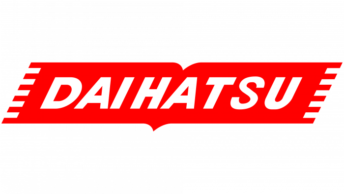
In the late 1950s, a new logo with the brand name appeared. The word is now in a printed italic font. All letters are capitalized, white, and on a red background. The inscription is rectangular with jagged edges and a triangular protrusion at the bottom. It vaguely resembles an open book.
1974 – 1998
![]()
The company continued to play with fonts, opting for square, straight sans-serif characters. But this was not the main identity change. In 1974, Daihatsu first introduced the stylized “D” graphic sign. It looks like a rocket’s nose and consists of a single line bent in several places. For maximum contrast, the white letter is shown inside a large red rectangle. The automaker’s name is red and appears at the bottom.
1998 – today
![]()
The D-shaped symbol was so successful that the company decided not to change it. But she didn’t back down from experimenting with typography, so now the lettering has become “slender,” without square outlines. Stroke thickness is uneven; serifs, as before, are absent.
Font and Colors

The stylized letter “D” is the main distinguishing mark of Daihatsu. It’s simple but very catchy. The company has never updated it; it works only with the inscription. The shape of the symbol is associated with movement, development, dynamics, and growth. The fact that the “D” points upwards indicates a desire for progress.
The Daihatsu brand has changed fonts several times. At first, the letters were handwritten and resembled Japanese characters. Then the style became more practical. The designers used a slanted sans-serif typeface. After 17 years, a wordmark with a square geometric font appeared. The latest version is a grotesque, elongated upward, with softened corners and different stroke thicknesses. It vaguely resembles Artigua Semi Bold or 19-PRA Demi.

The main color of the logo was and remains red. When combined with white, it creates a memorable contrast. This bright hue is associated with Japan, known as the Land of the Rising Sun.