


![]() Dainese Logo PNG
Dainese Logo PNG
The Dainese logo is a concentration of energy, without which there can be no forward movement. It reflects the peak of the extreme, its sharp angles, and difficult turns. Reliability, confidence, and safety: these are the hallmarks of a company ready to help in moments of relentless exertion.
Dainese was founded in 1972 by Lino Dainese in Molvena, a small town in Italy’s Vicenza province. At 24, he started with leather motorcycle pants, a product still uncommon in Italy as specialized protective gear. Racing was growing rapidly, and the company built its early identity around equipment designed for real use on the road and the track.
The first items were sewn from leather and sold to local riders. In 1975, Dainese introduced the first motorcycle back protector, made to protect the spine during crashes. Around the same time, the brand began working with professional racers, treating motorsport as a testing ground for new forms of protection.
Its early link with Giacomo Agostini, the 15-time world motorcycle champion, gave Dainese a serious racing connection. In 1984, the company developed the first hip protector. It continued to add protective parts for the knees, elbows, shoulders, and other exposed areas. In the same field, its main Italian rival was Alpinestars, founded in 1963 in Asolo, Veneto.
In the 1990s, Dainese began developing an airbag system integrated into motorcycle gear. The project later became D-air in the 2000s, when the technology reached practical use. Valentino Rossi, a multiple MotoGP world champion, became one of the brand’s most prominent racing ambassadors. In 2011, Dainese acquired AGV, the Italian helmet maker founded in 1946 in Valenza. In 2019, Investindustrial took control of the company, ending the family’s ownership.
Meaning and History
![]()
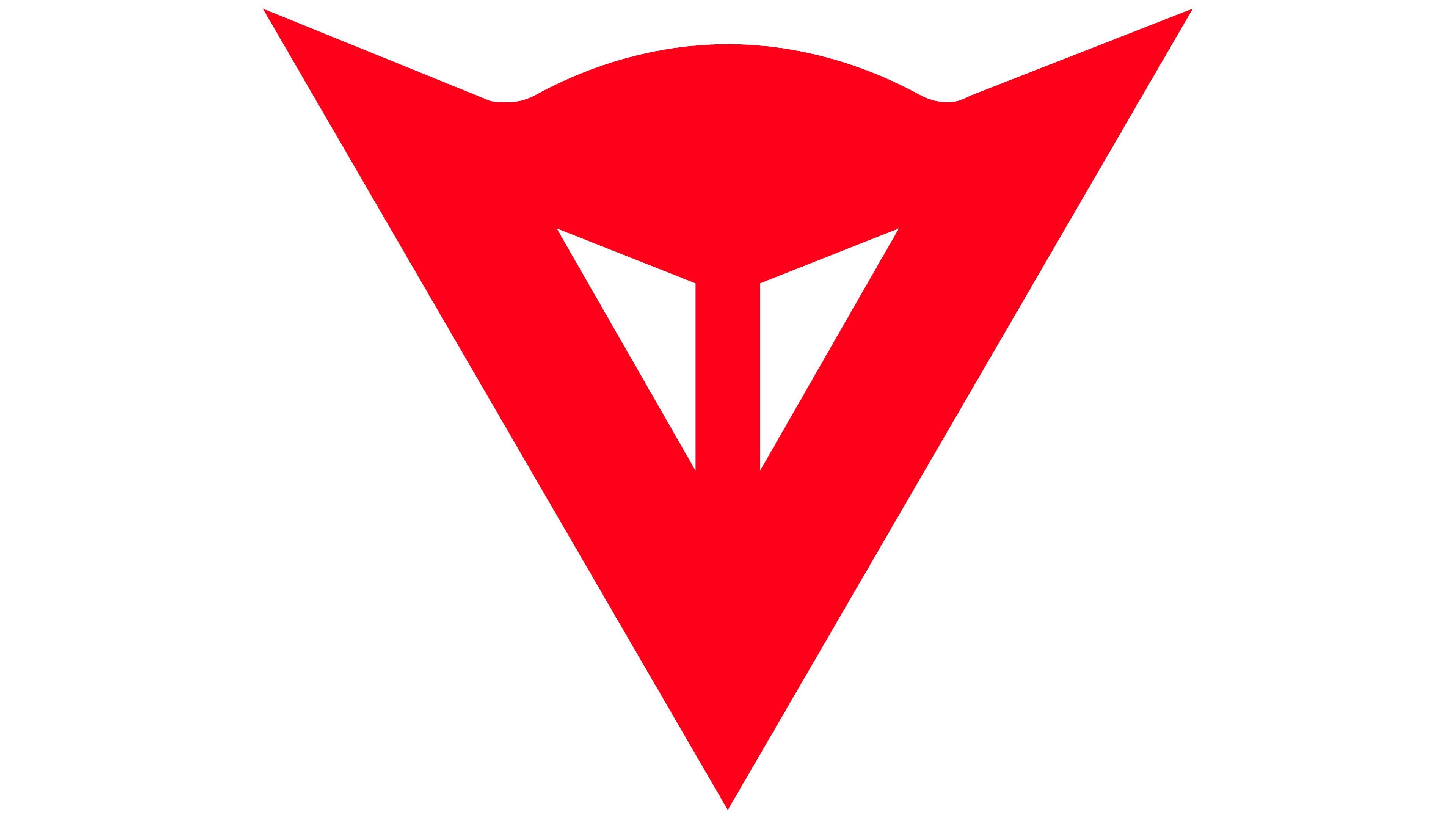
Brand recognition is high among people who enjoy mountain biking or skiing. For all this time, only one version of the logo has been presented, and it remains unchanged today. As a symbol of Dainese, the red devil looks quite intimidating yet also reflects the company’s direction, thanks to its aggressiveness and gloom, which can also be perceived as confidence.
Although the company was founded in 1972, its history began a little earlier, when 20-year-old Lino Dainese visited London on his Vespa. He then decided that producing protective equipment for motorcyclists would be a good way to make money.
What is Dainese?
It is a world-famous brand among extreme sports enthusiasts. For 50 years, the company has manufactured quality products in demand among its target audience.
Interestingly, the first sketches of the future logo also revolved around the “devil” theme, but looked even more sinister, thanks to many acculturative details. Some sketches suggested using a full-length image of the devil, while others featured only the head. He sometimes held the wheel to evoke motorcycle associations in the target audience.
The current version of the logo looks more relaxed, but it still raises doubts among potential Dainese customers. The logo consists of a word inscription and an emblem, which are used separately and are the only elements in most cases. The inscription is made in a modern style and is associated with cruelty and recklessness. It is a bold sans-serif typeface with a unique writing style for each letter. It’s hard to tell whether the characters are uppercase or lowercase. Most likely, different registers are used. Also, the lines’ pointed corners and different thicknesses stand out. For example, in “n,” the left vertical line is thicker than the right one.
The emblem itself looks like a red triangle turned down. At the same time, the upper part is significantly rounded. Two triangles are also used as the demon’s eyes in the center. Otello Gervasio, an artist from New York, designed the logo. This element is called the “Demon Flower.” Tacca Chantrieri (Asian flower), or “black bat flower,” clearly conveys the company’s message.
Font and Colors
A unique font style was chosen, with no analogs among the logos of world-famous companies. This is a bold cursive sans-serif typeface with distinctive features in each character’s writing. Special attention is needed because, despite the letters being identical in size, they are written in both uppercase and lowercase.
The logo’s author chose a red, white, and black color palette. This is not surprising because these colors most clearly convey the devilish theme. Red, as a rule, is associated not only with love but also with blood and aggression. Given that many motorcycle enthusiasts have a hobby in the form of hard rock, such a decision should have piqued their interest. The contrast between the emblem and the inscription also deserves attention.