


![]() Dallas Stars Logo PNG
Dallas Stars Logo PNG
A team with such a name could not have a symbol other than a star, so the Dallas Stars logo is “stellar,” emphasizing the hockey club’s high status and origin. If initially small, it later, through the efforts of designers, became a large sign that served as the background for the printed letter “D.”
The Dallas Stars originated in 1967 as the Minnesota North Stars, created during NHL expansion led by investors including Walter Bush Jr. The team played in Bloomington, named after the state motto, “L’Étoile du Nord”.
The debut season brought both progress and tragedy. In 1968, player Bill Masterton died after an on-ice injury, the only such case in NHL history. His name later became the league’s annual award.
During the 1970s, declining attendance and losses pushed the club to the edge. In 1978, it merged with the Cleveland Barons, stabilizing operations. By 1981, the team reached the Stanley Cup Final but lost to the New York Islanders.
In 1991, the North Stars made an unexpected playoff run, defeating the Chicago Blackhawks, St. Louis Blues, and Edmonton Oilers before losing to the Pittsburgh Penguins.
In 1993, owner Norm Green relocated the franchise to Texas, where it became the Dallas Stars. The move followed failed arena negotiations and league pressure tied to expansion plans involving The Walt Disney Company.
The 1993–1994 season saw strong results, led by Mike Modano. In 1996, the club was sold to Tom Hicks. Under Gainey’s management and Hitchcock’s coaching, performance improved.
In 1999, Dallas won 51 games and claimed the Stanley Cup against the Buffalo Sabers, with Brett Hull scoring a decisive overtime goal. Joe Nieuwendyk received the Conn Smythe Trophy.
In 2001, the team moved to the American Airlines Center. In 2011, Tom Gaglardi acquired the franchise. In 2020, Dallas returned to the Stanley Cup Final, losing to the Tampa Bay Lightning.
Meaning and History
![]()
This club has had several names and, accordingly, many emblems. This fact relates mostly to relocations that affect career growth and symbolism. The team’s history began in the mid-60s of the last century, during the NHL franchise expansion.
Initially, it was the “Minnesota North Stars” team. A little later (before the opening of the 1978-1979 season), athletes merged with the “Cleveland Barons” to overcome financial difficulties. But before this, they received official permission from the league and updated the symbolism.
The hockey players eventually moved to Dallas, Texas, after losing in this lineup until the 1993-1994 season. Then they changed the name to “Dallas Stars” as a sign of a new base, as they had nothing more to do with Minnesota. Thus, the franchise had several logos, each signifying the end of one era of sports and the beginning of another.
What is Dallas Stars?
It’s a professional hockey team based in Dallas. The club represents the Western Conference and is part of the Central Division, competing in the NHL. The club was created in 1967 as part of the franchise expansion. It has several awards: two President’s Trophies, eight division titles, and more.
1967 – 1985
![]()
The debut emblem graphically plays with two words from the team’s name: “North” and “Stars.” The first is depicted as a capital letter “N,” and the second as a star. A serif extending far beyond the writing sign is in the upper left part of the letter. On the right side, an upward-pointing arrow replaces the second leg. Above it is a straight five-pointed star. All elements are drawn in a circle with a wide green stripe, the same color as “N,” and the border of the yellow star with five rays.
1985 – 1991
![]()
The second logo for the “Minnesota North Stars” differs from the debut version in terms of volume. Improvised shadows create the 3D effect – stripes running parallel to the legs of the letter. Additional lines are outlined along the edge, adding an element of strictness and precise geometry. The star with elongated lower rays is separated from the arrow and raised above the “N.” In this version, the designers removed the circle, leaving only a white background.
1991 – 1993
![]()
The team revised the symbolism before moving to a new location, choosing a star as the symbol. The reason is practicality; as cities change names, “Stars” remain. Therefore, the hockey club’s management changed the ratio of graphics and text. The star is now much larger than the word, placed on the right and left rays, and the central segment is replaced by the letter “A.” The green color remained the same, and the yellow intensified to gold.
1993 – 1994
![]()
The athletes spent the first season at the new base under the old emblem, simply adding the city of Dallas to it. The inscription was divided into two parts and placed to the right and left of the upper ray above the word “Stars.”
1994 – 2013
![]()
Before the start of the next season in Dallas, the relocated franchise slightly adjusted its symbolism to distinguish it from the previous one. The focus was on color, and the developers enhanced the green shade, adding a darker palette. Otherwise, the emblem remained the same.
2013 – 2021
![]()
At the end of 2012, the team redesigned the logo to modernize and adapt it to various media. As a result, on June 4, 2013, a modified version was presented: a silver slanted star with a black metallic letter “D,” outlined in green and gray.
2021 – today
![]()
This year is considered a new period in the club’s emblem. Although the changes may be visually imperceptible, one is striking: the outer contour of the emblem has become brighter, and the color has shifted from dark green to bright green. Can these changes be considered a new logo? That’s a tricky question!
Font and Colors
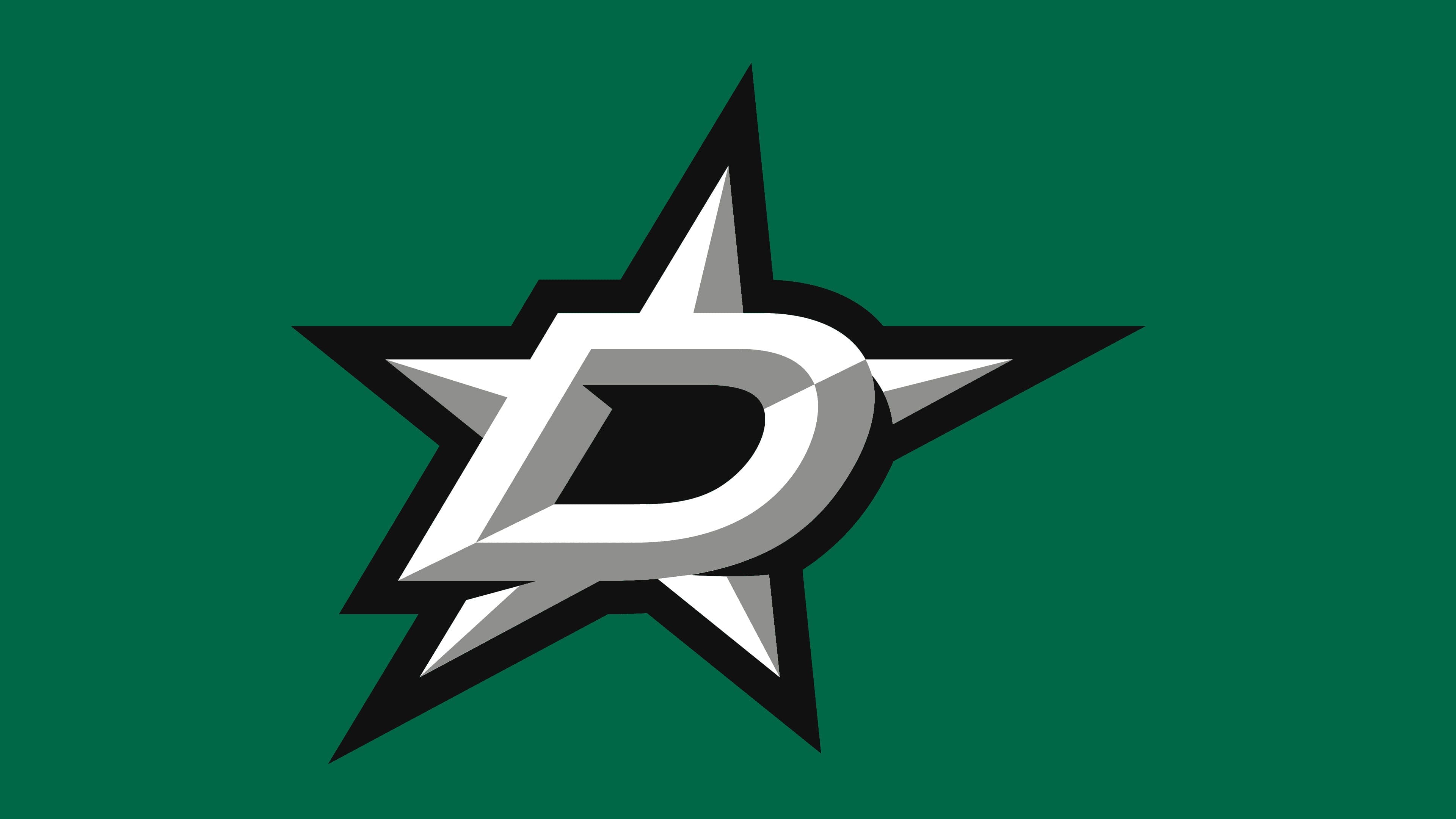
The current logo consists of a classic five-pointed star and a stylized letter “D.” Together, these elements form a single whole. Not one but two stars are used, inner and outer. The first consists of the letter symbol, which is located behind it, protruding ends in different directions. The second outlines the boundaries of the emblem. It has another protrusion, the sharp angle of “D.” The rays of the central star cast shadows, making them appear voluminous.
The logo uses uppercase lettering with a slight rightward tilt. The letters in the word “Dallas” are geometric; in “Stars,” they are more rounded, with streamlined inner edges. The font is sans-serif (grotesque) from the Sans Serif category.
When the franchise was in Minnesota, its brand colors were yellow, gold, and green. After moving to Dallas, gray in the PMS 877 variation appeared. However, the primary colors have always been green PMS 3425 and black PMS Process Black.
FAQ
When did the “Dallas Stars” change their logo?
The club changed its logo in 1991 after renaming itself Dallas Stars (before that, it was called Minnesota North Stars). During the rebranding, the letter N disappeared, and a large star replaced it with the letter A, stylized as the upper ray. The second significant change occurred in 2013 when the designers removed the team name and combined the star with the letter D.
What does the “Dallas Stars” logo represent?
The modern “Dallas Stars” logo features a large star with the letter “D” at its center. The letter is placed above the main sign and symbolizes the team’s name and the city where it is located. All elements are silver-white with double framing (black-green).
Where did the “Dallas Stars” come from?
This team appeared as a result of the NHL franchise expansion. It was initially called “the Minnesota North Stars.” Its final formation occurred in the 1978-1979 season when the club merged with the “Cleveland Barons.” Thus, each avoided financial problems. In the 1993-1994 season, the franchise relocated to Dallas and became the Dallas Stars.
Has Dallas ever won the Stanley Cup?
The “Dallas Stars” team, representing the NHL’s Western Conference, has participated in the Stanley Cup draw five times, the first in 1981 and the last in 2020. It won it in 1999.