


Seattle’s c89.5 introduced itself as DANCE 89.5 during Mornings with Drew Bailey. The launch took place at 9 a.m. on July 7, 2026. Along with its new name, the station unveiled a logo and the tagline “Seattle’s Party Radio.” The update supports its expanding events, artist collaborations, and digital projects.
The station has been broadcasting since 1971 and teaches radio production to students at Nathan Hale High School. Over 55 years, it has built a community of listeners, students, and dance music supporters. The new name is intended to encompass the station’s growing range of activities, including helping Seattle musicians reach international audiences. Its dance format, hosts, and educational program remain in place.
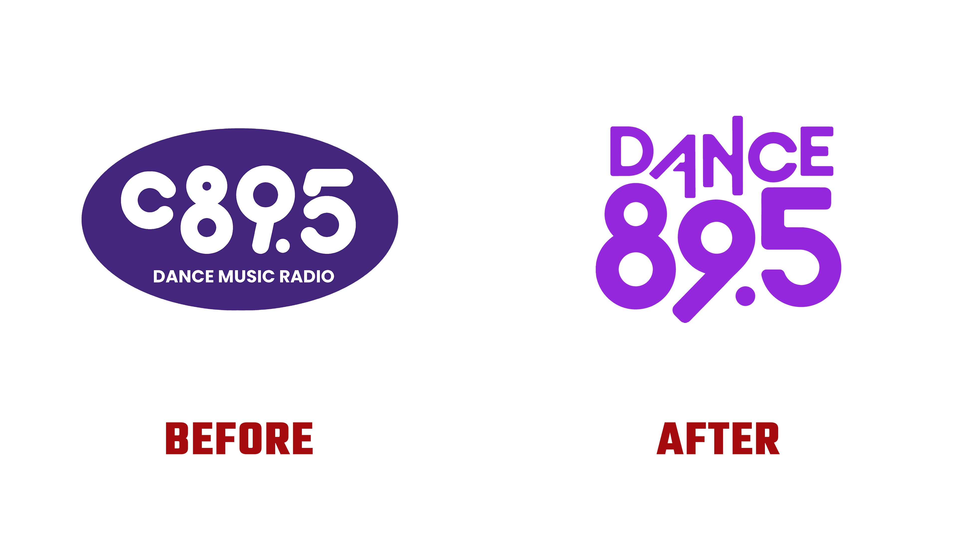
The music format now leads the logo. Previously, a large c89.5 appeared above the smaller line DANCE MUSIC RADIO. The rounded white letter and numerals sat inside an elongated dark purple oval. In the new version, DANCE sits above a large 89.5, while the tagline establishes the Seattle connection.
A freestanding two-line wordmark replaces the oval frame. The arrangement is narrower and taller. In the version presented, the white logo appears against a vivid purple background. DANCE is set in uppercase sans-serif letters with varied proportions. The right stem of the “A” is extended, while the right stem of the “N” rises above the neighboring letters. These projecting strokes give the upper line a stepped silhouette.
In 89.5, rounded numerals are paired with a long diagonal. The upper loop of the “9” extends into a tail pointing down and to the left. The “8” and “5” retain rounded contours, with a large circular decimal point between the “9” and “5.” A single-line version combines the name and frequency for wider formats.
In explaining the new identity, the station invokes a shared dance floor that welcomes people from different backgrounds and embraces different forms of self-expression. DANCE 89.5 connects the update to listener support and a sense of community. Music remains a way to bring people together, while events and artist projects extend those connections beyond the broadcast.
Designer Catherine Lin contributed to the identity. Her portfolio features posters combining purple, lime green, orange, pink, and blue. Photographs of people appear alongside records, smiling faces, and starburst shapes, extending the party theme. The new logo ties together layouts that vary in color and content.
Development of the logo, website, and app took nearly three years. For the launch, the station updated its digital platforms and added a player for on-demand shows. The station released a black T-shirt featuring a multicolored logo for the summer fundraiser. The announcement connected its gradient colors to Pride.