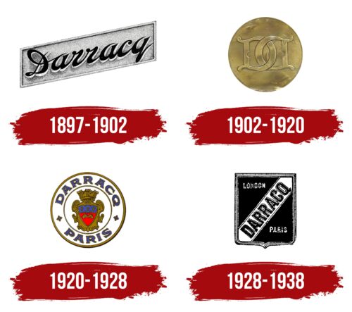
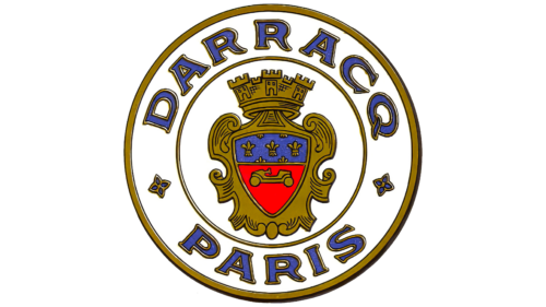
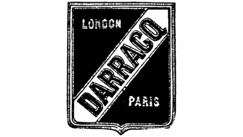
The Darracq logo is knightly and noble. The emblem exudes reliability and strength. Using ancient symbols, the company emphasizes its foundational role in the origins of French automobile manufacturing.
Darracq: Brand overview
Darracq, a company synonymous with innovation in the French automotive industry, was founded in 1897 by Alexandre Darracq. After leaving the bicycle business, he decided to develop the automobile industry and founded A. Darracq et Cie in Suresne, France. The new company’s task was to create cars with a gasoline engine, which led to several revolutionary developments.
At the beginning of its existence, Darracq stood out among other companies due to the introduction of mass production technologies and standardization of car components, which was uncharacteristic then. This ambitious approach allowed the company to expand production to include automobiles, motorcycles, bicycles, and even airplanes, all produced under license.
The early 1900s was a watershed moment for the company. In 1902, a British group of investors acquired the company, creating A Darracq and Company Limited, although its operations were still in France. This transition did not change Darracq’s innovative path. The company continued producing small cylinder-engined cars and new models, such as the successful Darracq Type V-12.
Unfortunately, despite initial successes, Darracq faced increasingly difficult problems. World War I and increased competition contributed to the company’s decline. Eventually, in the 1920s, Darracq merged with another French automaker, Talbot.
The combined company briefly existed under the Talbot-Darracq name, but the Darracq brand presence began to wane. By the 1930s, the Darracq brand was completely discontinued, ending over three decades of automotive history. Nevertheless, the company remained a pioneer in automobile production methods and design in automotive history.
Meaning and History
What is Darracq?
It is a French automaker known for producing many cars in the early 20th century. The company was founded by Alexandre Darracq and gained a reputation for its design and cars. The cars were popular in motor racing and achieved significant success in various competitions. The brand is known for its role in creating Talbot-Darracq after its merger with other companies. Despite its early prominence, the company eventually became part of larger automotive groups.
1897 – 1902
Darracq, which operated from 1897 to 1902, introduced a logo as a plaque, symbolizing the brand on its first bicycles. The ascending text in the logo reflects the company’s drive for growth and exploration of new horizons in transportation. This upward design element represents a continuous pursuit of innovation and excellence.
The company’s founder, Alexandre Darracq, began his career making bicycles, later expanding his interests and ambitions to automobile production. This transition from bicycles to cars is highlighted in the logo through capital letters, illustrating continuity and emphasizing the brand’s evolution. Selling the bicycle business made this shift possible, allowing the founder to focus entirely on automobile manufacturing.
The logo’s texture carries deep meaning. Its rough surface evokes tactile sensations, conveying the effort and craftsmanship in each model. This design element reminds us of the quality and attention to detail that underpin every Darracq product.
1902 – 1920
The logo of Darracq, featuring two vintage “D” letters intertwined within a gold coin, represents significant changes in the company’s structure and management. This design marks the transformation of Darracq et Cie into Darracq and Company Limited and the shift in ownership from founder Alexandre Darracq to joint management with investor partners. Using gold in the emblem signifies the company’s growth and prosperity, which this strategic management decision enables.
The logo’s round shape is aesthetically pleasing and hints at a connection with another well-known automotive brand, Opel. Collaboration with Opel created the special Opel Darracq model for the German market. This partnership highlights Darracq’s international operations and ambition to expand its influence and presence in global markets.
1920 – 1928
The company’s identity emphasizes heraldic motifs, ancient symbols, and images reminiscent of kings and marquises, highlighting its respect for tradition and history. Heraldic elements are embodied in the logo, which is crafted as a medallion. At the center of the medallion is a crest with a crown, symbolizing nobility and high status.
Inside the shield, French lilies are depicted at the top and red British velvet at the bottom, reflecting the company’s cultural fusion and international heritage. A golden car racing along a red stripe, symbolically resembling a red carpet, further emphasizes the premium status of the brand’s vehicles.
The emblem highlights the company’s rich history and French roots and signifies its prestige and high-class products. The logo appeared after the London parent company was renamed S T D Motors, marking a new chapter dedicated to preserving and honoring its heritage through symbolic elements in its branding.
1928 – 1938
The Darracq logo, used until around 1953, features a distinctive monochrome design in the form of a heraldic shield. This shield is divided diagonally into two equal parts, creating a striking visual effect. The brand name “Darracq” runs obliquely from the lower left corner to the upper right, in bold, capital block letters. This slanted positioning adds a sense of dynamism and forward momentum, reflecting the brand’s legacy and commitment to progress.
Each of the two black triangles within the shield contains the names of the cities where the joint venture’s headquarters were: London and Paris. These city names highlight the brand’s international reach and influence. The use of capital and the specific choice of cities underscore the brand’s prestige and heritage.
A double border surrounds the shield, adding depth and framing the logo’s central elements. This border enhances the overall aesthetic and provides a sense of completeness and refinement. With its stark contrasts, the monochrome color scheme contributes to a timeless and classic appearance, ensuring the logo’s lasting appeal.
The shield shape and inclusion of city names evoke imagery of knights embarking on grand campaigns, suggesting nobility and tradition. The slanted letters imply a long-standing history, indicating that the brand has endured many changes.
The Darracq logo, with its heraldic shield, slanted bold letters, and city names, captures the essence of a brand steeped in history and committed to innovation. The monochrome color scheme and double border add elegance and timelessness, while the design evokes a sense of adventure and nobility. This logo is a testament to Alexander Darracq’s enduring legacy and contributions to the automotive industry.
