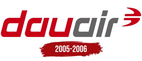
The Dauair logo represents the freedom of movement offered by the carrier. The open letter glyphs and soaring airliner show the readiness to chart new routes and take passengers beyond familiar territories. The emblem reflects the order and organization that distinguish the brand.
Dauair: Brand overview
Dauair was founded in 2005 in Lübeck, Germany, to create a new German leisure airline. Its goal was to provide low-cost flights from Germany to various European vacation destinations. This new venture was the brainchild of a coalition of aviation investors and cruise line operators who sought to carve a niche for themselves in the budget travel market.
The fledgling airline planned to begin operations in 2005 with a fleet of Boeing 737 aircraft based at Dortmund Airport. However, Dowair’s ambitious plans were thwarted when the airline failed to obtain an operating certificate from the German aviation authorities in time for the 2005 summer season.
Although the airline began announcing routes and selling tickets, it never managed to operate a single flight. By early 2006, as delays in obtaining certificates continued, Dauair’s financial support began to wane.
By March 2006, the company was forced to face the harsh reality and announced it would cease operations, resulting in the cancellation of all scheduled flights. Dauair refunded the money for the tickets and officially ceased operations without operating a single flight.
Dauair sought to emulate the German low-cost transportation model, but insurmountable regulatory and financial hurdles prevented it from taking off.
Meaning and History
What is Dauair?
It was a German regional airline based in Dortmund, known for specializing in serving niche routes and business travelers. The company operated a small Dornier 328 turboprop aircraft fleet, enabling efficient operations in small airports and on routes with low passenger traffic. It was recognized for its flights connecting industrial centers in Germany, such as Dortmund and Mannheim, with other European cities, which were particularly popular among business travelers.
2005 – 2006
The short-lived German airline Dauair has chosen an abstract drawing resembling a flying bird or airplane as its symbol. It consists of two dark red elements, the protrusions of which form the tail and wings. The brand name is written in a unique font – bold, italicized, square. The designers gave the letters “d,” “a,” and “u” a similar look, differing only in the upper part. These letters are colored in red, while “i” and “r” are colored in gray, which creates an attractive contrast.
The abstract symbol serves a dual function, evoking images of a bird and an airplane, reflecting the essence of air travel. The unique italic square font further distinguishes the brand, giving it a unique personality. The decision to use a red-grey color scheme provides contrast and enhances the visual appeal of the brand, making it recognizable and memorable.


