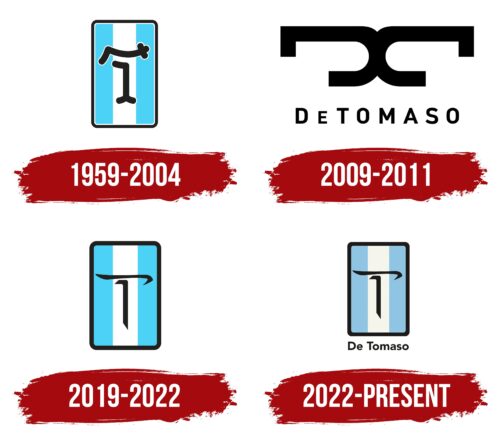
The De Tomaso logo is designed with patriotic motifs. The symbol combines safety, reliability, and a refined execution with attention to detail. The emblem represents a manufacturer with a strong individuality who loves their homeland.
De Tomaso: Brand overview
Founded in 1959 in Modena, Italy, by Argentine racer and automotive designer Alejandro de Tomaso, De Tomaso quickly became a prominent name in sports cars. The company initially focused on building prototypes and cars for Formula 1 and Formula 2 racing in the 1960s and early 1970s.
De Tomaso’s entry into the road car market began with the launch of the Vallelunga coupe in 1963, which paved the way for other iconic models, such as the Mangusta and Pantera, in the following decades. These cars featured distinctly Italian designs by renowned designers such as Ghia and Frua and V8 engines supplied by Ford. This combination defined the brand’s unique aesthetic and performance.
The 1970s was a period of expansion for De Tomaso when the company began to acquire well-known brands such as Maserati and Innocenti. This period also saw the launch of new models, such as the Longchamp luxury sedan, further strengthening the company’s position in the automotive market.
However, during the 1990s and 2000s, De Tomaso experienced financial difficulties. The company struggled to innovate, producing only refined versions of existing models, such as the Pantera sports car. Eventually, in 2004, De Tomaso ceased production and was liquidated.
Despite the cessation of operations, interested parties subsequently acquired the rights to the brand, leaving the possibility of a revival. During its 40-year history, De Tomaso produced approximately 7,700 vehicles, each characterized by the company’s signature style and spirit.
De Tomaso’s legacy survives in its contributions to the automotive industry, especially in the form of elegant mid-engine sports cars such as the Mangusta and Pantera. These models continue to symbolize the brand’s commitment to design excellence and innovation, hallmarks of De Tomaso’s history.
Meaning and History
What is De Tomaso?
It is an Italian automaker founded by Argentine-born Alejandro de Tomaso. The company is known for producing sports cars and luxury cars. It became famous for models such as the Pantera, Mangusta, and Vallelunga, which combined Italian design with powerful American V8 engines. It also produced luxury sedans and race cars. The brand has undergone several revivals and continues to take its rightful place in automotive history with its unique and powerful cars.
1959 – 2004
From 1959 to 2004, De Tomaso introduced its first logo, representing the founder’s roots. The logo design incorporates the Argentine flag as a tribute to the brand’s creator. Traditional horizontal stripes of the flag are transformed into a vertical arrangement, creating a visual association with a road and highlighting the brand’s dynamic nature.
The logo is rectangular with a bold black border, resembling a road sign. This design emphasizes key qualities of De Tomaso cars: safety, compactness, and aerodynamic efficiency, which are highly valued in auto racing.
A visual highlight of the logo is two unique elements resembling the letter ‘t,’ merging into one large capital symbol at the beginning of the brand’s name. This element represents the brand’s identity and its gradual growth and development.
2009 – 2011
De Tomaso, an automobile manufacturer, experienced significant changes, including a change of ownership and company name. With these changes came a new emblem, visually reflecting this transformation. The central element of the new emblem is a large mirrored “D.” This design choice signifies a break with the past, emphasizing that despite the similar name, the brand is now completely renewed as De Tomaso Automobili SpA.
The glyphs forming the text on the logo are crafted with open spaces, allowing room for future significant events. This design creates the image of a bird soaring into the sky, visually conveying a sense of flight. This image represents a drive for innovation and improvement, aiming for prosperity and a stronger market position.
The full brand name is written in elegant, thin letters at the bottom of the logo. The design elements highlight the luxury and respectability of the new De Tomaso, reflecting its status and ambitious plans for the future.
2019 – 2022
In 2019, after the Chinese investment group Ideal Team Ventures acquired De Tomaso, the brand underwent a significant update, reflected in its visual identity. The new logo revisited the original concepts from 1959, when the brand was first established while introducing new elements symbolizing ownership and strategic direction changes.
The design focused on the letter “T,” reworked to resemble Chinese characters. This stylistic choice highlights the cultural synthesis between the brand’s Italian heritage and the new owner’s Chinese influence. It symbolizes a commitment to global integration and mutual understanding.
The outer contour of the logo was modified, becoming significantly thicker, adding visual harmony and stability to the image. This change emphasizes the brand’s confidence and stability in the global market, where De Tomaso aims to establish new positions and expand its influence.
2022 – today
The De Tomaso logo is elegant and creative, reflecting the Italian automobile company founded by Alejandro de Tomaso. It features a thin, oriental-style glyph, showcasing confidence and precision. This design captures energy, professionalism, and a balance of beauty and strength.
The capital letter “T” is the focal point, rising majestically in the center like a tree, symbolizing strength and grace. The “T” sits against a vertical rectangle divided into three equal zones: two pale blue on the sides and one white in the middle. A black border frames the rectangle, adding sophistication and clarity.
At the bottom, the brand name “De Tomaso” appears in a small sans-serif font, adding to the modern and sleek look. The simplicity of the sans-serif letters contrasts with the artistic “T,” creating a balance between tradition and innovation.
The pale blue and white colors evoke tranquility and clarity, like a clear sky. These shades enhance the visual appeal and convey purity and elegance, aligning with De Tomaso’s high standards and refined aesthetics.
The black frame highlights the logo’s central elements, adding depth and focus. This framing technique emphasizes the meticulous attention to detail that characterizes De Tomaso vehicles.
The De Tomaso logo feels dynamic and alive, reflecting the brand’s spirit. The central “T” stands tall and proud, symbolizing the company’s core values. The calming colors and elegant typography invite viewers to learn more about the brand, sparking curiosity and admiration.


