


![]() Dead Kennedys Logo PNG
Dead Kennedys Logo PNG
The Dead Kennedys logo is full of satire and reflects the biting, sharp statements in the band’s song lyrics. The emblem carries a message: the band has always been at the center of conflict and intense emotions, exposing the unpleasant sides of power.
Dead Kennedys formed in San Francisco in the spring of 1978 after guitarist East Bay Ray placed an ad looking for a singer. Eric Reed Boucher from Boulder, Colorado, answered and became Jello Biafra. Bassist Klaus Flouride, drummer Ted, and rhythm guitarist 6025 soon joined. The band played its first show on July 19, 1978, at Mabuhay Gardens after one week of rehearsals.
The name caused problems from the beginning, and major labels avoided the group. In 1979, Biafra and East Bay Ray founded Alternative Tentacles to release “California Über Alles,” a satirical single aimed at California governor Jerry Brown. The same year, Biafra ran for mayor of San Francisco on a provocative platform and finished fourth.
In 1980, Dead Kennedys released Fresh Fruit for Rotting Vegetables after A&M refused to distribute it. The record came out through Faulty Products and reached beyond the California punk scene. By then, 6025 had left, and D.H. Peligro replaced Ted on drums at the end of 1980. The band followed with In God We Trust Inc. in 1981, Plastic Surgery Disasters in 1982, and Frankenchrist in 1985.
The Frankenchrist poster by H.R. Giger led to a 1986 police search of Biafra’s home and obscenity charges. The case ended after a hung jury and was dismissed, but legal costs strained the group. Dead Kennedys had already announced their breakup in January 1986, before releasing Bedtime for Democracy that autumn. After later royalty lawsuits, rights to the catalog passed to the other members, and in 2001, the band returned without Biafra.
Meaning and History
![]()
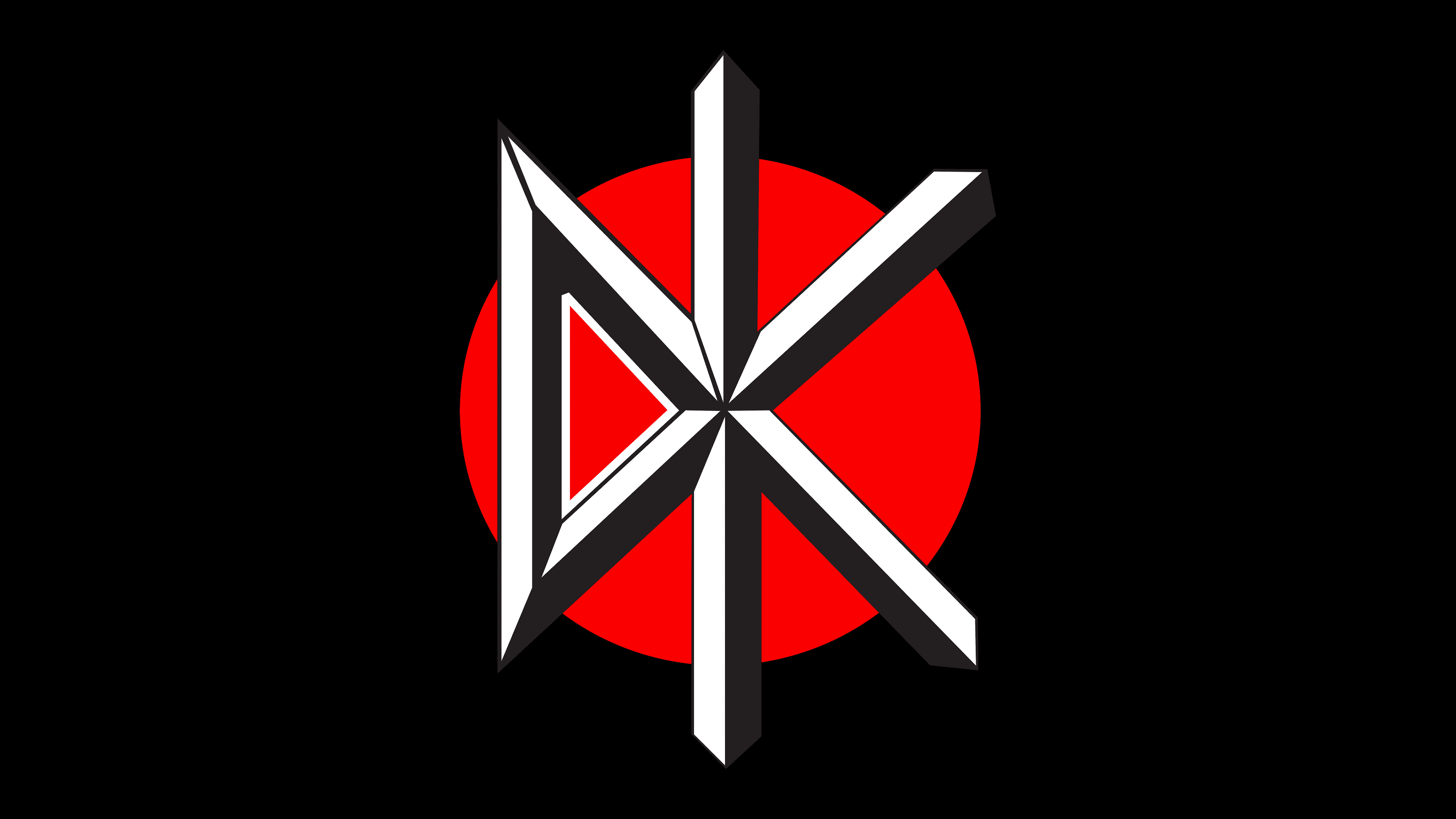
The group’s logo remained constant throughout its history. However, the band’s first album was released under Jello’s personal label, Alternative Tentacles, which features a bat in its logo. This likely led to the refusal to obtain the rights to the songs during the trial.
What is Dead Kennedys?
Dead Kennedys is a hard rock band that has had a significant influence on the development of this musical style. Their lyrics have a political orientation. The band’s lineup has not changed since 1986. The modern ensemble performs only cover versions of the original tracks by the band’s founder, Jello Biafra, who left the band.
1978 – 1986, 2001 – today
![]()
The band’s emblem features the letters DK over a red circle enclosed in a black square. The author is believed to be collage artist Winston Smith, who worked with sharp social themes. The artist designed album covers for Dead Kennedys and many other bands. The sketch was created in one night and was immediately used at concerts.
The letters on the emblem are an abbreviation of the band’s name. The band’s name is an interesting choice. Kennedy pursued policies to help the poor, and one of the possible reasons for his death was an attempt to reduce the power of the Federal Reserve System, meaning the president was killed over money and influence.
As Dead Kennedys actively opposed corruption and the pursuit of enrichment by society’s elites, through their name, they demonstrated that:
- After Kennedy’s death, the most perverted form of capitalism began in America, where money decides everything.
- They are continuators of the president’s cause and support his ideas.
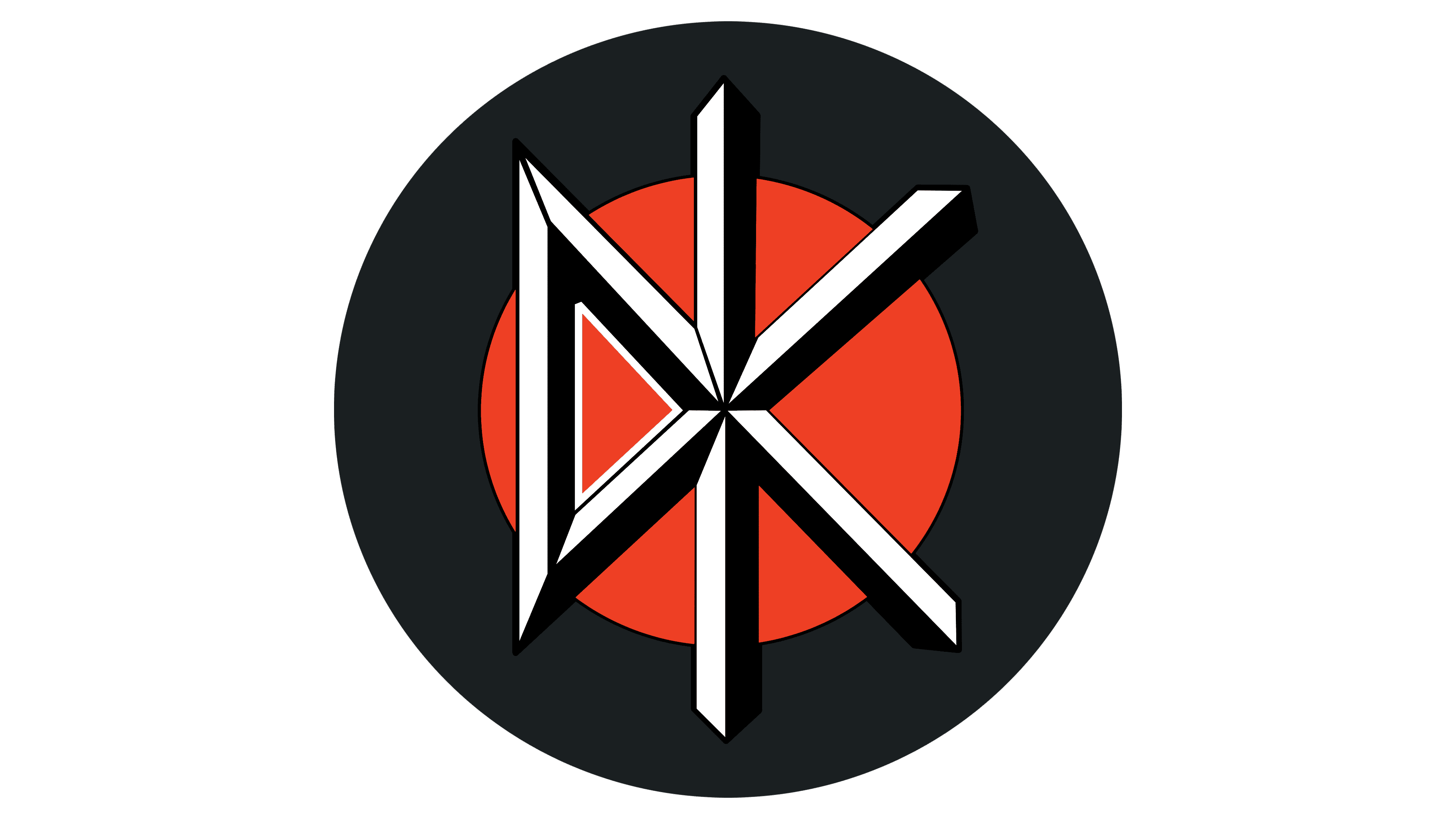
The inscription is designed as a double-edged sword, indicating the direction of the group’s songs. Their style is unusual for hard rock and quite specific, but it has found its fans. The main feature of the lyrics is biting political sarcasm. Black humor, like a sword, strikes at opponents’ weak spots. Most of the mockery is directed at religious and political figures, materialism, corporate greed, and abuses. The position of rejecting conservatism and violence is also expressed in album titles such as Fresh Fruit for Rotting Vegetables and Bedtime for Democracy.
The symbol of swords also demonstrates a readiness to defend themselves. Because of their mockery of politicians, the band made many enemies. This was especially true after the lead singer jokingly ran for mayor of San Francisco and finished 4th. As a result, the musicians were persecuted. The police were present at their concerts, harshly suppressing the fans. In 1986, it even reached a court hearing, where they demanded that each member be imprisoned for a year. Therefore, the musicians constantly had to defend themselves from attacks and stand up for themselves.
The red circle in the logo represents a problem, a sore point that becomes the reason for writing a song. All the band’s lyrics are always at the epicenter of unpleasant events, so the name is placed directly over the circle. The swords in the logo seem to cut open society’s abscess, going beyond the “inflamed” circle.
The black square is a symbol of anger and irritation among musicians at dishonest politicians. The band does not seek negotiations or build relationships. Their discontent is expressed in dark humor.
Font and Colors
The primary colors of the emblem are black and red.
- Red is the color of danger, problems, inflammation, and pain. The band’s performances are on edge. Their humor is harsh and leaves no one indifferent. It evokes a desire for justice in the listeners and, in the guilty, outrage and attempts to silence them. All of these intense emotions are reflected in the color red. The shade also conveys the idea of prohibition. The band sings about what is not commonly spoken about.
- Black is an analogy to dark humor. Dead Kennedys fight with unpleasant weapons, demonstrating the dark sides of the soul and the actions of wrongdoers. Music discs are like Pandora’s black box, containing society’s problems. Overall, the shade is a primary color commonly used in hard rock band emblems.
Since the logo features only two letters, each uniquely styled, it uses a distinctive font.