The Debenhams logo seems to be made of voluminous plastic parts. The image shows the ability of department stores to adapt to consumer demand. On the shelves are a variety of tastefully selected stylish goods necessary for the household.
Debenhams: Brand overview
| Founded: | 1778 – 15 May 2021 |
| Founder: | William Debenham |
| Headquarters: | London, England, UK |
| Website: | debenhams.com |
Meaning and History
In the last years of the British retailer’s existence, its headquarters were located in London. In the same city in 1778, the history of this company began when one of the streets opened a small fabric store. It became the forerunner of Debenhams. The famous name was formed from the name of William Debenham, who joined the business in 1813.
The department store chain was renamed Debenhams Limited in 1905. At that time, it was actively expanding, absorbing competitors, modernizing old outlets, and opening new ones. At the same time, it had to change logos, which was not very noticeable because of the uniformity of all variants. Reports began to show a drop in profits as early as 2013. Financial difficulties worsened year by year, and by the time COVID-19 was quarantined around the world, the company was almost bankrupt. So it could not successfully emerge from the situation. The final point in the history of Debenhams was put by Boohoo Group, which bought the chain of stores in January 2021 to begin liquidation.
The remaining brand, together with all its assets, including its name and logo, belongs to Boohoo. Debenhams’ sole successor is an online store trademarked Debenhams.com Online Limited.
What is Debenhams?
Debenhams is a defunct department store chain that was closed in May 2021. It operated hundreds of stores in the UK and several outlets in Ireland and Denmark at one time. It closed after 243 years of operation due to financial difficulties. The Debenhams name is owned by Boohoo and is only used for one beauty salon.
1778 – 1972
Over two centuries, the British retailer used different logos, information that has not survived. What is known is that it changed its name frequently – hence the signs on the stores alternated as well. The company became Debenhams Limited in 1905 and, after about 15 years, introduced a single corporate image for all its stores.
1972 – 1976
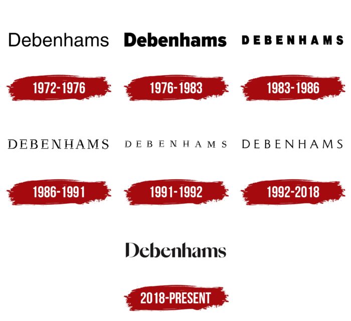
In 1972, the United Drapery Stores retail group almost bought Debenhams, but the deal was never completed. At the same time, the store chain adopted a new logo containing simple black lettering on a white background. Its name was a single word written in crisp, sans serif geometric letters. The font in use at the time has many equivalents, such as Yoxall Regular by Roger White, Mytupi Regular by Álvaro Thomáz, Sequel Sans Body Book by OGJ Type Design, Protestant – DGL Regular by Digital Graphic Labs, Nimbus Sans L Regular by URW++ or FreeSans Medium by GNU FreeFont.
1976 – 1983
The wordmark, created in the mid-1970s, differed from the previous version by the bolder lettering. Its main feature was the oblique cuts at the ends of the “e,” “a,” and “s.” This typeface is most reminiscent of the Kylo Sans Extra Bold from The Northern Block Ltd. Slightly fewer similarities are observed with FullerSansDT Black by DTP Types, Fuse V.2 Display Black by W Foundry, and Verb Extra Condensed Ultra by Yellow Design Studio.
1983 – 1986
In the 1980s, designers converted the lettering to upper case and used a grotesque with narrower, bolder letters. Of the modern fonts, it is roughly similar to Artica Condensed Black by cretype.
1986 – 1991
In 1986 the design of the word DEBENHAMS changed again. It is based on a high-contrast, fine, long serif typeface and has the ends of the base strokes all cut at the same angle, like stencil typefaces. The closest counterpart to this antiqua is Quisnue Regular by Leandro Ribeiro Machado, designed in 2016.
1991 – 1992
In the early 1990s, the designers decided to make the lettering more readable, for which they increased the letter spacing. The size of the signs themselves was naturally reduced.
1992 – 2018
The 1992 version looked much more elegant than its predecessors. The authors of the logo optimized the distance between the letters, shortened the serifs, removed the puckers, and aligned the lines in thickness. This font is similar to Shinntype’s Paradigm Pro Light but with narrower, flatter serifs.
2018 – today
After 20 years in the doldrums, the department store chain launched a marketing campaign that it hoped would attract customers and help it cope financially. Mother Design, a subsidiary of the Mother agency, was in charge of developing the visual identity. They wanted to show the dynamic look of Debenhams while retaining its 200-year heritage. They collaborated with the Swiss Typefaces foundry to create the new font.
On September 3, 2018, the wordmark appeared on the website and storefronts, similar to all previous versions, as it too contained the company’s name in black on a white background. Almost all but the first letter was lowercase, as in the pre-1983 versions. Many of the vertical lines had slices, echoing the design of the 1986-1992 logos. The “n”, “a”, “m” and “s” had large triangular serifs. The contrasting thickness of the strokes and smooth roundings created a sense of dynamism.
Font and Colors
For 243 years, department store chain Debenhams used its signature as its logo, which made it recognizable despite its lack of a global reputation. But all attempts to show forthcoming changes and attract customers’ attention through visual means proved a failure: even the wordmark adopted in 2018 didn’t save the company from liquidation. However, the design developers were confident in its winnability and considered the balance of “modernity and classicism” very successful. The vintage style, which harks back to the era of the 1960s and 1970s, was meant to appeal to a core demographic and evoke nostalgia in customers.
The font for the latest Debenhams logo was based on SangBleu and combined the characteristics of both grotesque and antique. It was created by Mother Design and Swiss Typefaces to reflect the brand’s long heritage of typography, blending it with modern design. The letter-spacing was not too wide, but the lettering was easy to read thanks to the contrasting thickness of the strokes and cone shape of some lines. And the unchanged black and white palette demonstrated the stability and accessibility of the department store chain.
Debenhams color codes
| Eerie Black | Hex color: | #1b1919 |
|---|---|---|
| RGB: | 27 25 25 | |
| CMYK: | 0 7 7 89 | |
| Pantone: | PMS Neutral Black C |


