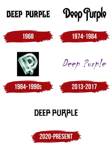
The Deep Purple logo is characterized by mystique and intrigue, fitting the image of a band known for its experimental and innovative approach to music. The unconventional font underscores the unique nature of the band’s musicians.
Deep Purple: Brand Overview
Deep Purple was a revolutionary rock band born in 1968 in London amidst musical innovation. Rooted in the foundations of hard rock and heavy metal, this iconic English band became known for challenging musical norms and inspiring legions of passionate fans.
Deep Purple’s early years were marked by constant changes in the band’s lineup, but they eventually found their perfect rhythm in the famous lineup: Ian Gillan, Ritchie Blackmore, Jon Lord, Roger Glover, and Ian Paice. Early hits such as the captivating “Hush” and the soulful “Kentucky Woman” brought them into the hearts of rock lovers worldwide.
As their popularity grew, Deep Purple embarked on a world tour that sold millions of records and earned them a place in the annals of rock ‘n’ roll history. The chart-topping songs “Smoke on the Water,” “Highway Star,” and “Child in Time” became anthems for a generation and cemented the band’s status as one of the most influential in rock music.
Deep Purple’s influence on rock music is deep and wide-ranging. Their signature sound, characterized by powerful riffs, operatic vocals, and a defiant attitude, enthralled listeners and paved the way for many musicians. Their influence continues to resound in contemporary music halls, inspiring new waves of artists to push boundaries.
Deep Purple’s enduring legacy lies in its rebellious spirit and unwavering commitment to musical authenticity. Whether you are a devoted fan of the band or are new to their sound, Deep Purple’s influence and impact will be felt for centuries to come, a testament to their enduring contribution to the world of music.
Meaning and History
What is Deep Purple?
They are an iconic English rock band, originally recognized as pioneers of hard rock and heavy metal. Formed in London, the band quickly gained fame for their innovative and energetic performances. They have significantly impacted the music industry and earned their place in rock and roll history. Despite numerous lineup changes, they consistently produced chart-topping hits and acclaimed albums. Their music, including songs such as “Smoke on the Water” and “Child in Time,” has carried them through generations, selling over 100 million records worldwide and making them one of the best-selling musicians ever.
1968
The band’s logo features its name. Initially, the group chose the name Roundabout, reflecting their early steps in the music world. Before releasing their first album, they changed it to Deep Purple, inspired by the song by jazz composer Peter DeRose. This name became a recognizable symbol of the band and secured its place in rock music history.
The first emblem used a strict Gothic font, accurately reflecting the hard rock style with elements of organ music. The bold black letters emphasize the seriousness and intensity of the compositions, creating a sense of power and depth in the sound. This logo first appeared on the cover of the band’s debut album, “Shades of Deep Purple,” marking a significant event in hard rock history.
1974 – 1984
The emblem created for the collection “Burn” features a font stretching upward like a candle’s flame, giving an impression of movement and live fire. Each letter seems infused with energy, reaching upward, symbolizing growth and ambition. The straight glyphs, with their slanted ends, resemble pointed blades, adding aggression and strength to the text.
The combination of sharp elements and smooth curves creates a unique visual harmony. This harmony emphasizes the band’s musical style, where sharp explosions mix with soft blues transitions. The contrast between rigid lines and flowing curves reflects their music’s dynamic and diverse sounds.
The emblem symbolizes the band’s rebirth with new members. It reflects their drive for creative growth and innovation.
1984 – 1990s
The interlocked 3D letters D and P resemble a maze where the artists seek a way out. This image represents the band’s desire to change direction after a break. The unconventional angle highlights a new understanding of their purpose and mission, offering a fresh perspective on their creativity and future.
The emblem’s three-dimensional design conveys a sense of strength and stability. Each element of the letters conveys a feeling of solidity and resilience, reflecting the band’s confidence in their abilities and determination to continue their artistic pursuits. The depth and volume of the letters symbolize the depth of their musical ideas and the significance of their work.
2013 – 2017
The emblem on the album cover “Now What?!” features an interesting and original design. It immediately grabs attention with its uniqueness. Punctuation marks replace parts of the letters, giving it a distinctive style and symbolism.
A question mark replacing the first letter “R” introduces an element of mystery and uncertainty. This symbolizes the band’s openness to new ideas and experiments, emphasizing their constant search for self-expression and willingness to try new and unconventional things.
An exclamation point replacing the letter “L” adds dynamism and energy. It highlights bold and successful decisions reflected in the album’s musical compositions, showing the band’s confidence in their new discoveries and eagerness to share them with fans.
2020 – today
The Deep Purple logo, featured on the cover of the 2020 album Whoosh!, draws inspiration from a 1968 wordmark created for the Shades of Deep Purple album. Each letter in the logo has a unique shape, making them look like small works of art. The design blends graceful curves with sharp serifs, creating a striking visual contrast.
Each letter resembles a miniature contemporary art gallery sculpture with intricate twists and turns. The smooth curves and sharp edges make the letters look like detailed drawings from the margins of a notebook, elevated to an artistic level.
The distinctiveness of each glyph ensures that the logo stands out. The intricate design elements create a dynamic and engaging visual experience. The harmonious blend of curves and edges adds depth and character to the logo.


